
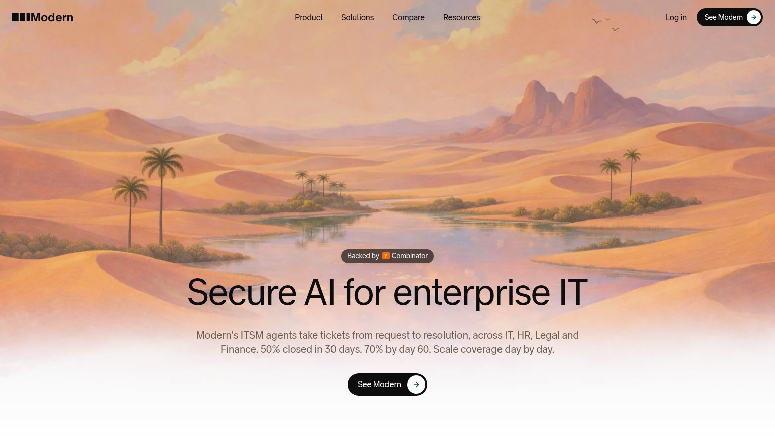
Your landing page’s weakest score is Trust.
How Modern ranks
68Growth scoreupdated
category scores
category scoresShowHide
Score over time
Trust
52FairProof that the product is real, competent, and safe to try.


| Trust read | |
|---|---|
| Modern | "Backed by Y Combinator" badge above the hero headline |
| implicit context Moveworks may benefit from pre-existing familiarity among its target audience. | |
| "Leader in IDC MarketScape: Worldwide Conversational AI Platforms for Back-Office Use Cases" badge | |
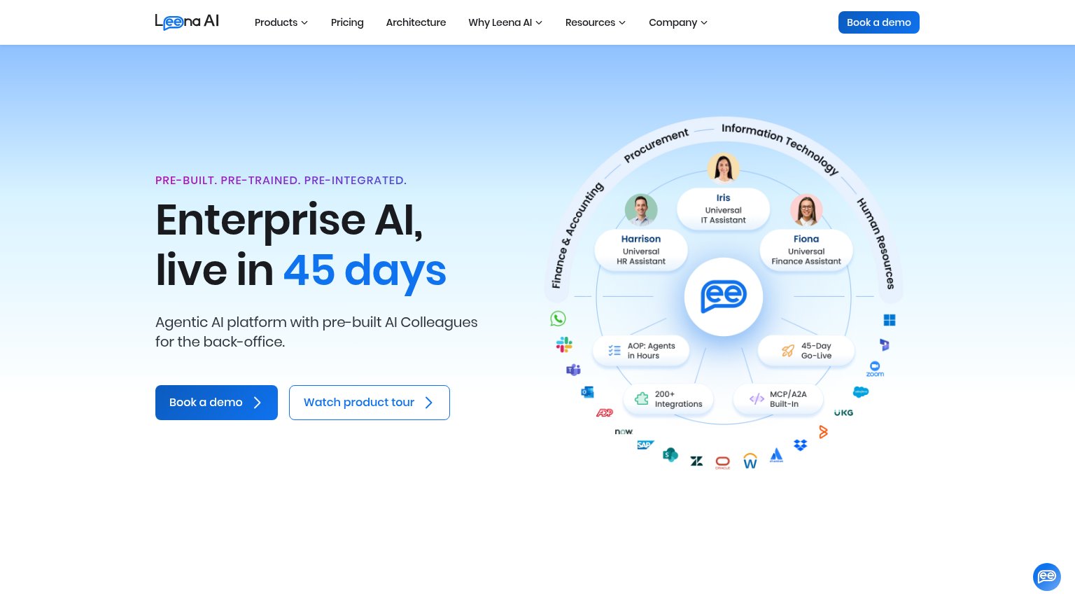
| "200+ Integrations" badge in the hero diagram surrounded by real vendor icons (Slack, SAP, ServiceNow, Zoom, Salesforce) | |
| Customer logo strip including BlueCross BlueShield Nebraska, Exemplis, Halter, Highradius, Lightmatter, and MaryRuth's |
CTA
62FairCopy, size, verb, cost-feel — does the primary CTA earn the click?
Problems
- 'See' is passive, promises no value
- destination unclear: demo or signup?
- brand name instead of outcome
Value props
72FairTitle, subtitle, hero — do they sell the product's true value?
Modern’s headline undersells
Secure AI for enterprise IT
Modern's ITSM agents take tickets from request to resolution, across IT, HR, Legal and Finance. 50% closed in 30 days. 70% by day 60. Scale coverage day by day.
Working
- Specific numbers: 50% in 30 days, 70% by 60
- Names outcome: request to resolution
- Names departments: IT, HR, Legal, Finance
Could improve
- Headline is a category label, not a promise
- Hero image decorates, shows no product
- Numbers buried in subhead, not H1
Mobile web
72FairThe phone experience as a first-class citizen.
 123
- Subhead over hero image — Light-grey text blends into the desert image; the first line is nearly unreadable.
- Header See Modern button — Duplicates the hero CTA and replaces any menu, leaving no route to Product or Solutions links on mobile.
- See Modern hero CTA — Desktop-proportioned pill floats at roughly half the column width instead of a full-bleed thumb target.
Information hierarchy
82StrongDoes the design help or inhibit what the page is trying to say?
123- Duplicate header CTA — Second "See Modern" pill styled identically to the hero CTA splits the single action into two equal targets.
- Five-link nav row — Product, Solutions, Compare, Resources plus Log in give five exits before the visitor reaches the pitch.
- Low-contrast subtitle — Gray metric copy ("50% closed in 30 days") sits on a pale gradient and nearly vanishes, worse on mobile.