
Your landing page’s weakest score is Trust.
How LightSprint ranks
75Growth scoreupdated
category scores
category scoresShowHide
Score over time
Trust
58FairProof that the product is real, competent, and safe to try.
| Trust read | |
|---|---|
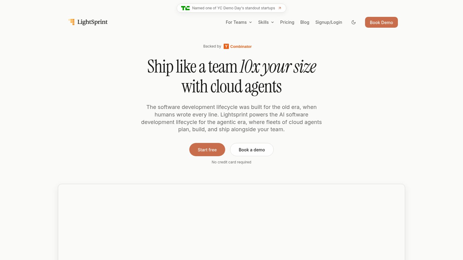
| LightSprint | TechCrunch badge: "Named one of YC Demo Day's standout startups" |
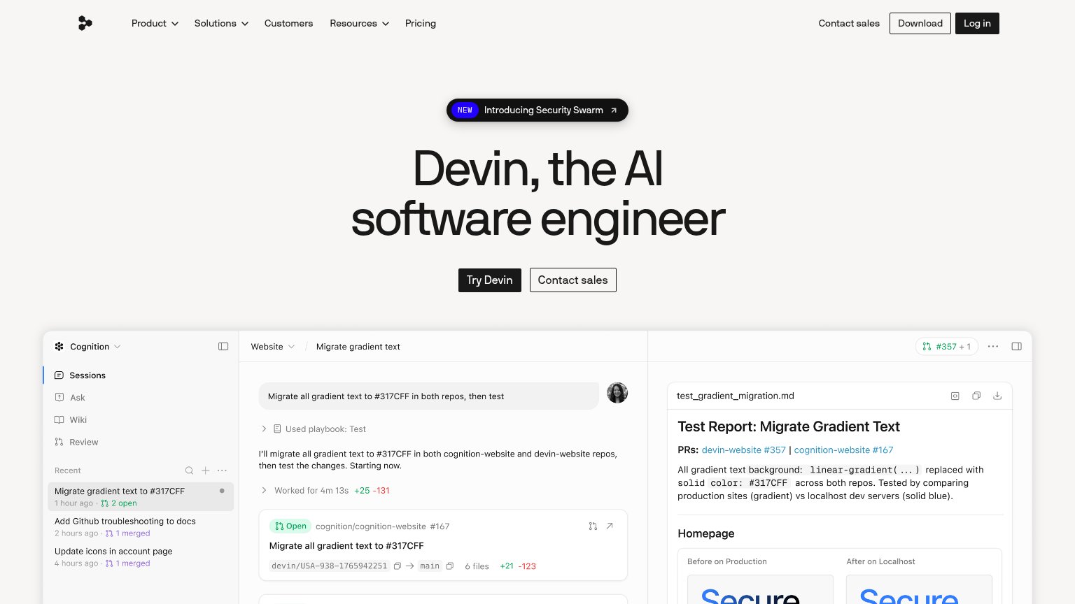
| Embedded Devin session demo showing the task "Migrate all gradient text to #317CFF in both repos, then test" with real P | |
| No visible trust signal identified. | |
| Terminal demo running 'codegen search "summarize a PR"' with real directory results | |
| Live code demo showing the agent working: "Applying: implement click..." status over a React snippet | |
| "80.8K" GitHub star count in the desktop header |
Information hierarchy
74FairDoes the design help or inhibit what the page is trying to say?
1234- Book Demo nav button — Filled terracotta matches Start free exactly, splitting the primary action between two competing asks.
- TechCrunch banner — An outbound link occupies the highest-attention position on the page, leaking visitors before the headline lands.
- Book a demo button — Third conversion button in the fold, duplicating the nav's Book Demo and diluting Start free at near-equal size.
- Four-line subhead paragraph — Two-sentence block asks for a paragraph read between the headline and CTA, slowing the scan to the button.
Value props
76FairTitle, subtitle, hero — do they sell the product's true value?
LightSprint’s headline sells
Ship like a team 10x your size with cloud agents
The software development lifecycle was built for the old era, when humans wrote every line. Lightsprint powers the AI software development lifecycle for the agentic era, where fleets of cloud agents plan, build, and ship alongside your team
Working
- '10x LightSprint's size' is a vivid, quantified outcome
- Names the mechanism: cloud agents
- YC + TechCrunch badges add credibility
Could improve
- Subhead is manifesto, not specifics
- Hero demo card is blank in the fold
- No concrete task or metric beyond '10x'
Mobile web
82StrongThe phone experience as a first-class citizen.
 123
- Start free button — Desktop-proportioned pill at roughly a third of the column width — should be a near full-bleed thumb target on mobile.
- Subheadline paragraph — Seven lines of dense body copy stack between the headline and the CTA, delaying the tap.
- TechCrunch banner — Wraps to two lines above the nav, adding a double-decker header that eats a slice of the hero.
CTA
86StrongCopy, size, verb, cost-feel — does the primary CTA earn the click?
Problems
- nav pushes 'Book Demo' instead
- no header echo in label