
Your landing page’s weakest score is Trust.
How Kimpton ranks
71Growth scoreupdated
category scores
category scoresShowHide
Score over time
Trust
52FairProof that the product is real, competent, and safe to try.

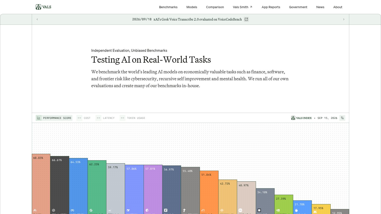
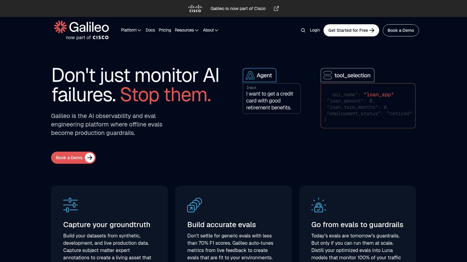
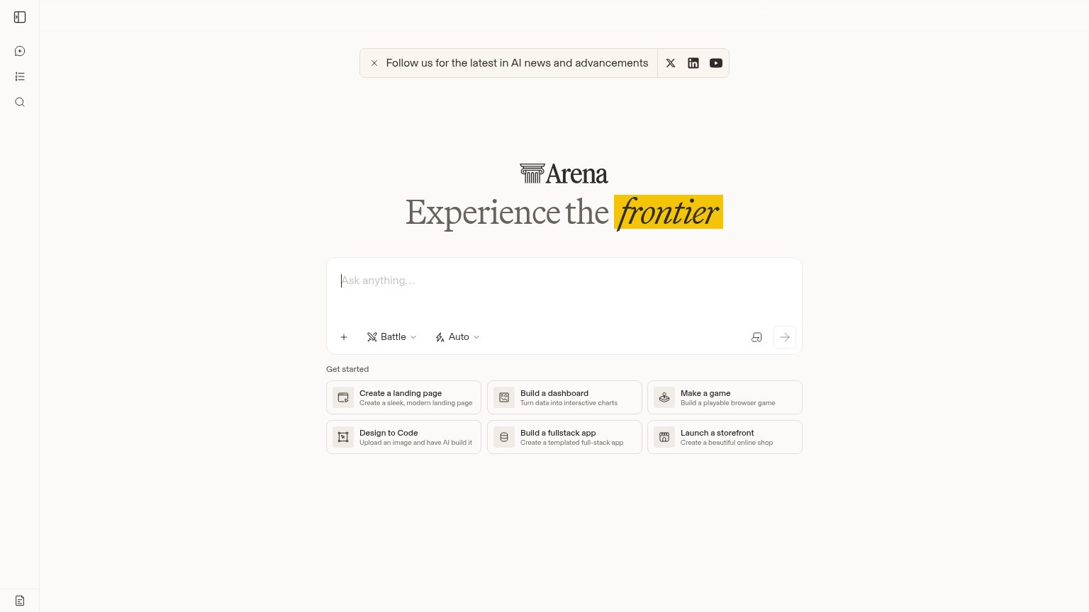
| Trust read | |
|---|---|
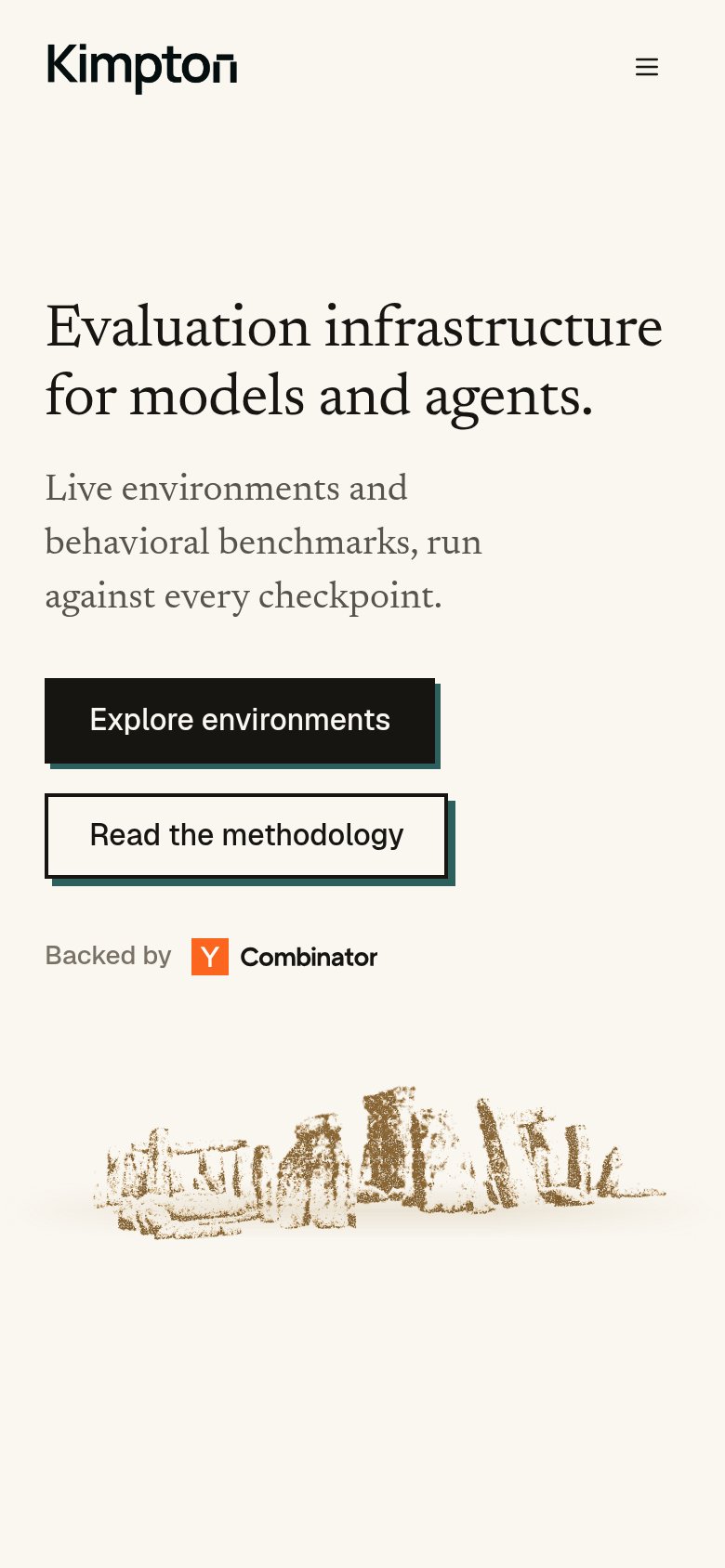
| Kimpton | "Backed by Y Combinator" badge below the hero CTAs |
| Live "Ask anything…" prompt box with Battle/Auto mode controls showing real product UI | |
| implicit context Scale (SEAL Evaluations) may benefit from pre-existing familiarity among its target audience. | |
| "Introducing SpeedrunBench" announcement banner linking to a blog post | |
| Live benchmark leaderboard with named models and exact scores (e.g. Claude Fable 5.1 — 68.83%), stamped "VALS INDEX · SE | |
| "Galileo is now part of Cisco" banner with Cisco logo |
Value props
68FairTitle, subtitle, hero — do they sell the product's true value?
Kimpton’s headline undersells
Evaluation infrastructure for models and agents.
Live environments and behavioral benchmarks, run against every checkpoint.
Working
- Honest, jargon-free category claim
- "Every checkpoint" is a concrete cadence
- YC badge adds credibility proof
Could improve
- No outcome or benefit named
- Zero numbers or proof points
- Hero art decorates, doesn't demo product
CTA
72FairCopy, size, verb, cost-feel — does the primary CTA earn the click?
Problems
- weak browse verb, no payoff
- competes with 'Talk to us' in nav
- three different labels above fold
Information hierarchy
78FairDoes the design help or inhibit what the page is trying to say?
123- Read the methodology button — Boxed at near-equal weight to Explore environments, splitting the primary action in two.
- Talk to us button — A third dark boxed CTA in the header competes with the hero's primary button.
- Nav link row — Four links plus Log in offer five exits before the visitor reaches the hero CTA.
Mobile web
84StrongThe phone experience as a first-class citizen.
 1
- Read the methodology button — Same size and weight as the primary CTA directly above, splitting the tap decision.