FuchsiaYC P26 landing page report.
← Back to YC P26

Score over time

807060504030Certivity 66 on Jul 25 (Wayback)Certivity 58 on Sep 22 (Live)ComplianceQuest is not hardware certification — replaced by Compliance & Risks 64 on May 16 (Wayback)ComplianceQuest is not hardware certification — replaced by Compliance & Risks 60 on Sep 20 (Live)Nemko 52 on May 5 (Wayback)Nemko 51 on May 19 (Wayback)Nemko 52 on Jun 23 (Wayback)Nemko 42 on Jul 18 (Wayback)Nemko 44 on Aug 16 (Wayback)Nemko 43 on Sep 12 (Wayback)Nemko 64 on Sep 22 (Live)Fuchsia 71 on Apr 11 (Wayback)Fuchsia 67 on Apr 24 (Wayback)Fuchsia 69 on May 19 (Wayback)Fuchsia 70 on Sep 20 (Live)Apr 11Apr 24May 19Sep 20
Past reportsShow past reportsHide past reports
  1. Sep 20, 202670LiveOverall +1 · Mobile web +10 · Value props −4Viewing
  2. May 19, 202669Overall +2 · Trust +10 · Value props +4View →
  3. Apr 24, 202667Overall −4 · Mobile web −18 · Value props −4View →
  4. Apr 11, 202671First tracked report — strongest Information hierarchy 82, weakest Trust 48View →

Trust

58Fair

Proof that the product is real, competent, and safe to try.

Trust read
Fuchsia"Backed by Y Combinator" badge
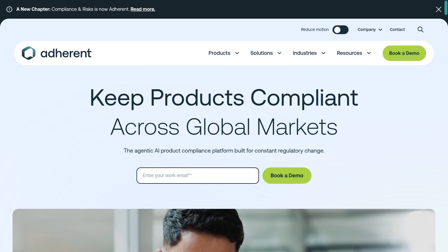
Certivity"Trusted by the world's best companies" logo strip with Daimler Truck and AUMOVIO logos (mobile capture)
ComplianceQuest is not hardware certification — replaced by Compliance & RisksNo visible trust signal identified.
Nemko"Since 1933, we have ensured that our customers comply with requirements anywhere in the world."

CTA

66Fair

Copy, size, verb, cost-feel — does the primary CTA earn the click?

Fuchsia
ComplianceQuest is not hardware certification — replaced by Compliance & Risks

Problems

  • call feels costly and committal
  • no payoff named for the click
  • no echo of headline promise

Mobile web

68Fair

The phone experience as a first-class citizen.

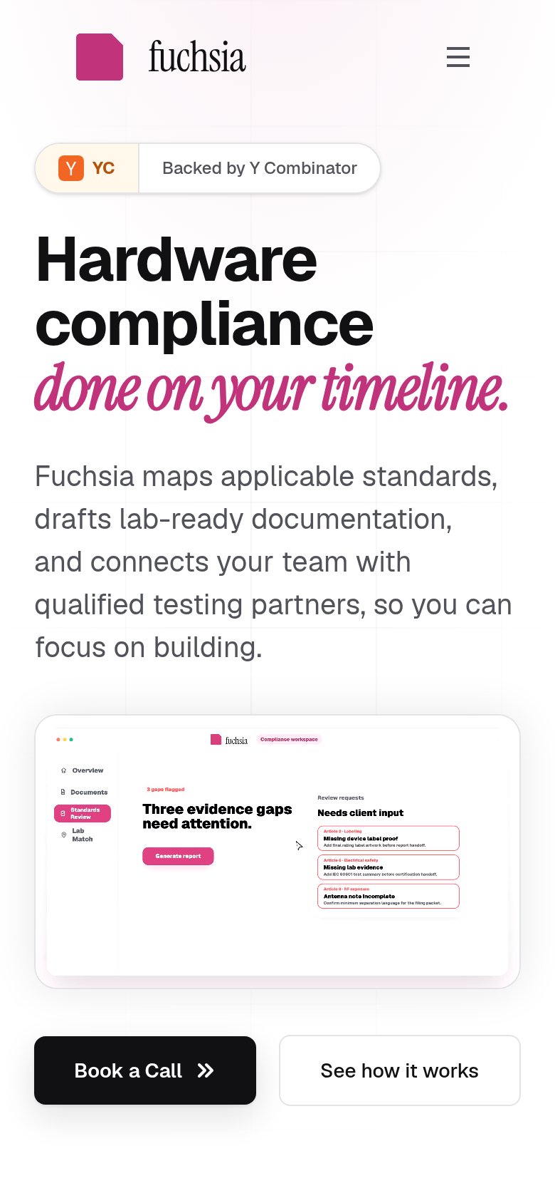
Mobile web annotations on the mobile capture123
  1. Book a Call button — Primary CTA sits well below the first mobile viewport, after the headline, subhead, and product screenshot.
  2. Product screenshot detail — Desktop workspace UI shrunk to phone width — flagged articles and sidebar labels are unreadably small.
  3. Script headline line — 'done on Fuchsia's timeline.' script type nearly touches the viewport edges with no side padding.

Value props

78Fair

Title, subtitle, hero — do they sell the product's true value?

Fuchsia’s headline sellsHardware compliance done on your timeline.Fuchsia maps applicable standards, drafts lab-ready documentation, and connects your team with qualified testing partners, so you can focus on building.

Working

  • Names the exact job: hardware compliance
  • Subhead lists three concrete deliverables
  • Hero screenshot shows the product working

Could improve

  • No numbers to back the timeline claim
  • No standards named (FCC, CE, IEC)
  • No customer proof beyond YC badge

Information hierarchy

82Strong

Does the design help or inhibit what the page is trying to say?

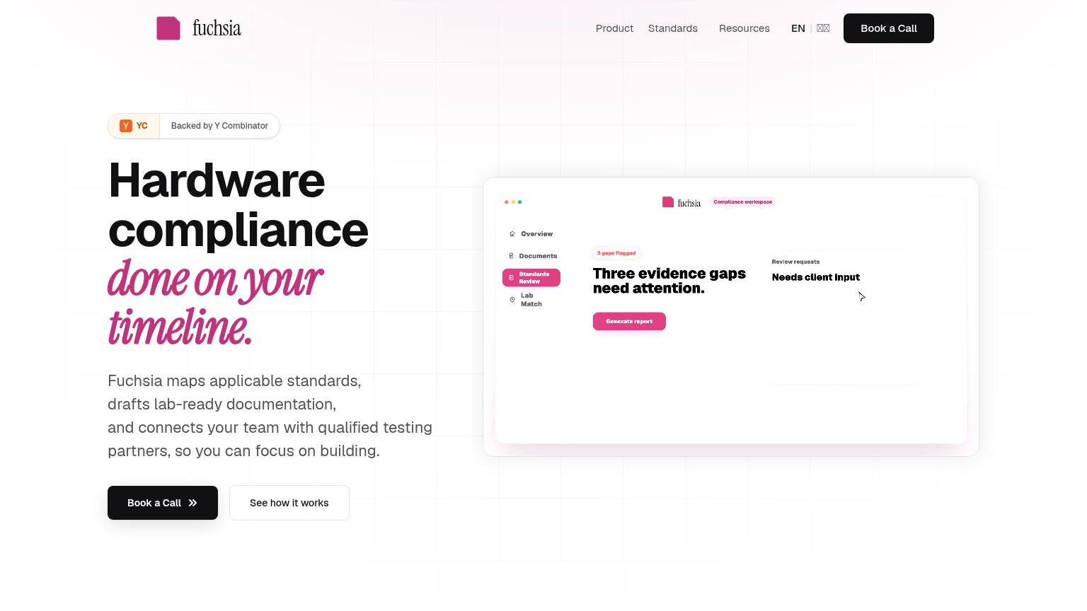
Information hierarchy annotations on the desktop capture123
  1. Review requests panel — The mockup's right column is nearly empty — the evidence cards shown on mobile are missing, so the proof visual looks broken.
  2. Header Book a Call — Duplicates the hero's primary CTA at identical black weight, splitting the single-action focus of the fold.
  3. Mockup sidebar labels — Overview/Documents/Standards Review text renders too small to read at desktop size, adding noise instead of product proof.