DraftedYC P26 landing page report.
← Back to YC P26

Your landing page’s weakest score is Trust.

Fix Trust

Score over time

80706050Maket 77 on Apr 27 (Wayback)Maket 77 on May 6 (Wayback)Maket 77 on May 16 (Wayback)Maket 77 on Jun 10 (Wayback)Maket 74 on Sep 20 (Live)ARCHITEChTURES 66 on Sep 22 (Live)Finch 59 on Apr 20 (Wayback)Finch 56 on May 14 (Wayback)Finch 56 on Sep 22 (Live)Planner 5D 59 on May 5 (Wayback)Planner 5D 60 on Jul 2 (Wayback)Planner 5D 59 on Jul 15 (Wayback)Planner 5D 62 on Aug 5 (Wayback)Planner 5D 64 on Sep 8 (Wayback)Planner 5D 61 on Sep 22 (Live)Drafted 66 on Apr 4 (Wayback)Drafted 64 on Apr 14 (Wayback)Drafted 66 on Apr 21 (Wayback)Drafted 66 on May 3 (Wayback)Drafted 67 on Jun 1 (Wayback)Drafted 77 on Sep 20 (Live)Apr 4Apr 14Apr 21May 3Jun 1Sep 20
Past reportsShow past reportsHide past reports
  1. Sep 20, 202677LiveOverall +10 · Mobile web +24 · Trust +16Viewing
  2. Jun 1, 202667Overall +1 · Information hierarchy +20 · CTA +14View →
  3. May 3, 202666Mobile web +6 · CTA −4View →
  4. Apr 21, 202666Overall +2 · Information hierarchy +4 · Mobile web +4View →
  5. Apr 14, 202664Overall −2 · Information hierarchy −10 · CTA +4View →
  6. Apr 4, 202666First tracked report — strongest Value props 78, weakest Information hierarchy 58View →

Trust

68Fair

Proof that the product is real, competent, and safe to try.

Trust read
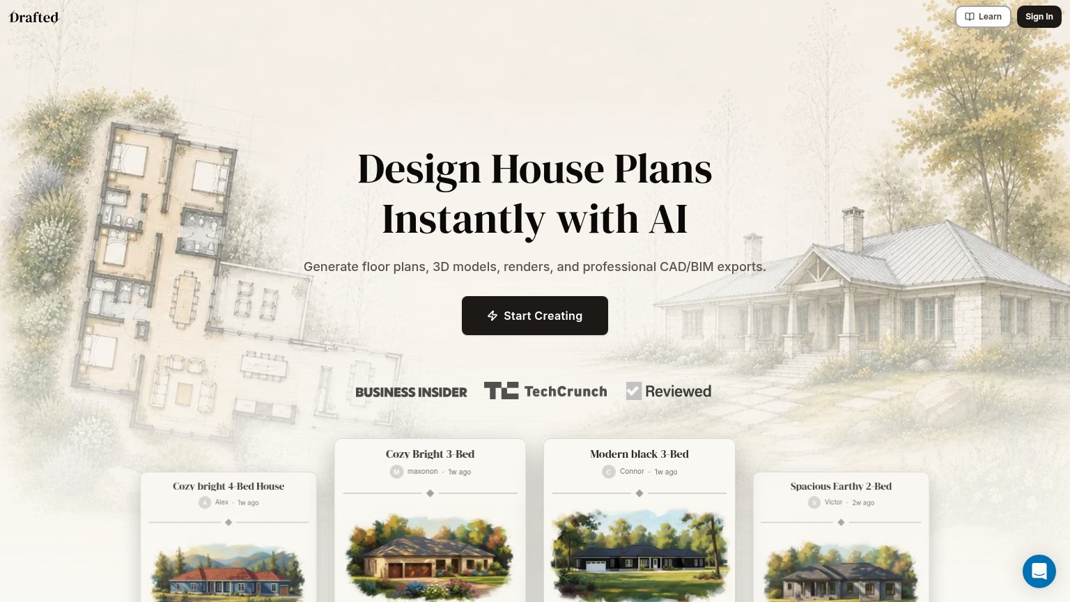
DraftedPress logo bar (Business Insider, TechCrunch, Reviewed) beneath the Start Creating CTA
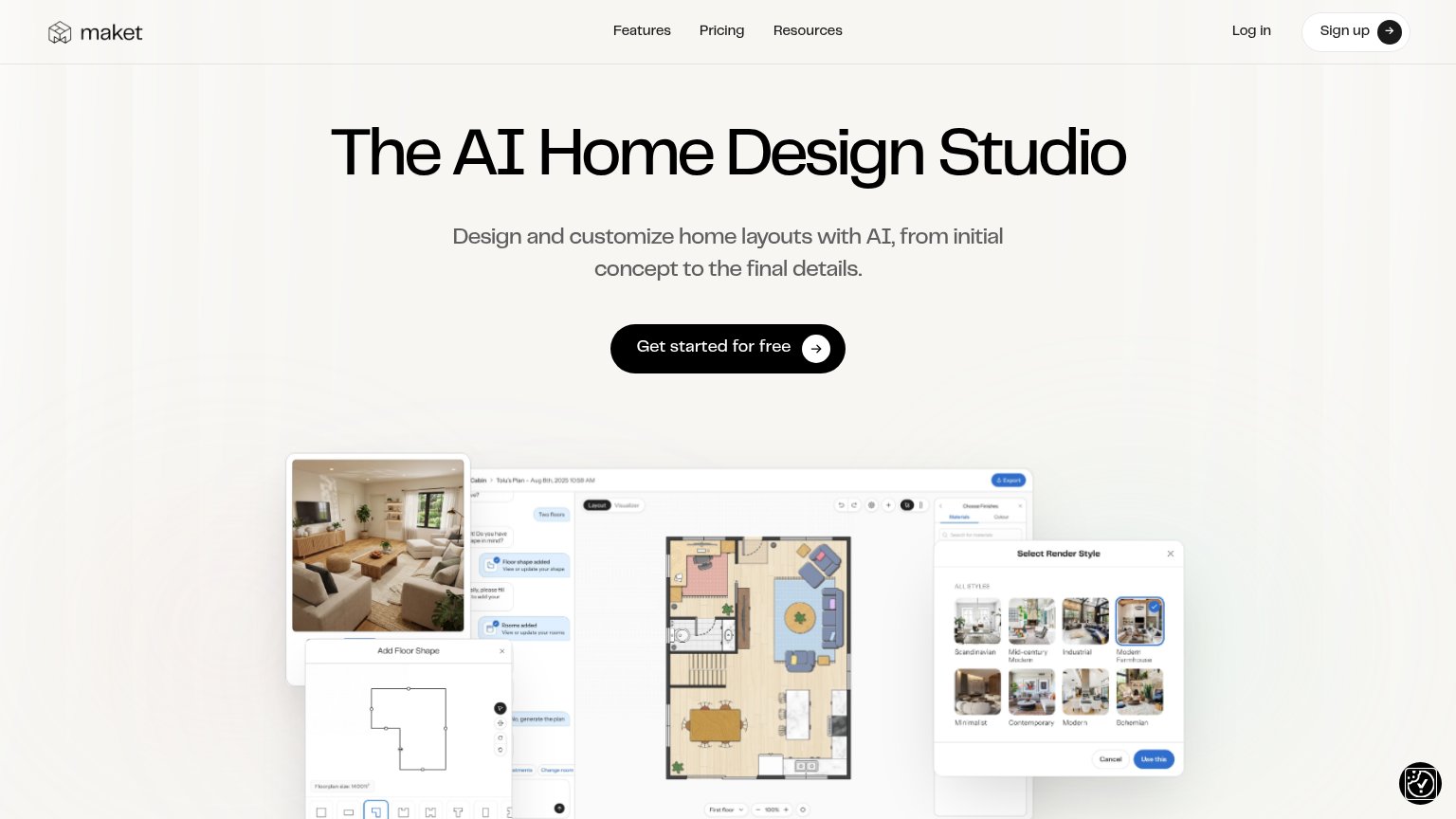
MaketDetailed product UI screenshot: floor-plan editor with "Select Render Style" panel showing eight named render styles (Sc
ARCHITEChTURES"Used by architects and real estate developers to optimize the feasibility analysis process with regulatory confidence"
FinchCustomer logo strip: tp bennett, U+A, KPF, H&dM, UNS, Aedas
Planner 5DGoogle Play and App Store download badges on the mobile app prompt

CTA

76Fair

Copy, size, verb, cost-feel — does the primary CTA earn the click?

Drafted
Maket

Problems

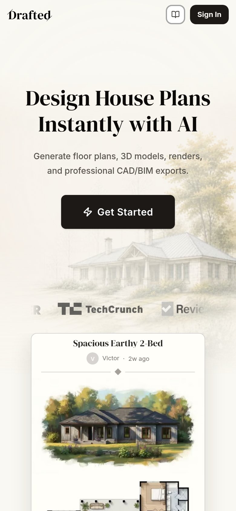
  • label differs on mobile: 'Get Started'
  • generic 'Get Started' on mobile
  • no visible zero-cost cue

Value props

78Fair

Title, subtitle, hero — do they sell the product's true value?

Drafted’s headline sellsDesign House Plans Instantly with AIGenerate floor plans, 3D models, renders, and professional CAD/BIM exports.

Working

  • Names the exact job and speed benefit
  • Subhead lists concrete outputs (CAD/BIM)
  • Hero and cards show real product output

Could improve

  • No numbers or quantified outcome
  • No emotional hook vs hiring a drafter
  • "Instantly" is the only speed proof

Information hierarchy

82Strong

Does the design help or inhibit what the page is trying to say?

Information hierarchy annotations on the desktop capture123
  1. Press logo row — Three same-weight press logos sit directly under the CTA and pull the eye off 'Start Creating' before it lands.
  2. Community plan cards — Four user-generated cards crest the fold at unequal heights, introducing a second competing focal band with no framing headline.
  3. Learn nav button — Outlined pill styling gives this exit near-button weight beside Sign In, splitting top-right attention three ways.

Mobile web

82Strong

The phone experience as a first-class citizen.

Mobile web annotations on the mobile capture12
  1. Clipped press logos — Logo strip is cut off mid-word at both edges ('R', 'Revie'), reading as a layout bug that undermines the trust signal.
  2. Get Started button — Label diverges from desktop's 'Start Creating' and stops short of full-bleed width on a phone column.

Competitors

inferred from product, audience, and value prop