
Your landing page’s weakest score is Trust.
How Atrisa ranks
72Growth scoreupdated
category scores
category scoresShowHide
Score over time
Trust
62FairProof that the product is real, competent, and safe to try.

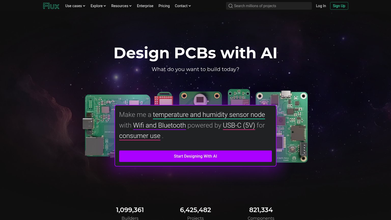
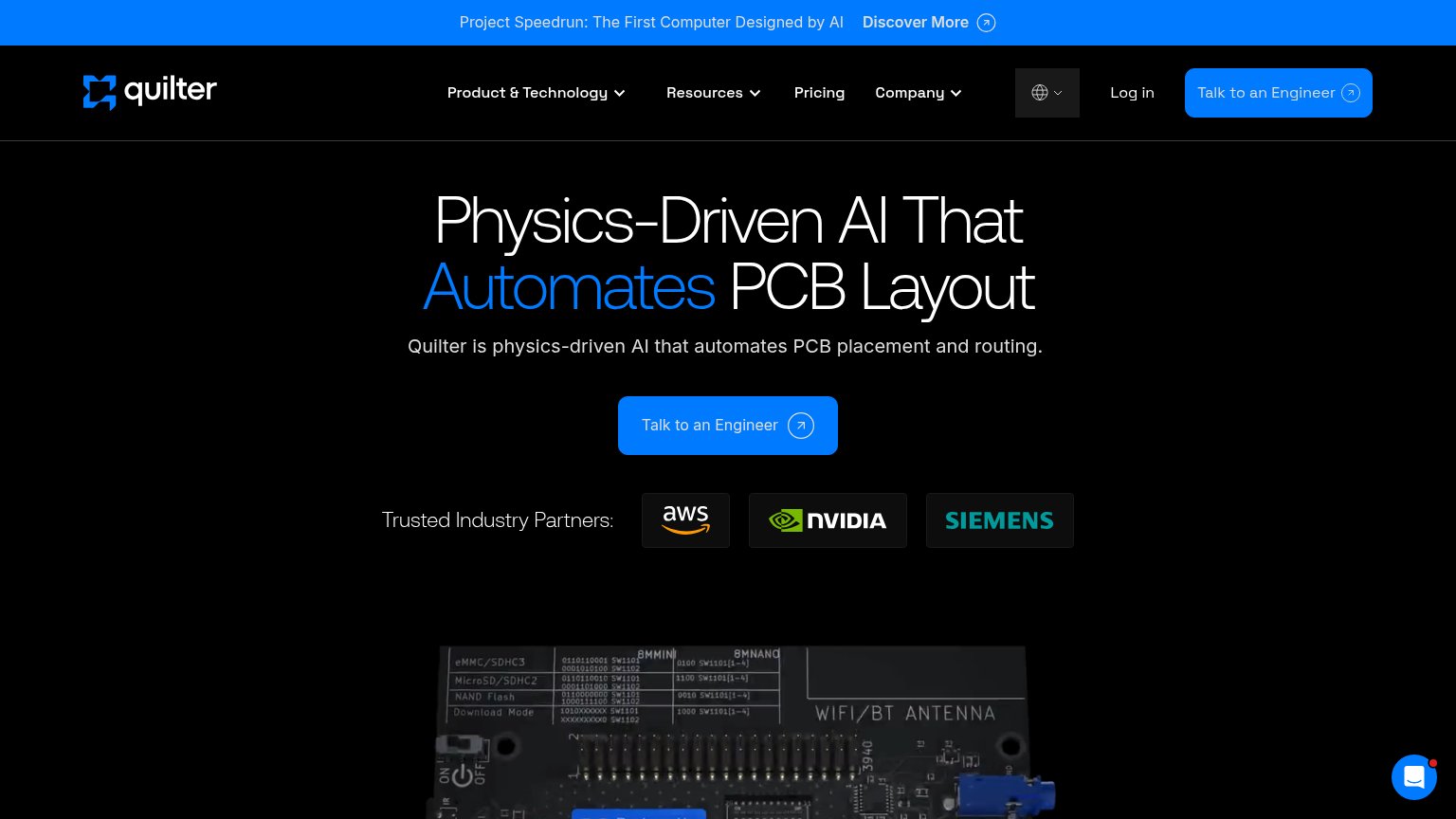
| Trust read | |
|---|---|
| Atrisa | Product UI showing a Miller compensation loop-gain plot ("Cc 2 pF · PM 38° · 320 MHz") with Atrisa suggesting "Add a cas |
| "$8M - Led by Khosla Ventures" funding badge | |
| News banner: "Our Work with Anthropic" and "Announcing our Series A with a16z" | |
| Usage counters: "1,099,361 Builders", "6,425,482 Projects", "821,334 Components" | |
| "Trusted Industry Partners:" strip with AWS, NVIDIA, and Siemens logos |
CTA
68FairCopy, size, verb, cost-feel — does the primary CTA earn the click?
Problems
- 'Request' feels like asking a favor
- click buys a sales call, not value
- no secondary lower-cost path
Value props
72FairTitle, subtitle, hero — do they sell the product's true value?
Atrisa’s headline undersells
Give your analog team a higher gain
Atrisa works alongside your engineers to design circuits, run simulations, investigate failures, and turn hard-won knowledge into team-wide leverage.
Working
- Subhead names four concrete engineering jobs
- Hero demo shows real Bode plot + AI suggestion
- 'Higher gain' pun signals analog-native credibility
Could improve
- Headline is a pun, not an outcome
- No numbers or proof points beyond YC badge
- Rotating headline dilutes a single clear claim
Mobile web
78FairThe phone experience as a first-class citizen.
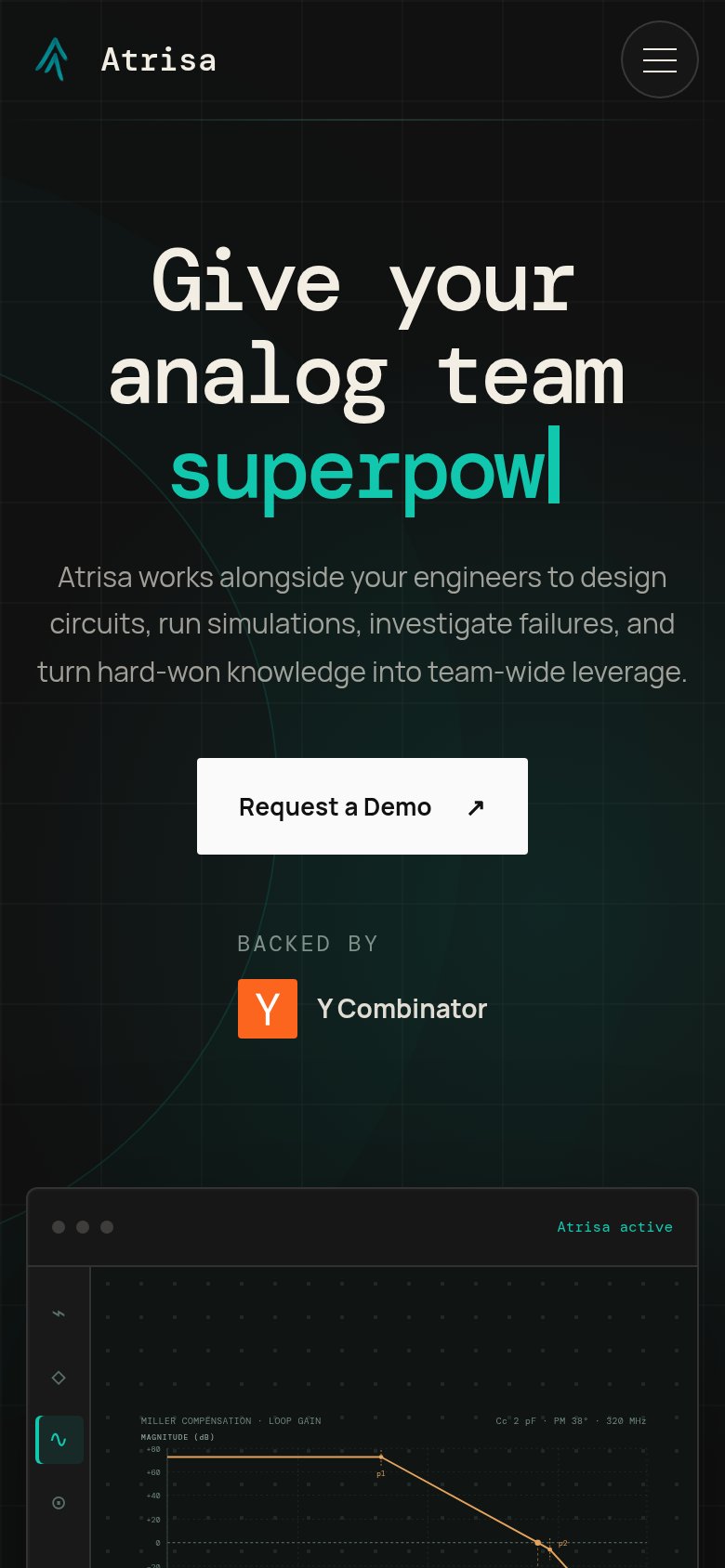 123
- Truncated animated headline — Typewriter effect leaves the value prop reading "superpow" mid-animation, so fast bouncers never see the full message.
- Half-width demo button — "Request a Demo" floats at roughly half the column width instead of a thumb-friendly near-full-bleed tap target.
- Oversized monospace headline — Headline wraps into three tall lines and eats about a third of the viewport before the subhead starts.
Information hierarchy
82StrongDoes the design help or inhibit what the page is trying to say?
123- Header Request a Demo — Duplicates the hero CTA at equal solid-white weight, splitting the fold's one action across two targets.
- Nav links row — Product, How it works, and Demo sit at the same tonal weight as the header CTA, giving exits equal billing.
- Demo window text — Chart labels and the 'Add a cascode' chat card render at near-illegible size and contrast, muting the proof element.