TinfoilYC P25 landing page report.
← Back to YC P25

Your landing page’s weakest score is Trust.

Fix Trust

Score over time

757065605550Caution 67 on Apr 12 (Wayback)Caution 66 on May 13 (Wayback)Caution 60 on Jun 12 (Wayback)Caution 68 on Jul 28 (Wayback)Caution 71 on Sep 4 (Wayback)Caution 70 on Sep 20 (Live)Anjuna Security 62 on Mar 30 (Wayback)Anjuna Security 64 on Apr 26 (Wayback)Anjuna Security 58 on Jul 10 (Wayback)Anjuna Security 62 on Jul 18 (Wayback)Anjuna Security 64 on Sep 10 (Wayback)Anjuna Security 62 on Sep 20 (Live)Edgeless Systems 60 on Jul 31 (Wayback)Edgeless Systems 63 on Sep 20 (Live)Fortanix 54 on Mar 27 (Wayback)Fortanix 64 on Sep 20 (Live)Evervault 66 on May 18 (Wayback)Evervault 69 on Sep 20 (Live)Tinfoil 58 on Jul 15 (Wayback)Tinfoil 57 on Jul 24 (Wayback)Tinfoil 56 on Sep 20 (Live)Jul 15Jul 24Sep 20
Past reportsShow past reportsHide past reports
  1. Sep 20, 202656LiveOverall −1 · Information hierarchy −6 · Trust +4Viewing
  2. Jul 24, 202657Overall −1 · Trust −4View →
  3. Jul 15, 202658First tracked report — strongest Information hierarchy 68, weakest Trust 42View →

Trust

42Poor

Proof that the product is real, competent, and safe to try.

Evervault
Fortanix
Caution
Edgeless Systems
Trust read
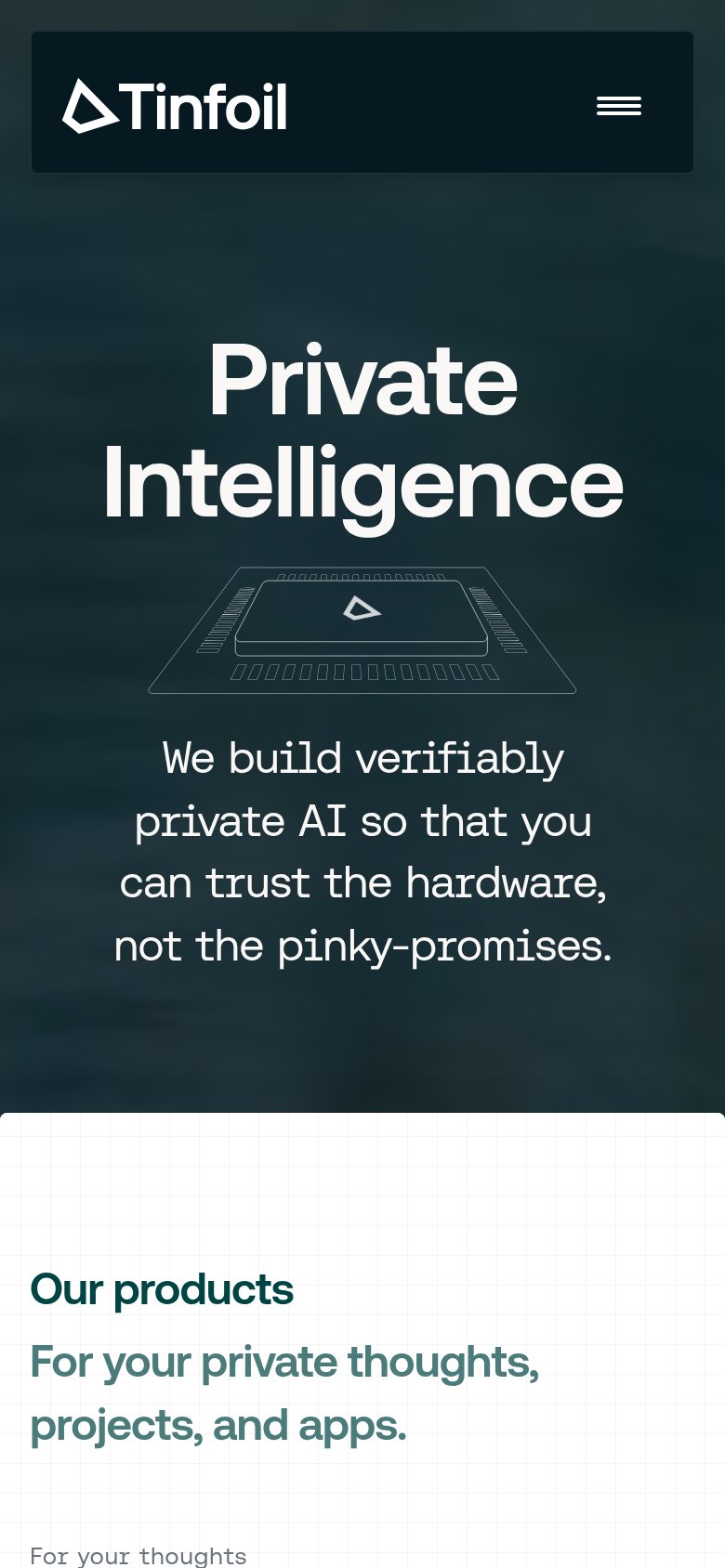
TinfoilNo visible trust signal identified.
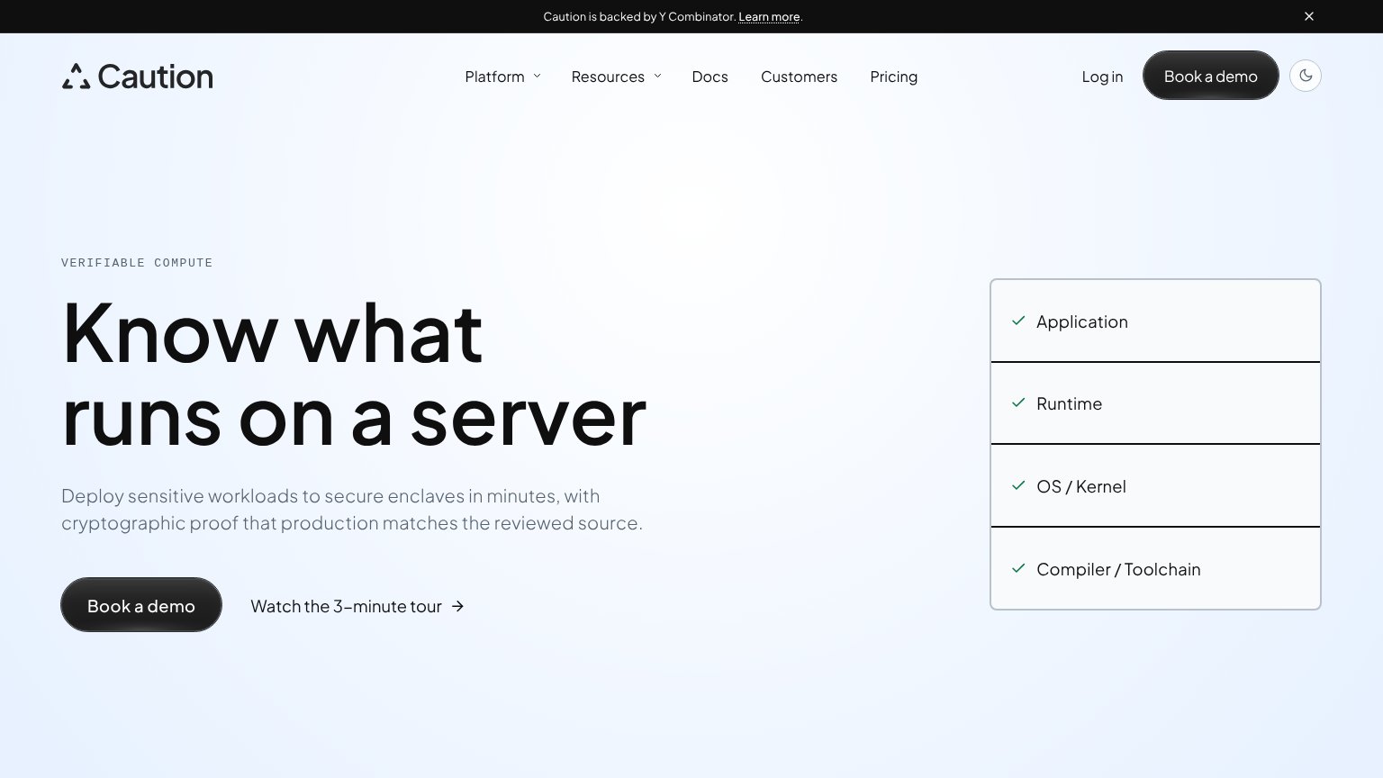
Caution"Caution is backed by Y Combinator." banner
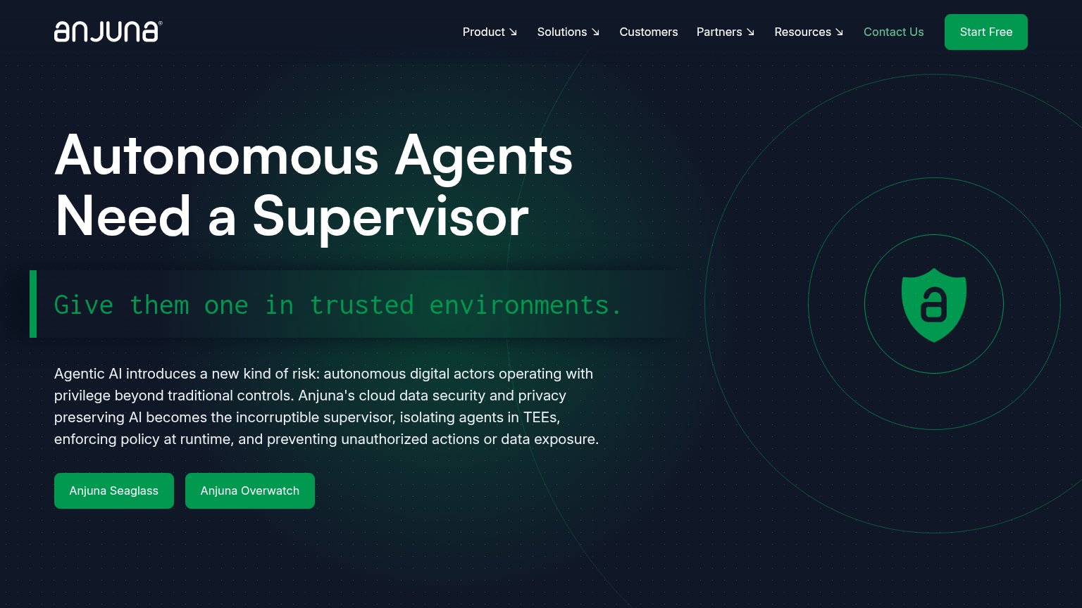
Anjuna SecurityNo visible trust signal identified.
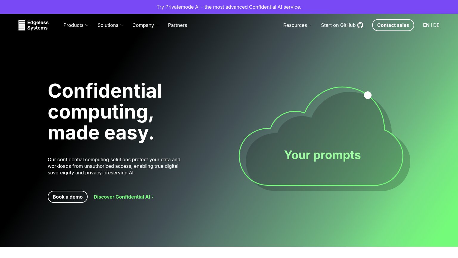
Edgeless Systems"Start on GitHub" link implying inspectable open-source code
Fortanix"Fortanix | NVIDIA" co-branding lockup above the hero illustration
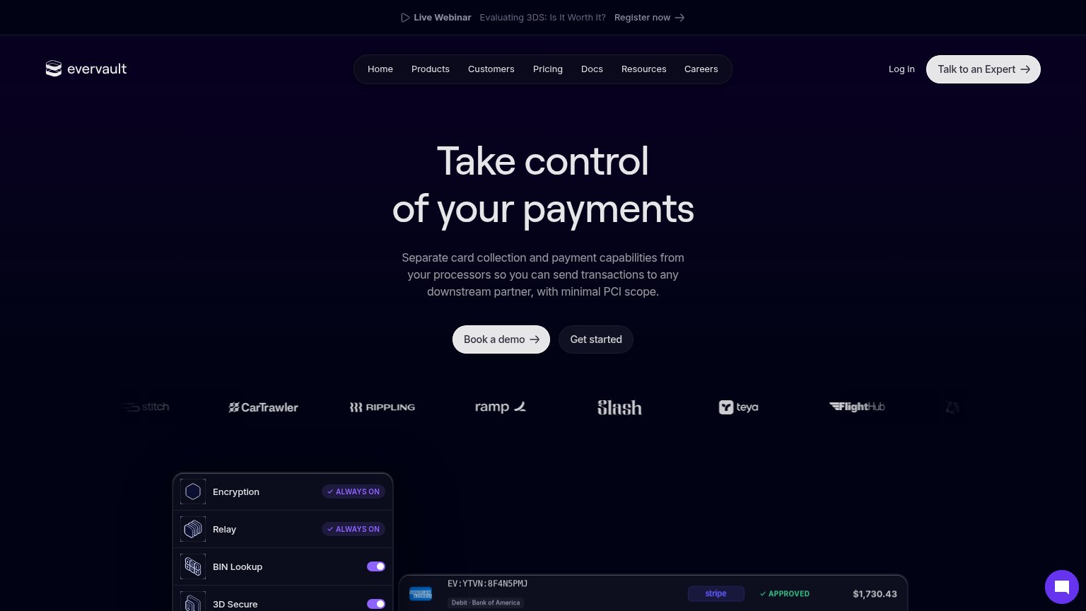
EvervaultCustomer logo strip beneath the hero CTAs: CarTrawler, Rippling, Ramp, Slash, Teya, FlightHub, Stitch

CTA

58Fair

Copy, size, verb, cost-feel — does the primary CTA earn the click?

Tinfoil
Caution
Edgeless Systems
Evervault
Anjuna Security

Problems

  • no CTA in the hero itself
  • hidden behind hamburger on mobile
  • nav-sized, competes with 6 nav items
  • generic label, no payoff named

Mobile web

58Fair

The phone experience as a first-class citizen.

Mobile web annotations on the mobile capture12
  1. Hero subhead block — No CTA follows it — the entire first viewport ends with zero tappable action; Get Started is buried in the hamburger.
  2. Wrapping subhead text — Body copy scaled down too little, wrapping into four cramped lines that push products content far below the fold.

Information hierarchy

62Fair

Does the design help or inhibit what the page is trying to say?

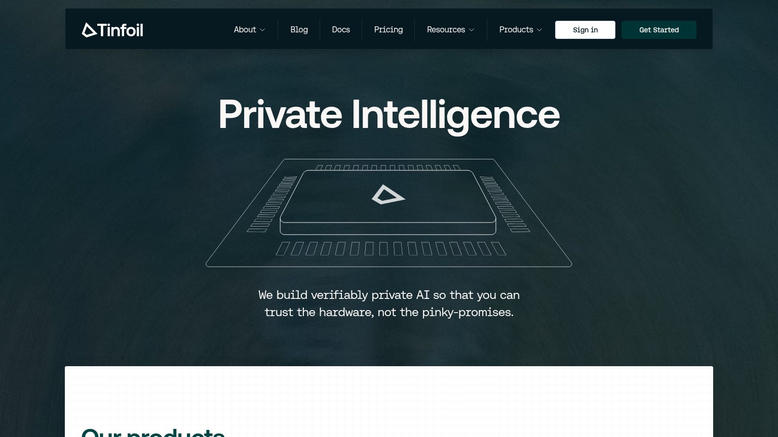
Information hierarchy annotations on the desktop capture123
  1. Get Started button — Dark teal fill nearly disappears into the dark header bar, so the primary CTA has the weakest contrast of anything in the nav.
  2. Six-item nav row — Six equal-weight links plus two dropdowns give attention more exit paths than actions before the visitor reads the headline.
  3. Vague tagline placement — The one sentence explaining what Tinfoil does sits at the very bottom edge of the fold, below a large abstract chip illustration.

Value props

62Fair

Title, subtitle, hero — do they sell the product's true value?

Tinfoil’s headline undersellsPrivate IntelligenceWe build verifiably private AI so that you can trust the hardware, not the pinky-promises.

Working

  • "Pinky-promises" contrast hits real distrust
  • Subhead names hardware-level verifiability
  • Clean, confident brand voice

Could improve

  • Headline too abstract to parse alone
  • No numbers or proof points in the fold
  • Chip illustration decorates, not demos