
Your landing page’s weakest score is Value props.
How Text.ai ranks
66Growth scoreupdated
category scores
category scoresShowHide
Value props
58FairTitle, subtitle, hero — do they sell the product's true value?
Text.ai’s headline vague
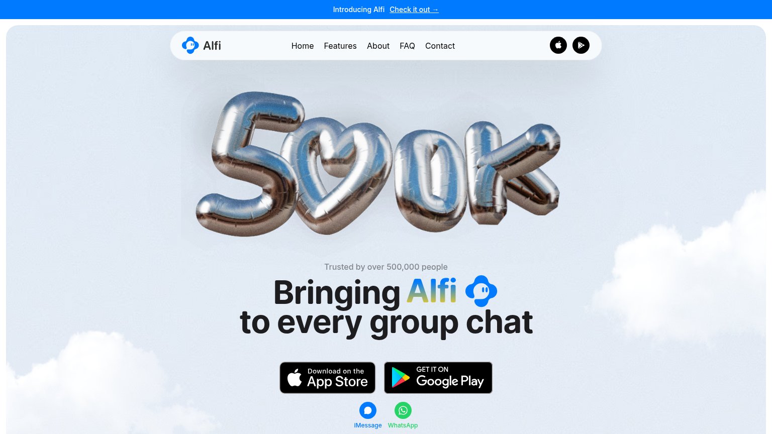
Bringing Alfi to every group chat
Trusted by over 500,000 people
Working
- 500K proof point is concrete and bold
- Platform badges show where it lives
- iMessage/WhatsApp icons add context
Could improve
- Headline never says what Alfi does
- Hero balloon decorates, not demos
- No emotional payoff or outcome named
Information hierarchy
64FairDoes the design help or inhibit what the page is trying to say?
 1234
- 500K balloon graphic — The trust stat outranks the headline — the fold's biggest visual says '500K' before it says what Alfi does.
- Dual app store badges — Two equal-weight store badges plus iMessage/WhatsApp icons split the primary action four ways with no dominant CTA.
- Top nav links — Five nav links plus two store icon buttons and a banner link give attention eight exits before the CTA.
- iMessage/WhatsApp icons — Platform icons sit below the badges at similar visual weight, adding a second decision layer under the CTA row.
CTA
68FairCopy, size, verb, cost-feel — does the primary CTA earn the click?
Problems
- click split across 4 targets
- stock badges, no dominant button
- smaller than hero graphic
- banner 'Check it out' competes
Trust
68FairProof that the product is real, competent, and safe to try.
| Trust read | |
|---|---|
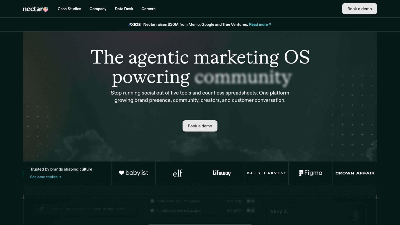
| Text.ai | "Trusted by over 500,000 people" hero claim with 500K balloon graphic |
| "Trusted by brands shaping culture" logo bar: Babylist, e.l.f., Lifeway, Daily Harvest, Figma, Crown Affair | |
| No visible trust signal identified. |
Mobile web
74FairThe phone experience as a first-class citizen.
 123
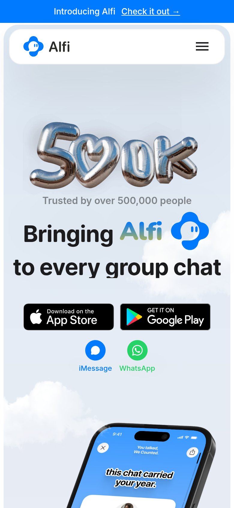
- Balloon 500K graphic — Decorative 500K balloon art eats roughly a third of the first viewport, pushing the store CTAs to the fold edge.
- App Store buttons — Side-by-side store badges stay desktop-proportioned instead of stacking full-width for a thumb-friendly tap.
- Promo banner — Sticky 'Introducing Alfi' bar plus the pill header double-decks the top of the viewport before the hero starts.