
Your landing page’s weakest score is Trust.
How QFEX ranks
57Growth scoreupdated
category scores
category scoresShowHide
Score over time
Trust
34PoorProof that the product is real, competent, and safe to try.
| Trust read | |
|---|---|
| QFEX | No visible trust signal identified. |
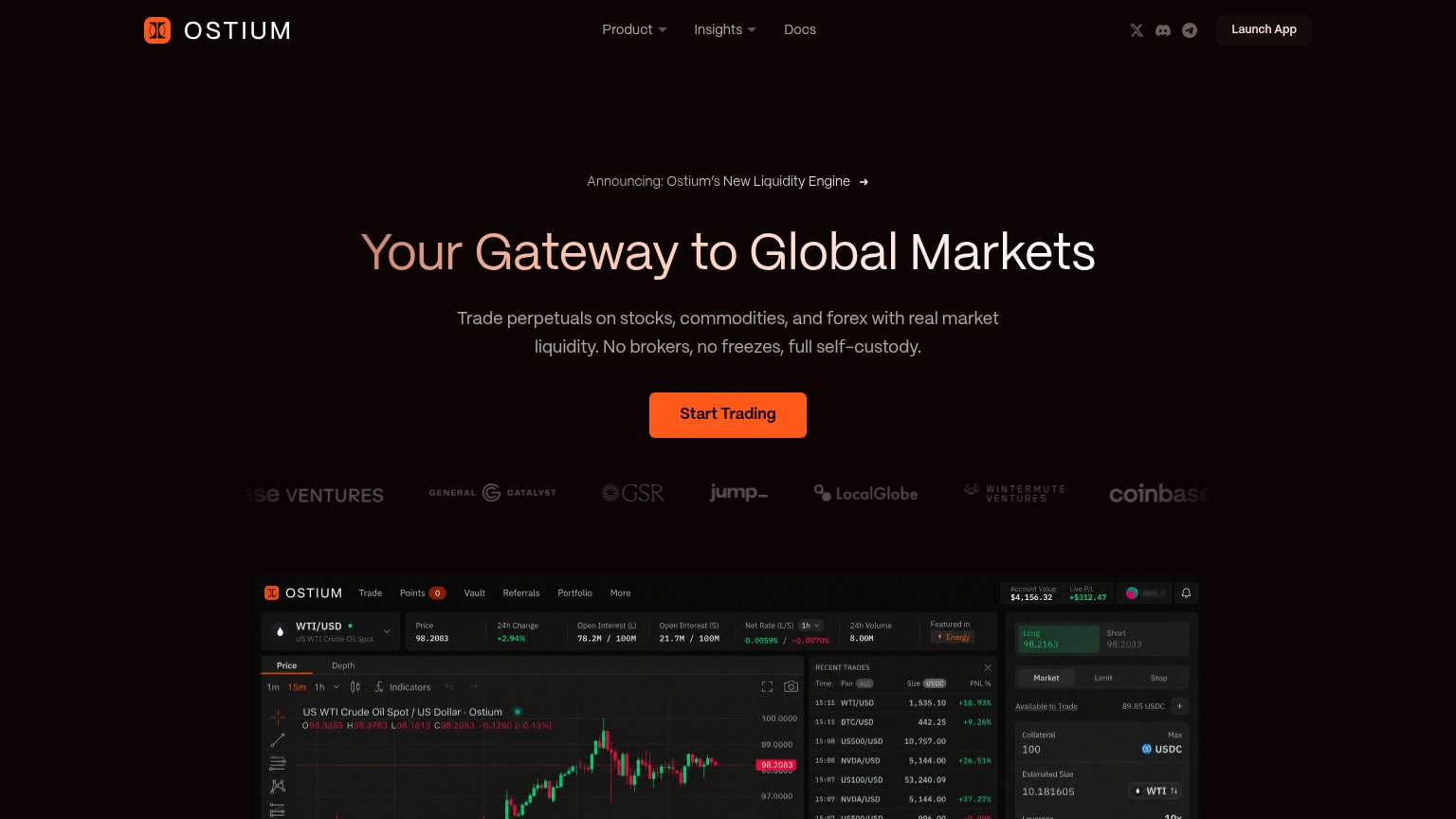
| Investor logo strip (Coinbase Ventures, General Catalyst, GSR, Jump, LocalGlobe, Wintermute) with a real trading UI scre | |
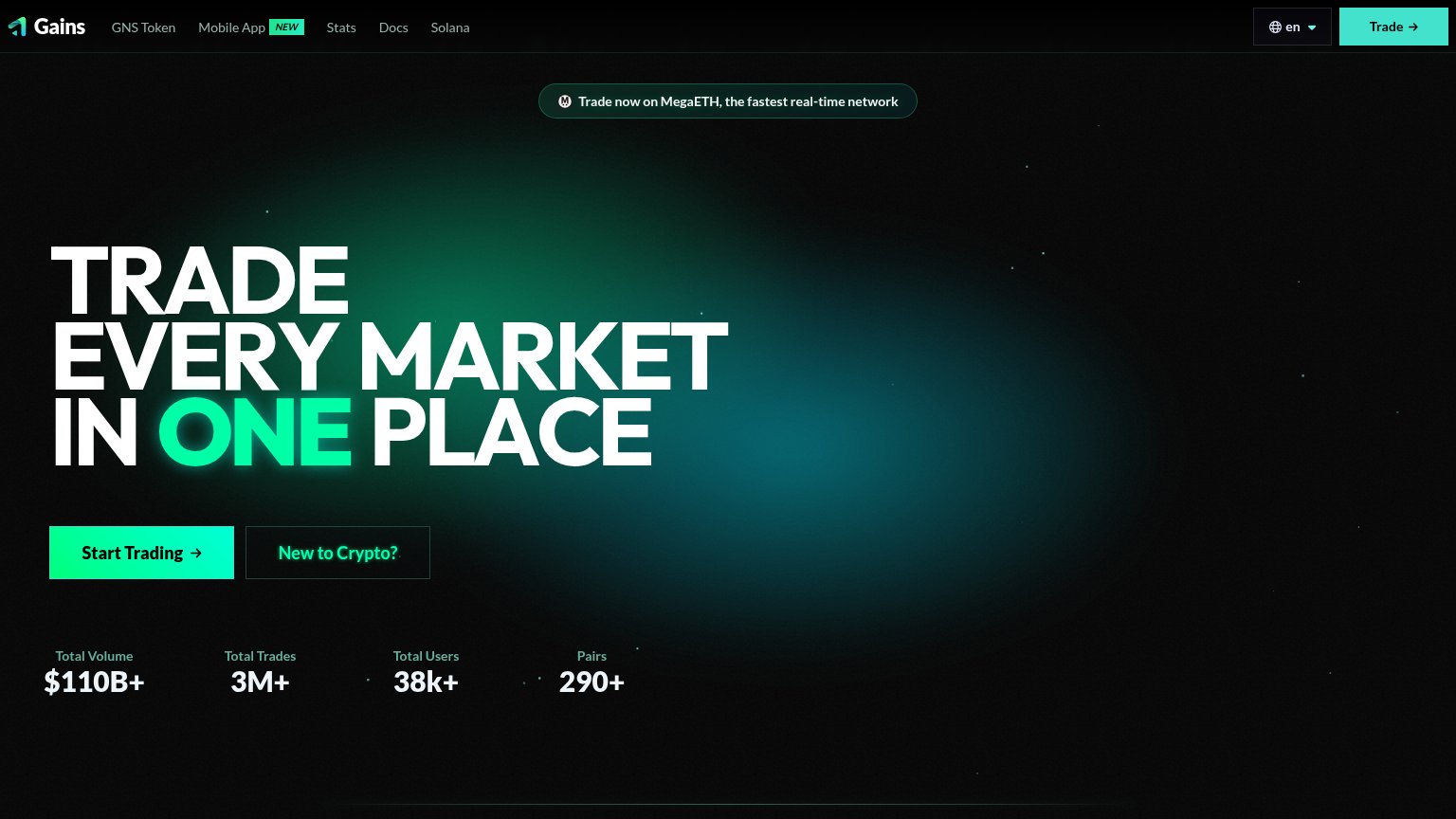
| Stats bar: "Total Volume $110B+ · Total Trades 3M+ · Total Users 38k+ · Pairs 290+" | |
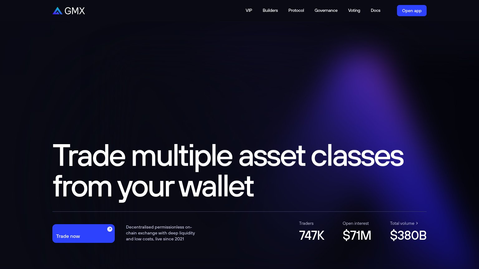
| Stats row: "Traders 747K · Open interest $71M · Total volume $380B" |
Mobile web
48PoorThe phone experience as a first-class citizen.
 12
- Start trading button — Primary CTA sits three panels down and is desktop-proportioned, not full-width for thumbs.
- How markets headline — Overlaps the MSFT/GOOGL ticker rows, making the value statement hard to read.
Value props
62FairTitle, subtitle, hero — do they sell the product's true value?
QFEX’s headline vague
How markets should be.
The first 24/7 exchange only for US equities, commodities and FX.
Working
- Subhead names real differentiator: 24/7
- "First" claim creates category ownership
- Ticker imagery signals live markets
Could improve
- Headline says nothing about the product
- No user outcome or benefit stated
- Hero shows a 1980s floor, not QFEX itself
CTA
68FairCopy, size, verb, cost-feel — does the primary CTA earn the click?

Problems
- two competing labels: Start trading / Trade now
- 'trading' implies funded-account commitment
- hero button small vs giant headline
- no echo of 'How markets should be' headline
Information hierarchy
72FairDoes the design help or inhibit what the page is trying to say?
1234- Split value proposition — Subline sits bottom-left of panel one while the headline lives in panel three, forcing the eye to stitch the message together.
- How markets headline — Placed bottom-right outside the natural top-left scan path, so the core promise reads last instead of first.
- Trade now button — Same white-pill weight as 'Start trading' below but with a different label, splitting the primary action into two.
- Dense ticker boards — Dozens of same-weight ticker rows dominate the fold and out-shout the headline and CTA they should frame.