
Your landing page’s weakest score is Trust.
How Moby Analytics ranks
- 1.
DataSnipper74
- 2.
Moby Analytics73
- 3.
Fieldguide66
- 4.
Inflo61
- 5.
MindBridge59
73Growth scoreupdated
category scores
category scoresShowHide
Score over time
Trust
56FairProof that the product is real, competent, and safe to try.
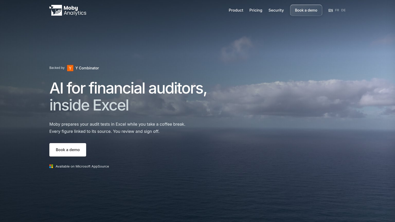
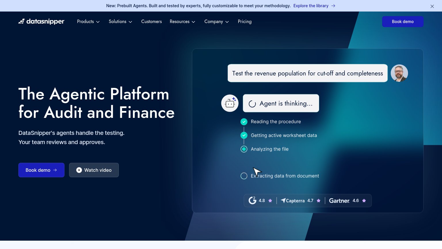
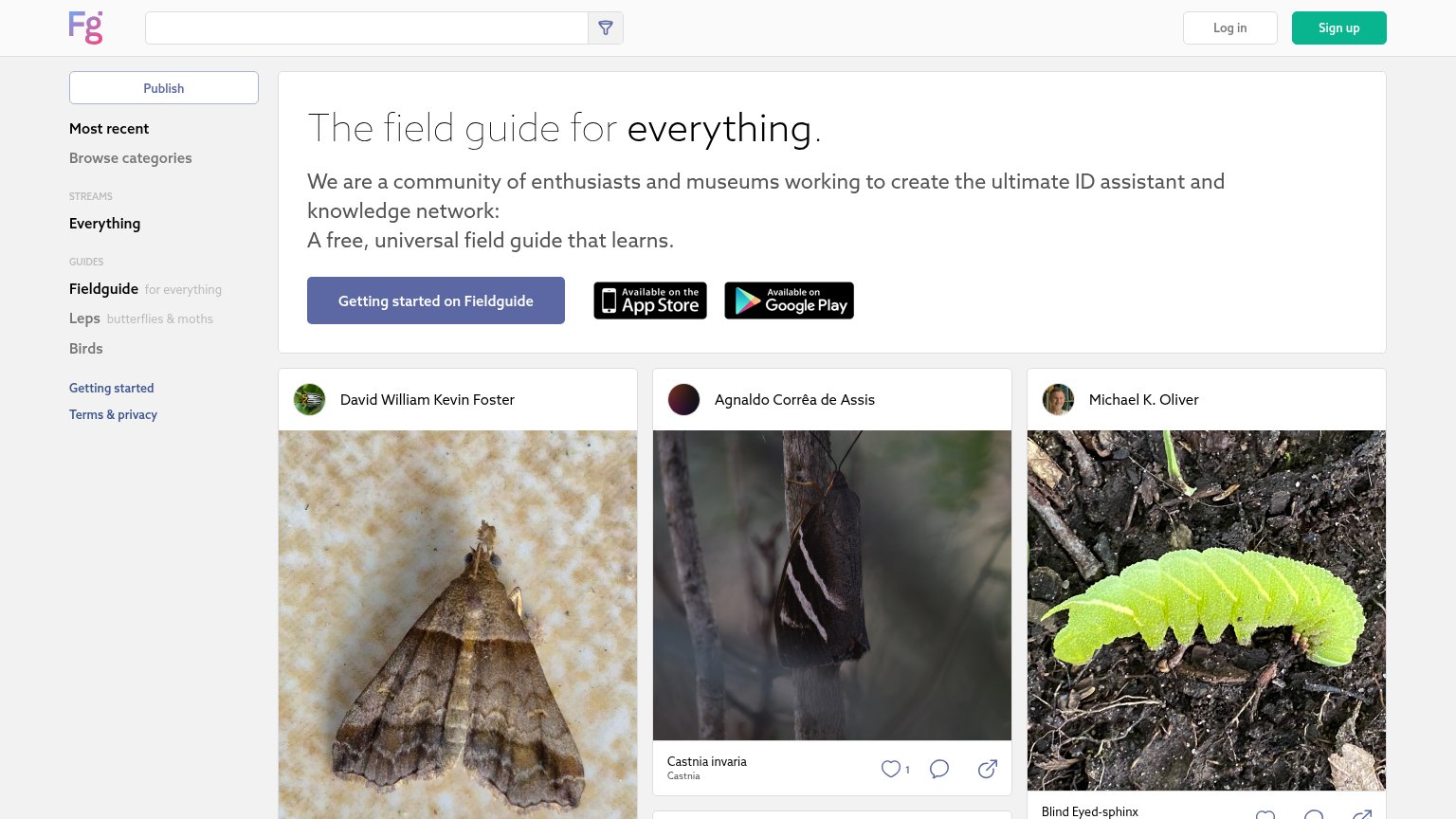
| Trust read | |
|---|---|
| Moby Analytics | "Backed by Y Combinator" badge above the headline |
| Review-score strip in the hero demo: G2 4.8, Capterra 4.7, Gartner 4.6 | |
| Live feed of real user observations with named contributors and species IDs (e.g. "Castnia invaria" by Agnaldo Corrêa de | |
| "MindBridge analyzes 100% of financial transactions to help finance and audit teams identify risk, understand what matte | |
| "Audit Pricing in the AI Era — 2026 Research — Download now" research banner |
CTA
64FairCopy, size, verb, cost-feel — does the primary CTA earn the click?

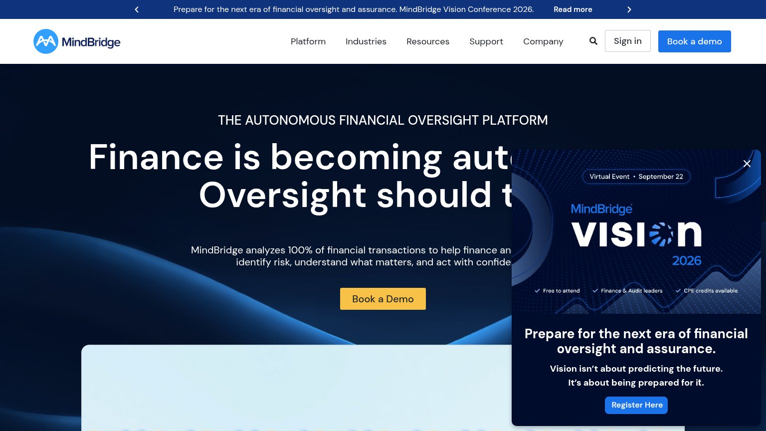
Problems
- demo ask feels costly
- small footprint vs headline
- AppSource path not clickable CTA
Value props
78FairTitle, subtitle, hero — do they sell the product's true value?
Moby Analytics’s headline sells
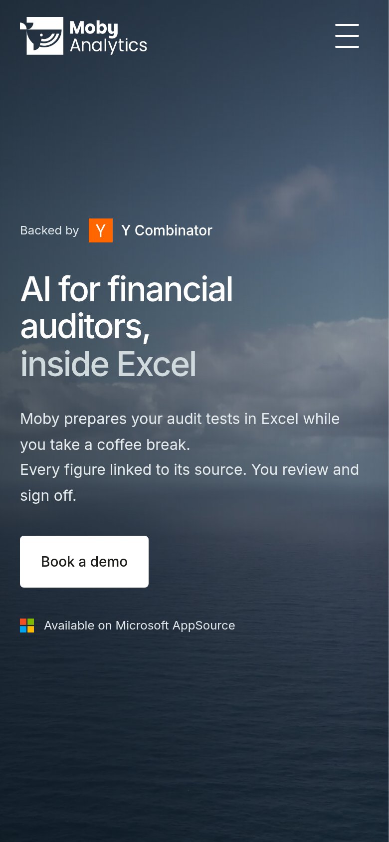
AI for financial auditors, inside Excel
Moby prepares your audit tests in Excel while you take a coffee break. Every figure linked to its source. You review and sign off.
Working
- Names exact buyer and Excel surface
- Coffee-break line makes speed felt
- Source-linking answers trust objection
Could improve
- Ocean hero shows nothing of product
- No numbers anywhere in the fold
- No named audit test for specificity
Mobile web
82StrongThe phone experience as a first-class citizen.
 12
- Book a demo button — Desktop-proportioned at ~40% width; should be near-full-bleed for thumb reach.
- Supporting paragraph — Four wrapped lines of body copy dilute the single value statement above the CTA.
Information hierarchy
84StrongDoes the design help or inhibit what the page is trying to say?
123- Nav Book a demo — Duplicates the hero CTA at equal weight, splitting the single conversion action across two buttons.
- FR DE language links — Two extra clickable exits in the top-right corner of the scan path before the visitor reads the offer.
- 'inside Excel' greyed text — The key differentiator is set in muted grey, half the visibility of the rest of the headline.