
Your landing page’s weakest score is Trust.
How Labric ranks
74Growth scoreupdated
category scores
category scoresShowHide
Score over time
Trust
52FairProof that the product is real, competent, and safe to try.
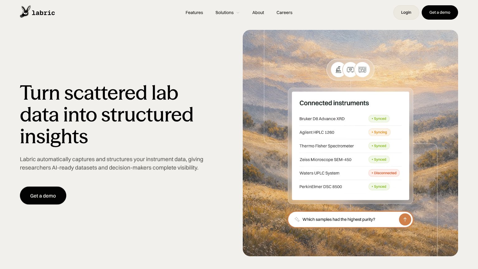
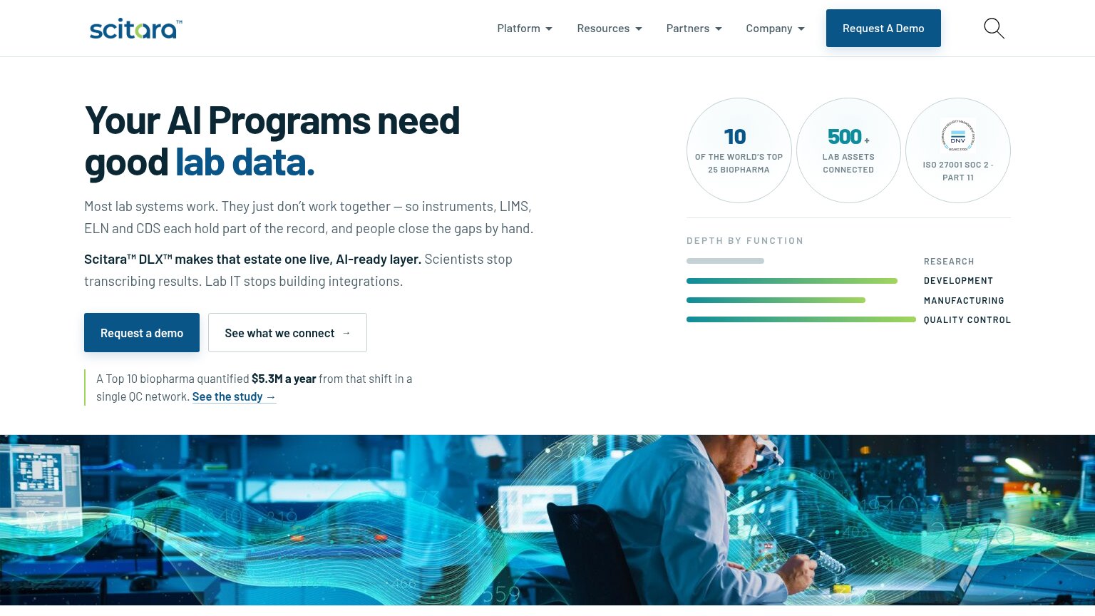
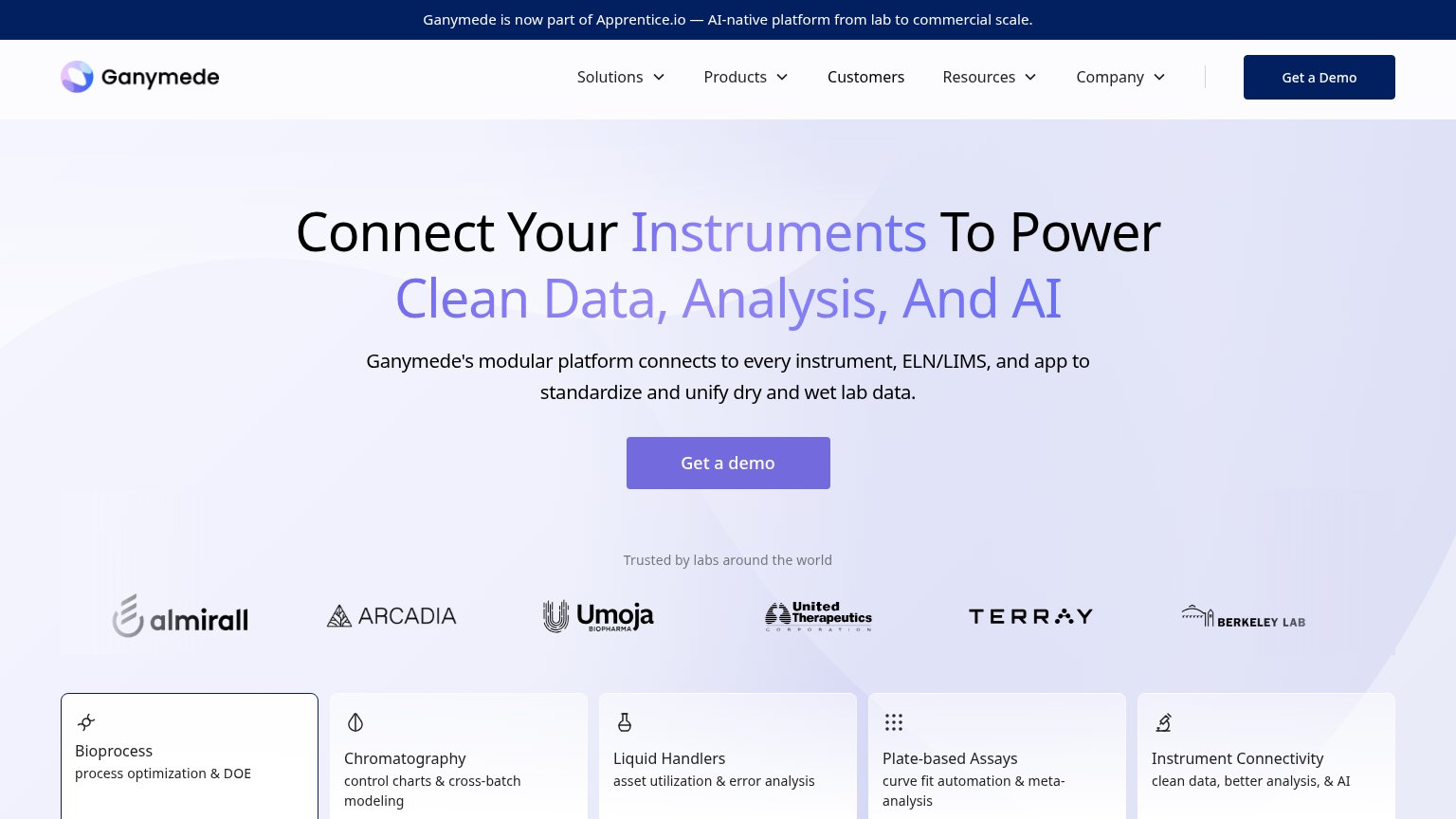
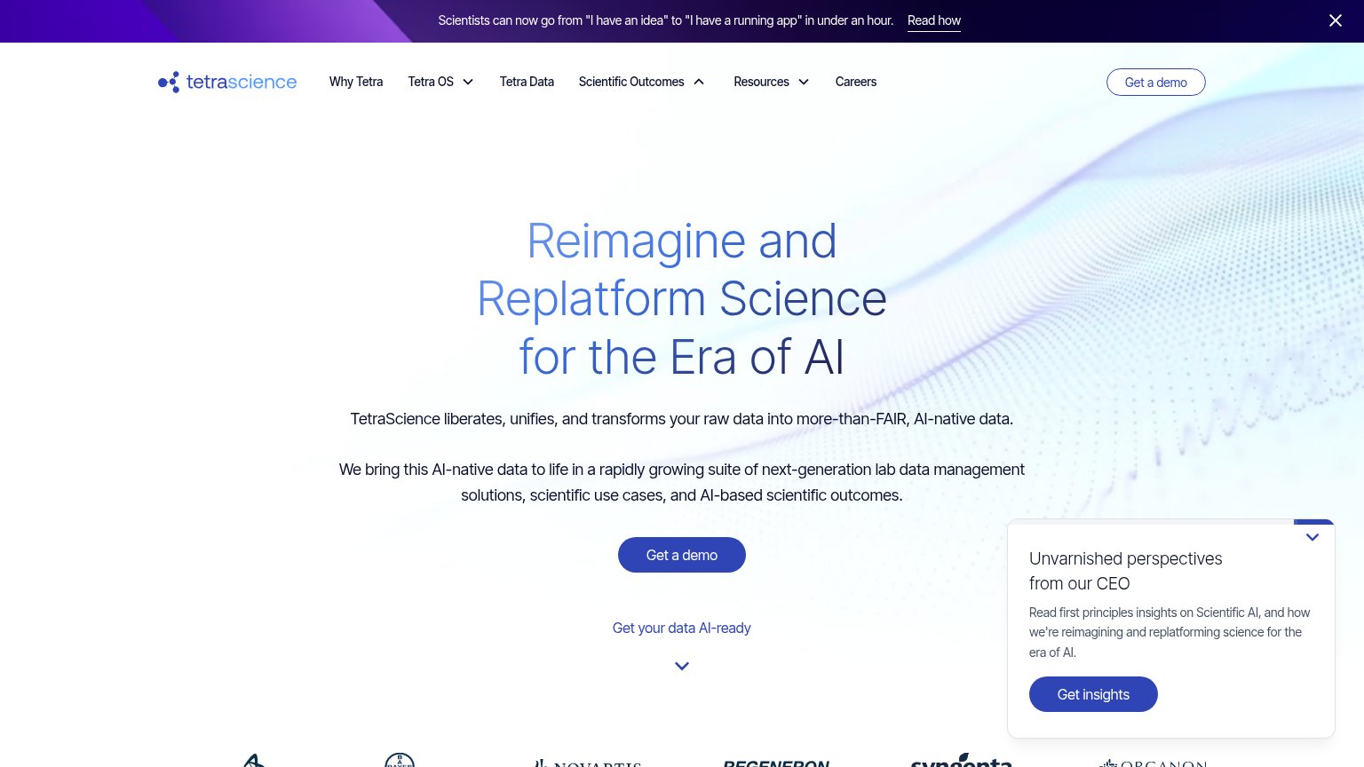
| Trust read | |
|---|---|
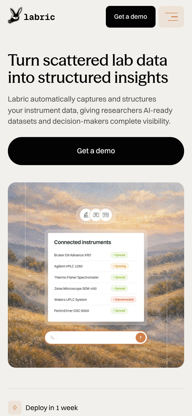
| Labric | "Connected instruments" UI panel listing real instrument models (Bruker D8 Advance XRD, Agilent HPLC 1260, Thermo Fisher |
| Customer logo strip (Novartis, Regeneron, Syngenta, Bayer, AstraZeneca, Organon) | |
| "A Top 10 biopharma quantified $5.3M a year from that shift in a single QC network. See the study →" beside the ISO 2700 | |
| Customer logo bar labeled "Trusted by labs around the world" (Almirall, Umoja Biopharma, United Therapeutics, Berkeley L | |
| Eyebrow badge above the headline appearing to cite deployment at several of the 10 largest pharma companies | |
| Real product screenshots showing LIMS/ELN interfaces with agentic AI prompts ("Codon optimize", "Chart DNA results", "Sy |
CTA
72FairCopy, size, verb, cost-feel — does the primary CTA earn the click?
Problems
- demo click feels costly/sales-gated
- no self-serve or instant-value path
- mock prompt input is not interactive
Value props
76FairTitle, subtitle, hero — do they sell the product's true value?
Labric’s headline sells
Turn scattered lab data into structured insights
Labric automatically captures and structures your instrument data, giving researchers AI-ready datasets and decision-makers complete visibility.
Working
- Clear before/after transformation
- Hero shows real instruments syncing
- Subhead names two audiences
Could improve
- No numbers anywhere in the fold
- 'AI-ready datasets' is jargon-adjacent
- 'Deploy in 1 week' buried below fold
Information hierarchy
84StrongDoes the design help or inhibit what the page is trying to say?
123- Header Get a demo — Same black-pill styling as the hero CTA, splitting the primary action into two equal-weight targets.
- Nav links row — Features, Solutions, About, Careers offer four exit paths before the visitor reaches the value prop.
- Login button — Boxed treatment gives a non-converting path near-button prominence beside the demo CTA.
Mobile web
86StrongThe phone experience as a first-class citizen.
 12
- Connected instruments card — Desktop-density list type shrinks to squint-small sizes on the phone screen.
- Duplicate header demo button — Repeats the hero's full-width "Get a demo", crowding the header next to the hamburger.