
Your landing page’s weakest score is Trust.
How HABIT ranks
57Growth scoreupdated
category scores
category scoresShowHide
Score over time
Trust
32PoorProof that the product is real, competent, and safe to try.
| Trust read | |
|---|---|
| HABIT | No visible trust signal identified. |
| implicit context Sakana AI may benefit from pre-existing familiarity among its target audience. | |
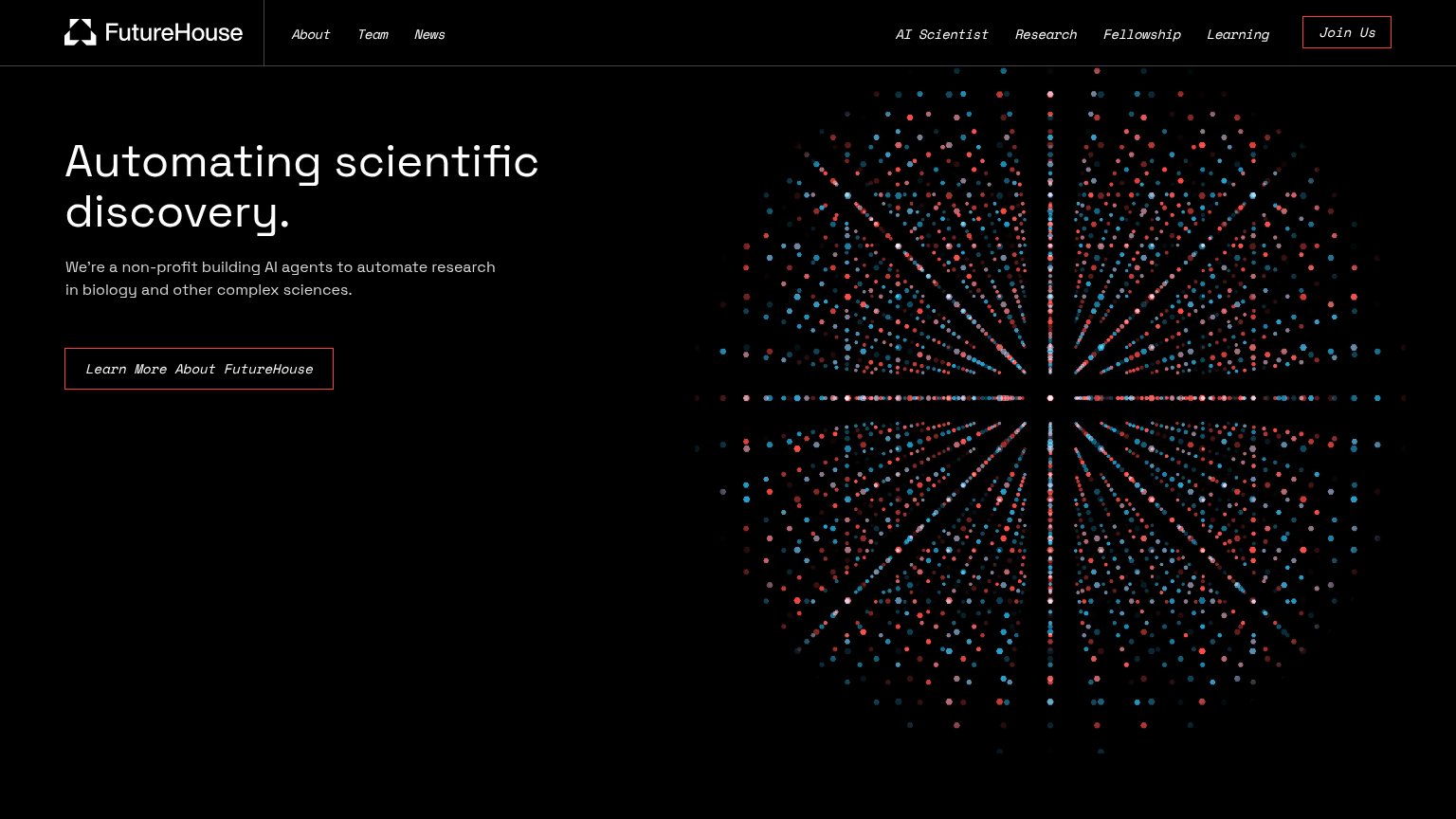
| "We're a non-profit building AI agents to automate research in biology and other complex sciences." | |
| No visible trust signal identified. | |
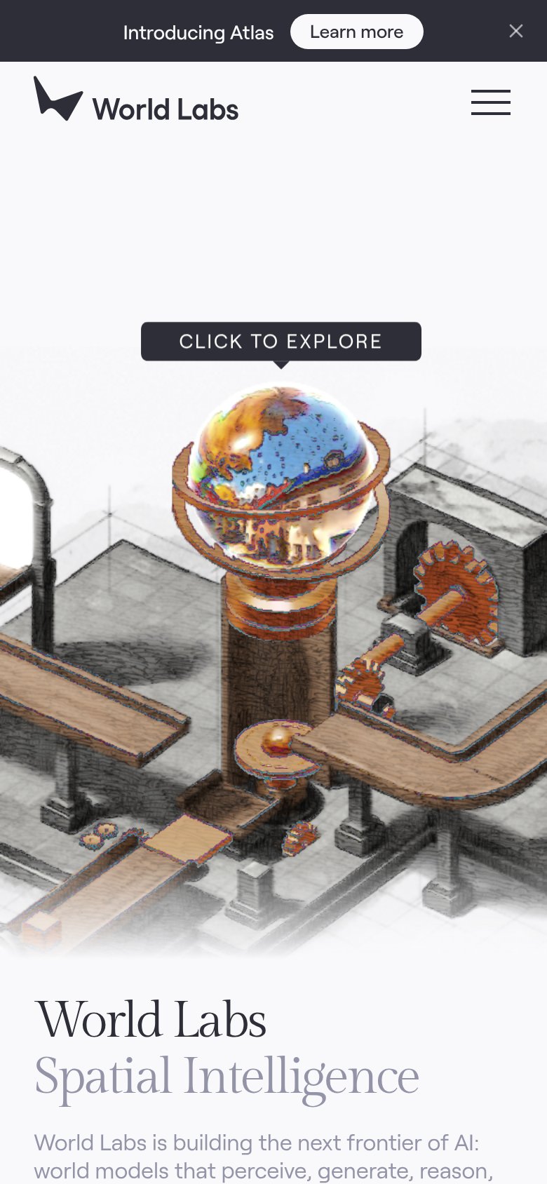
| "CLICK TO EXPLORE" interactive world demo in the mobile hero |
CTA
55FairCopy, size, verb, cost-feel — does the primary CTA earn the click?
Problems
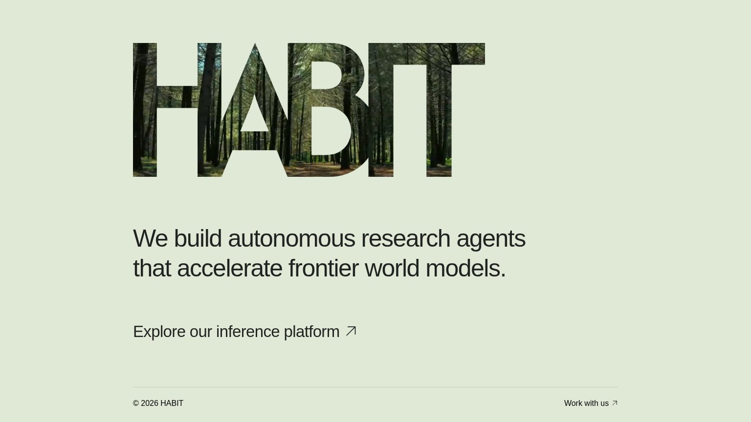
- styled as text link, not button
- 4 words, over 3-word ideal
- "our" centers brand, not visitor
- arrow implies outbound detour
Value props
56FairTitle, subtitle, hero — do they sell the product's true value?
HABIT’s headline vague
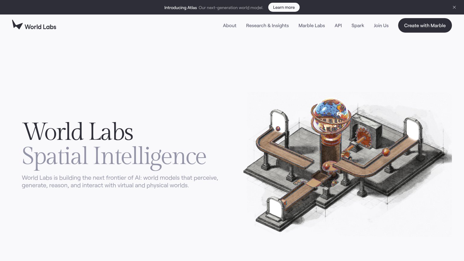
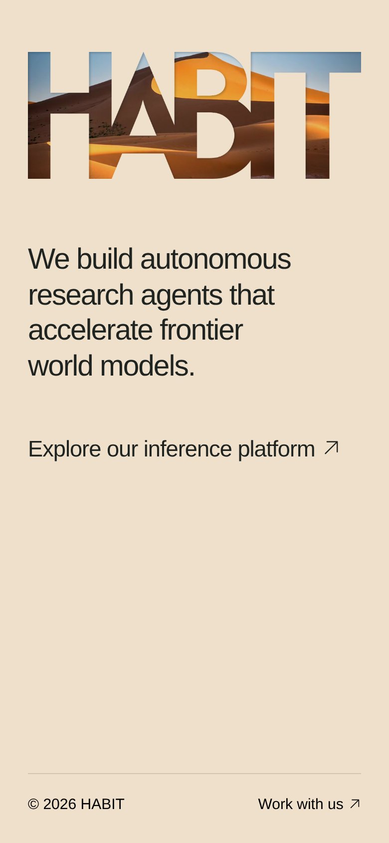
We build autonomous research agents that accelerate frontier world models.
Working
- Names a concrete category: research agents
- States an outcome verb: accelerate
- One clean claim, zero buzzword stacking
Could improve
- No subhead to explain the claim
- Zero numbers or proof points
- Hero image decorates, shows nothing
Mobile web
64FairThe phone experience as a first-class citizen.
 12
- Explore platform link — Primary CTA is a plain text link with no button styling or thumb-sized tap target.
- Work with us link — Secondary conversion path is a tiny footer text link, easy to miss and hard to tap.
Information hierarchy
78FairDoes the design help or inhibit what the page is trying to say?
12- Explore platform link — The primary CTA is styled as plain body text with an arrow, indistinguishable in weight from a caption — visitors won't identify it as the page's action within a second.
- Work with us link — Footer link creeps into the fold at nearly the same size as the primary CTA, offering a competing exit before the main action.