
Your landing page’s weakest score is Value props.
How Den ranks
61Growth scoreupdated
category scores
category scoresShowHide
Score over time
Value props
38PoorTitle, subtitle, hero — do they sell the product's true value?
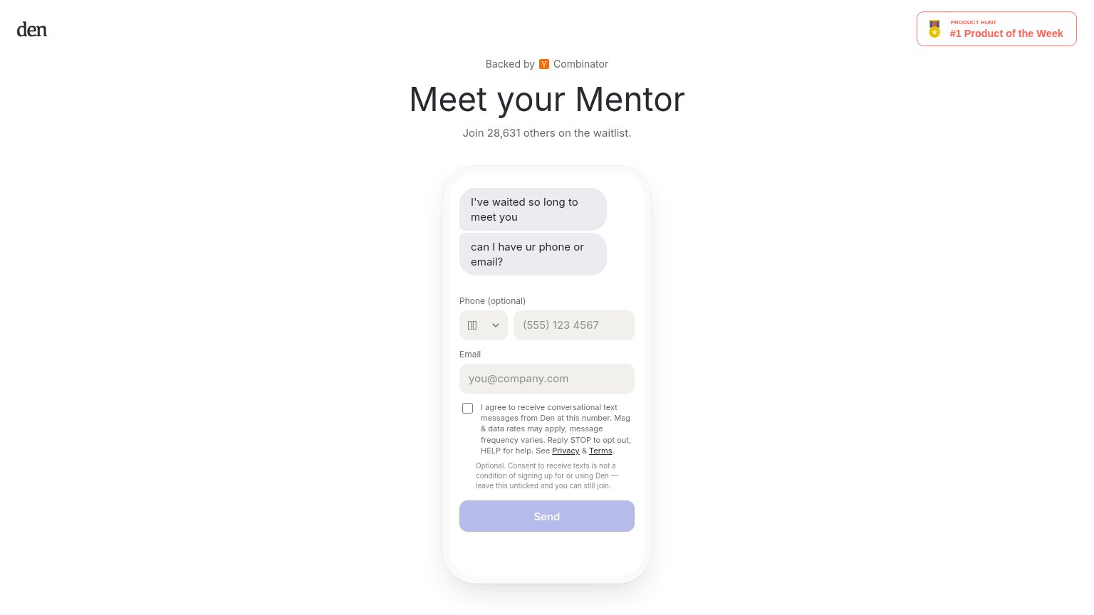
Den’s headline vague
Meet your Mentor
Join 28,631 others on the waitlist.
Working
- Waitlist count adds real social proof
- YC + Product Hunt badges build trust
- Chat-style hero creates intrigue
Could improve
- Headline never says what Den does
- Desktop/mobile headlines disagree
- Subhead adds zero product specifics
CTA
58FairCopy, size, verb, cost-feel — does the primary CTA earn the click?
Problems
- names mechanic, not payoff
- looks disabled on desktop
- no echo of waitlist/mentor promise
- 'Send' feels like giving, not getting
Trust
66FairProof that the product is real, competent, and safe to try.
| Trust read | |
|---|---|
| Den | "Backed by Y Combinator" badge above the headline |
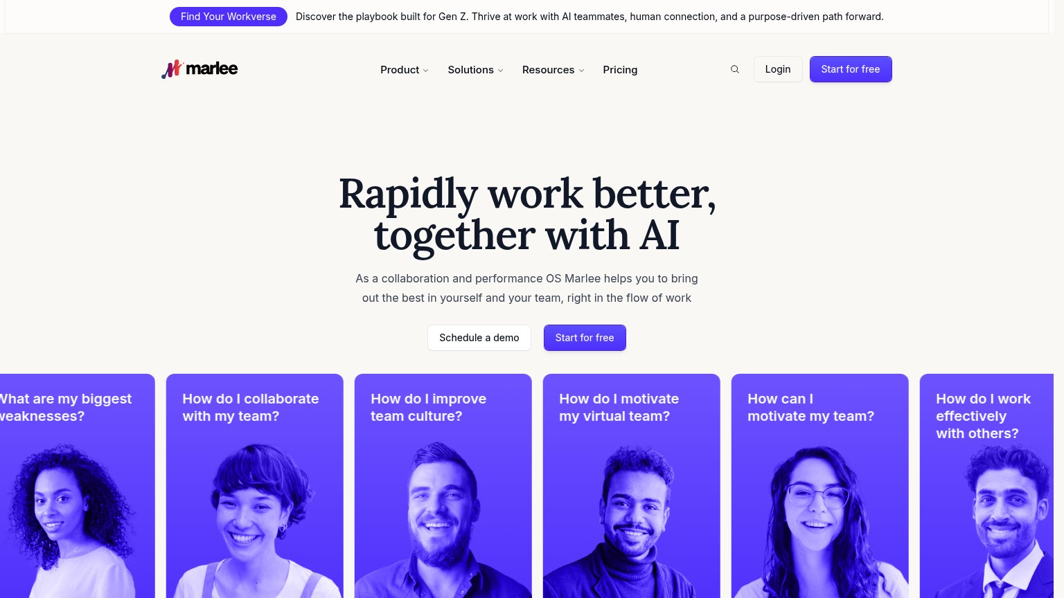
| No visible trust signal identified. | |
| Headline "Wave AI joins Alan" with the Wave AI and Alan logos, signaling an acquisition by an established company | |
| No visible trust signal identified. | |
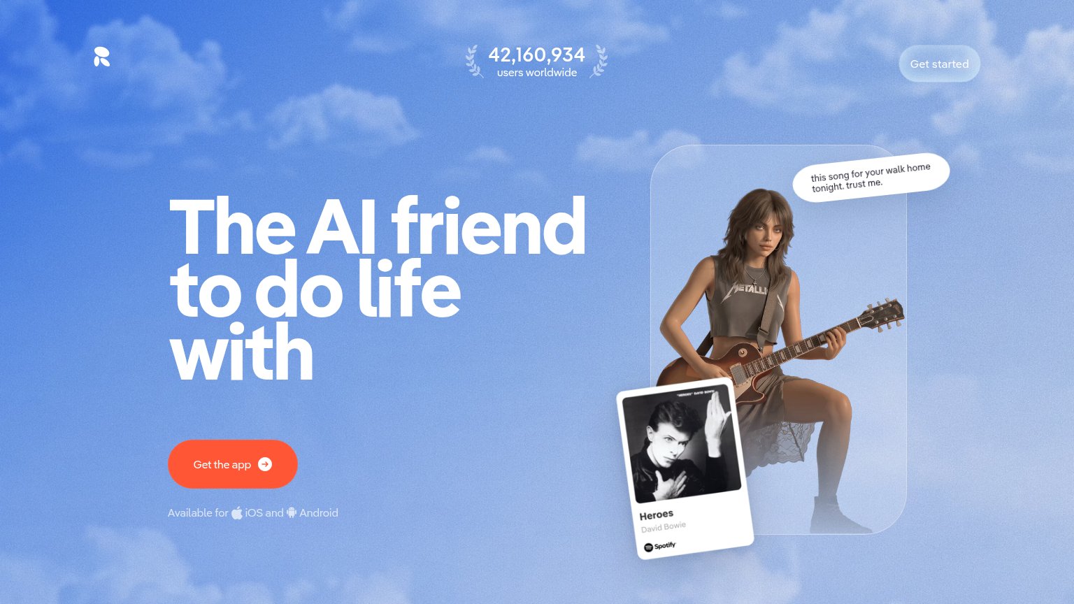
| 42,160,934 users worldwide |
Information hierarchy
72FairDoes the design help or inhibit what the page is trying to say?
1234- Send button disabled-looking — The primary CTA renders in washed-out lavender with low-contrast white text, reading as disabled before the form is touched.
- SMS consent text block — Five lines of legal copy plus a disclaimer sit between the email field and the Send button, adding cognitive weight at the decision point.
- Product Hunt badge — The red-outlined badge in the top-right is the brightest element on the fold and pulls attention away from the headline and form.
- Phone field first — The optional phone input outranks the required email field, forcing visitors to parse an input they can skip.
Mobile web
72FairThe phone experience as a first-class citizen.
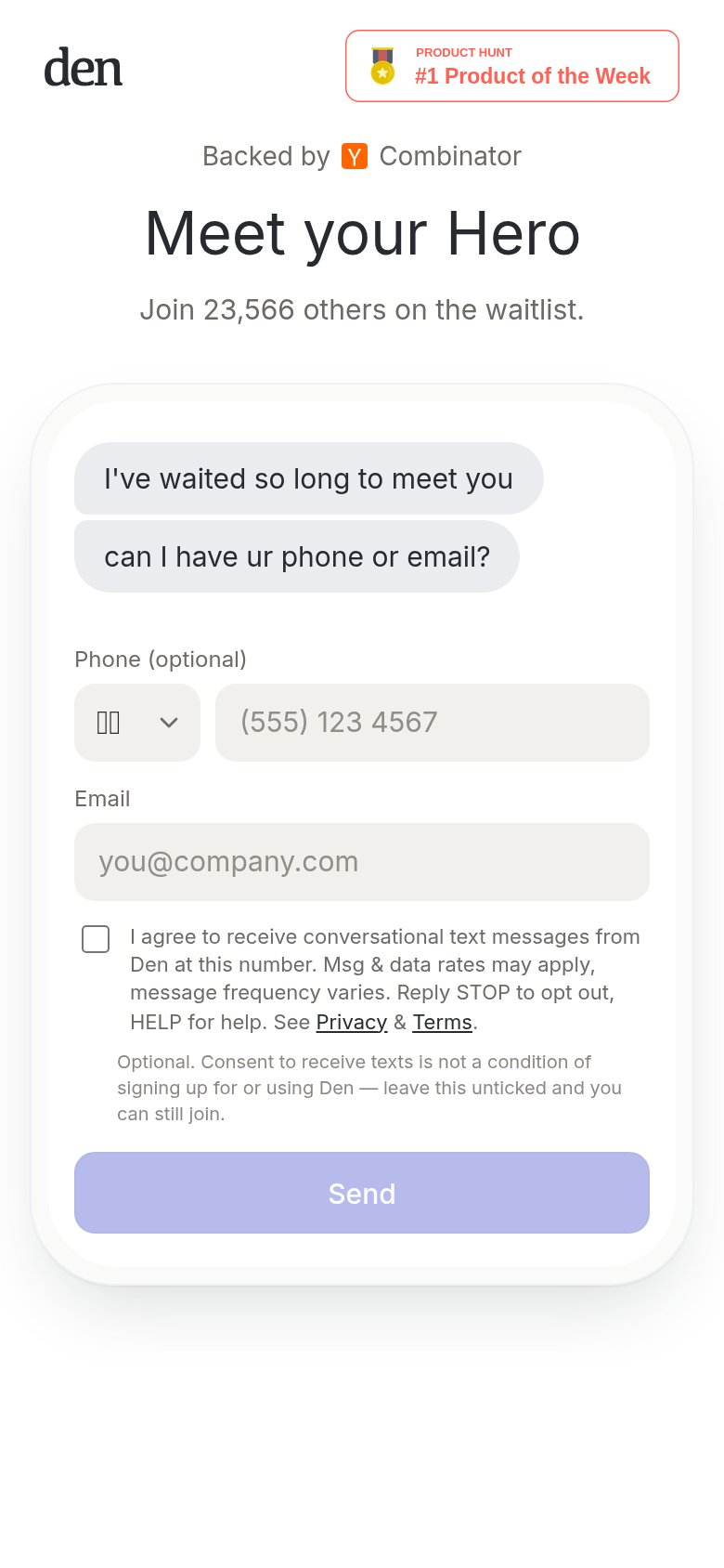 1234
- SMS consent block — Seven lines of legal copy push the Send button below the first viewport.
- Send button placement — The only CTA lands off-screen; visitors must scroll to complete signup.
- Country code selector — Renders as broken glyph boxes instead of a flag, looking buggy at the top of the form.
- Product Hunt badge — Oversized header badge competes with the logo and is the first tappable element, routing taps off-site.