
Your landing page’s weakest score is Trust.
How Aegis ranks
- 1.
Fathom Health (Denials)75
- 2.
Aegis66
66Growth scoreupdated
category scores
category scoresShowHide
Trust
48PoorProof that the product is real, competent, and safe to try.
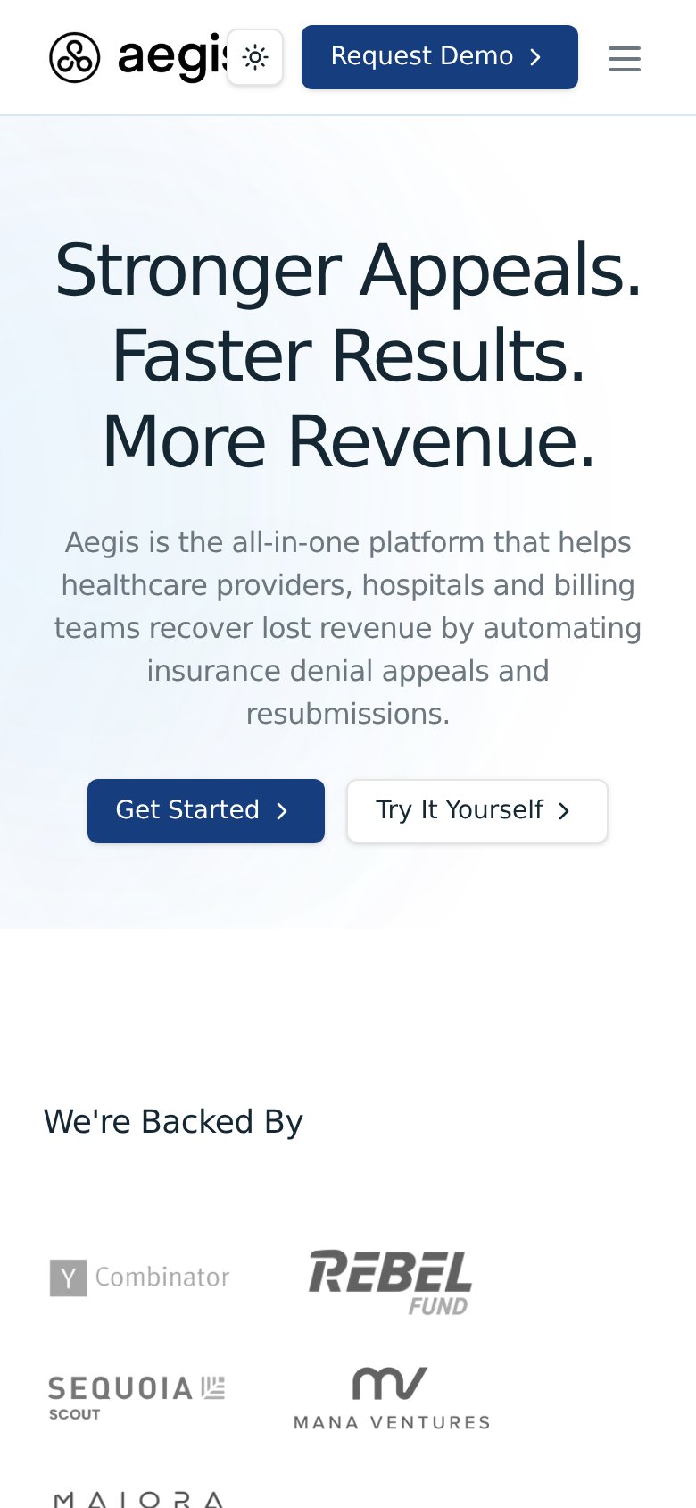
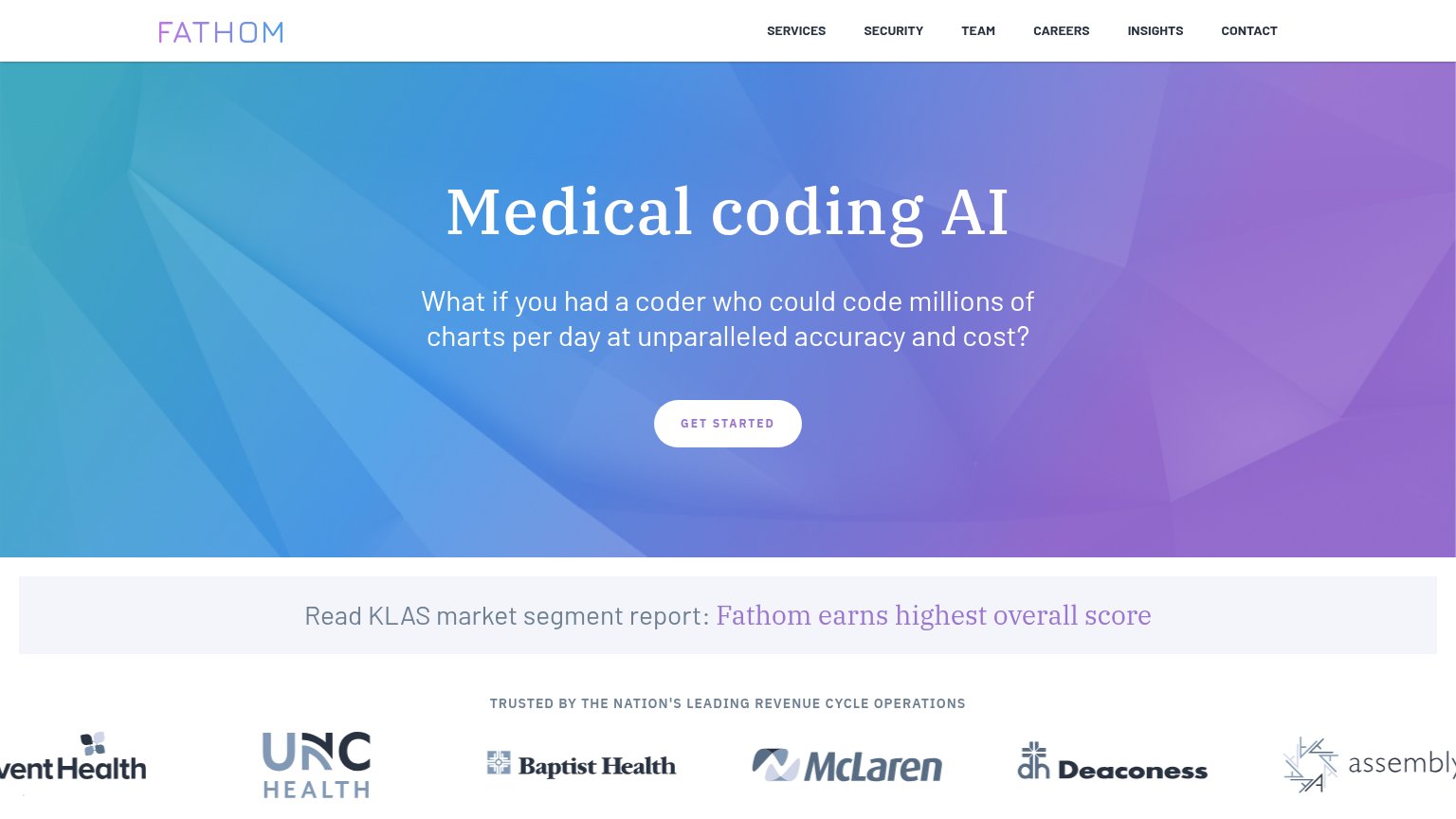
| Trust read | |
|---|---|
| Aegis | "We're Backed By" investor logos (Y Combinator, Sequoia Scout, Rebel Fund, Mana Ventures) |
| KLAS banner: "Fathom earns highest overall score" |
Mobile web
68FairThe phone experience as a first-class citizen.
12- Clipped logo wordmark — The wordmark is cut off mid-letter and overlapped by the theme toggle — an obvious unchecked mobile layout break.
- Crowded header row — Theme toggle, Request Demo button, and hamburger compete in one row, splitting attention across three tap targets.
CTA
70FairCopy, size, verb, cost-feel — does the primary CTA earn the click?
Problems
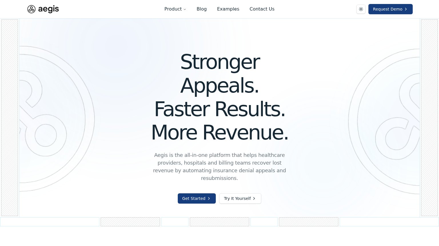
- 3 competing labels on one fold
- generic copy, no payoff named
- header 'Request Demo' steals focus
- no headline echo
Information hierarchy
72FairDoes the design help or inhibit what the page is trying to say?
123- Dual navy CTAs — Nav "Request Demo" matches "Get Started" in weight, splitting the primary action across two filled buttons.
- Four-link nav row — Product, Blog, Examples, Contact Us sit at equal weight beside the CTA, adding four exits before the pitch lands.
- Try It Aegis button — Sits at near-equal size beside Get Started, forcing a choice instead of one obvious next step.
Value props
72FairTitle, subtitle, hero — do they sell the product's true value?
Aegis’s headline sells
Stronger Appeals. Faster Results. More Revenue.
Aegis is the all-in-one platform that helps healthcare providers, hospitals and billing teams recover lost revenue by automating insurance denial appeals and resubmissions.
Working
- Outcome-led triad: appeals, speed, revenue
- Subhead names audience and exact job
- 'Recover lost revenue' hits the pain
Could improve
- Zero numbers or proof stats in the fold
- Hero art decorates, never shows product
- 'All-in-one platform' is generic filler