Past reportsShow past reportsHide past reports
- Sep 22, 202669LiveOverall +1 · CTA −12 · Mobile web +10Viewing
- Sep 8, 202668First tracked report — strongest Value props 78, weakest Trust 58View →

Your landing page’s weakest score is Trust.
How Adentris ranks
category scores
Proof that the product is real, competent, and safe to try.
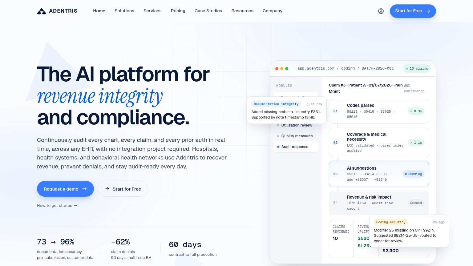
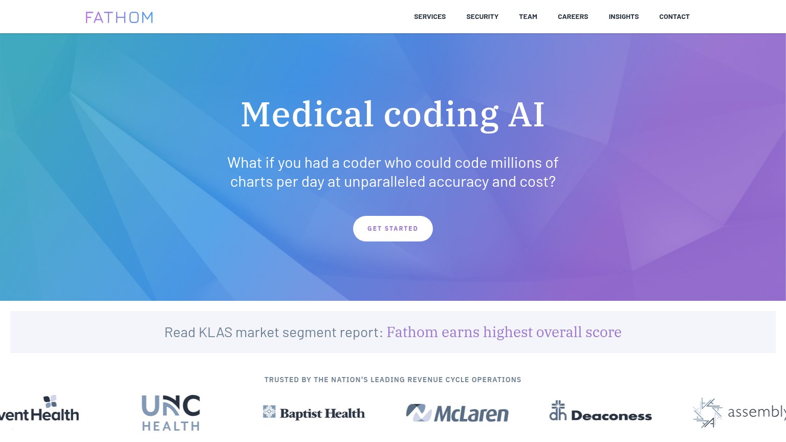

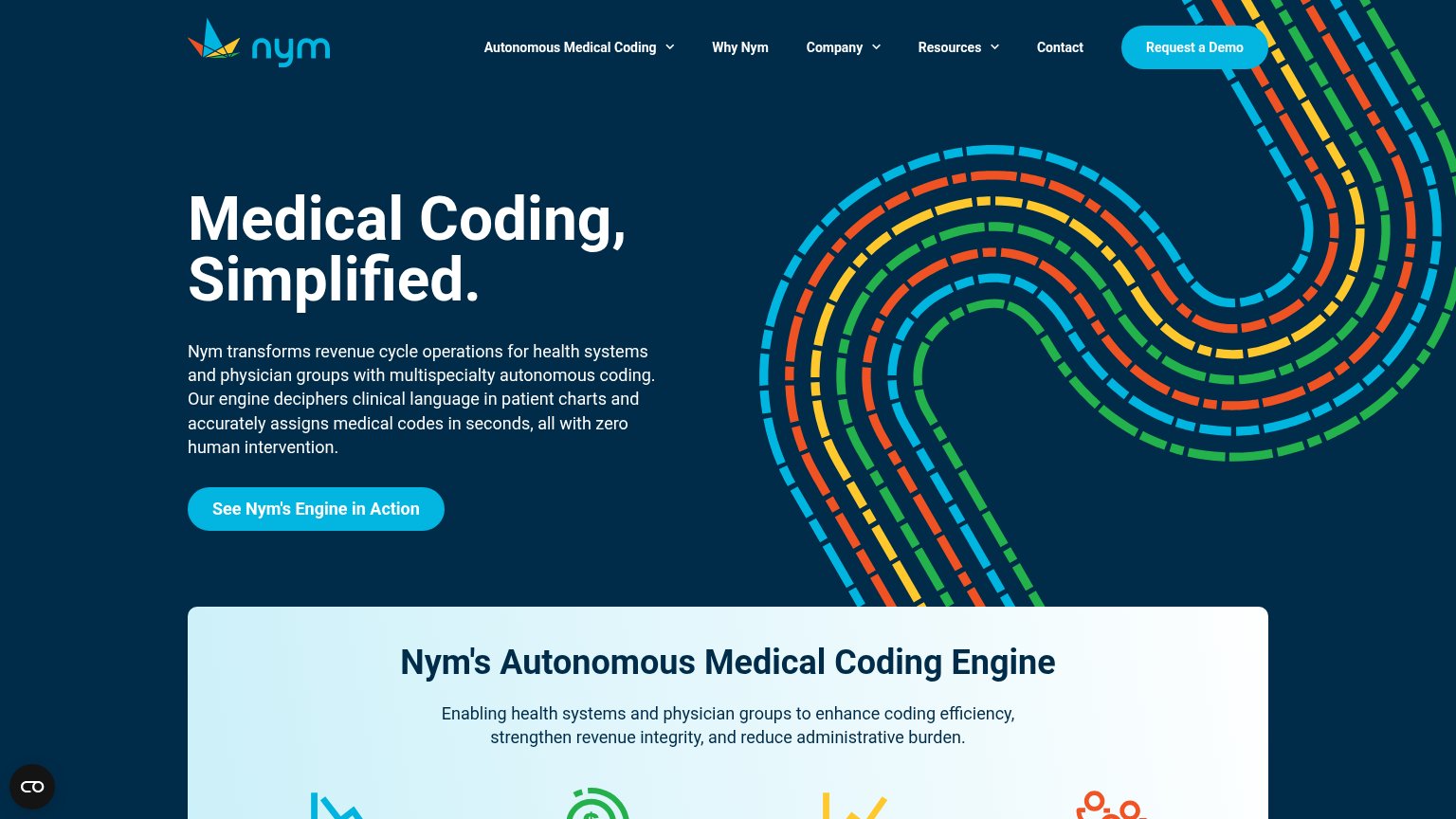
| Trust read | |
|---|---|
| Adentris | "73 → 96% documentation accuracy pre-submission, customer data" outcome stat |
| "2026 Best in KLAS for Autonomous Medical Coding" award banner with badge | |
| No visible trust signal identified. | |
| No visible trust signal identified. | |
| KLAS banner: "Fathom earns highest overall score" | |
| No visible trust signal identified. |
Copy, size, verb, cost-feel — does the primary CTA earn the click?

Problems
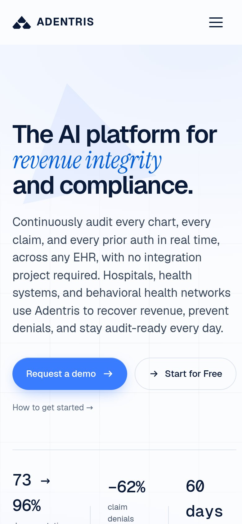
The phone experience as a first-class citizen.
 123
Does the design help or inhibit what the page is trying to say?
1234Title, subtitle, hero — do they sell the product's true value?
The AI platform for revenue integrity and compliance.
Continuously audit every chart, every claim, and every prior auth in real time, across any EHR, with no integration project required. Hospitals, health systems, and behavioral health networks use Adentris to recover revenue, prevent denials
Working
Could improve
You need a lazyweb account to add your product, do a growth audit, create backlog and more
Sign me in to my Lazyweb report hub. Fetch https://www.lazyweb.com/hub/agent/sign-in.md and follow its instructions exactly. If you can't fetch URLs, tell me and I'll paste the instructions instead.
Lazyweb MCP
Step 1 of 2 · your login
Where should we send your reports? This email becomes your login on lazyweb.com — everything your agent makes lands in your workspace.
That doesn't look like an email — check it and try again.
No password, no spam — one workspace link now, then your agent command.
Step 2 of 2 · your agent
Paste this into your agent. Claude Code, Codex, Cursor, or another MCP-capable agent opens the link and sets itself up. Data access is plan-dependent.
Generating your agent command...
Free account
We’ll add Adentris as your product and bring this score into your workspace. You can change it later in Settings.