
Your landing page’s weakest score is Value props.
How Forward ranks
70Growth scoreupdated
category scores
category scoresShowHide
Score over time
Value props
62FairTitle, subtitle, hero — do they sell the product's true value?
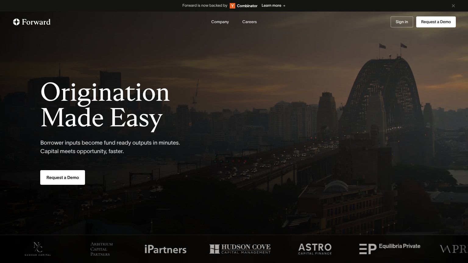
Forward’s headline undersells
Origination Made Easy
Borrower inputs become fund ready outputs in minutes. Capital meets opportunity, faster.
Working
- Subhead names real input-to-output flow
- 'In minutes' anchors speed claim
- Six lender logos add credibility
Could improve
- 'Made Easy' is a generic formula
- Skyline hero shows nothing of product
- No hard numbers or proof metrics
Trust
66FairProof that the product is real, competent, and safe to try.
| Trust read | |
|---|---|
| Forward | Logo strip of named capital firms (Namdar Capital, Arbitrium Capital Partners, iPartners, Hudson Cove Capital Management |
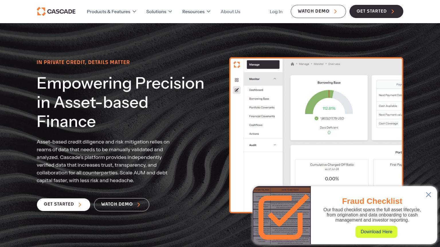
| Product dashboard screenshot showing "Borrowing Base" gauge at 112.81% with 1,803,017.79 USD and covenant navigation | |
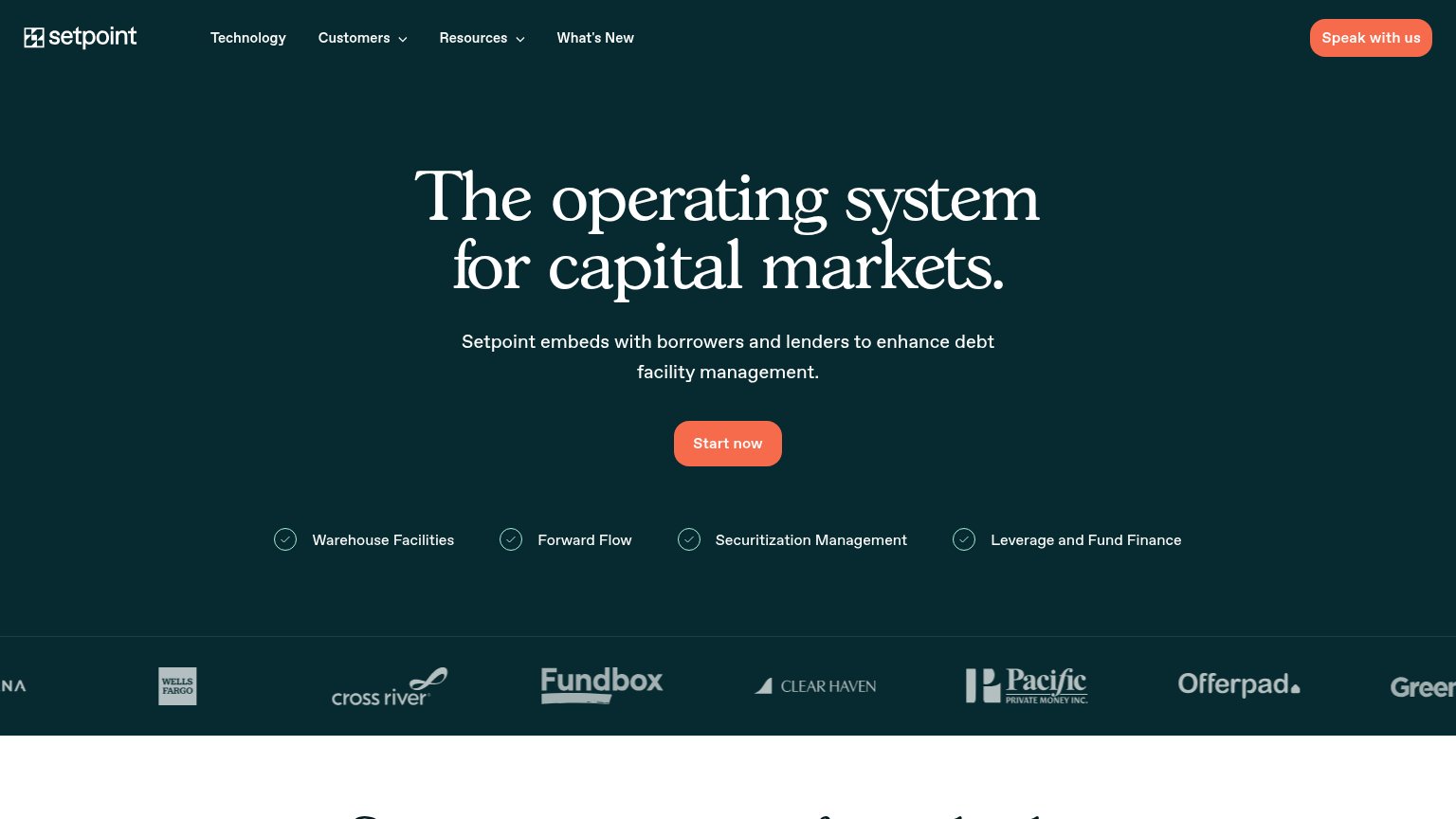
| Customer logo strip featuring Wells Fargo, Cross River, Fundbox, Clear Haven, Pacific Private Money, Offerpad, and Green | |
| "200+ Credit agreement fields digitized and stored and managed by Finley" metric tile | |
| Capterra, GetApp, and Software Advice badges each rated 4.8/5 below the hero CTA |
CTA
68FairCopy, size, verb, cost-feel — does the primary CTA earn the click?

Problems
- 'Request' feels costly/sales-gated
- no instant value from first click
- button small vs. huge hero headline
Mobile web
76FairThe phone experience as a first-class citizen.
 123
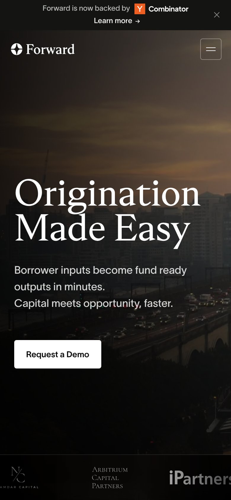
- Request a Demo button — Desktop-proportioned button floats at ~40% width; full-bleed would be far more thumb-friendly.
- YC announcement banner — Wraps to two lines on mobile and consumes the top of the viewport before the brand appears.
- Partner logo strip — Logos clip mid-word at both edges ('iPartners', 'Namdar Capital'), reading as broken layout.
Information hierarchy
78FairDoes the design help or inhibit what the page is trying to say?
123- YC announcement banner — The topmost element sends attention to an outbound 'Learn more' link before the visitor even reads the headline.
- Duplicate demo button — The header 'Request a Demo' is styled at the same white weight as the hero CTA, splitting focus between two identical actions.
- Sign in button — An outlined button sitting beside the primary CTA pulls existing-user traffic into the highest-attention corner of the page.