
Your landing page’s weakest score is Trust.
How The Subvocal Company ranks
- 1.
The Subvocal Company72
- 2.
Wispr Flow66
- 3.
AlterEgo (MIT Media Lab spinout)59
72Growth scoreupdated
category scores
category scoresShowHide
Score over time
Trust
30PoorProof that the product is real, competent, and safe to try.
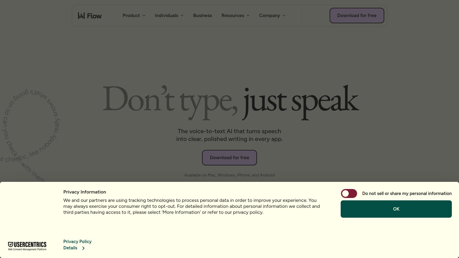
| Trust read | |
|---|---|
| The Subvocal Company | No visible trust signal identified. |
| Caption "Wired device shown is a pre-production prototype" indicating a real device demo | |
| Available on Mac, Windows, iPhone, and Android |
CTA
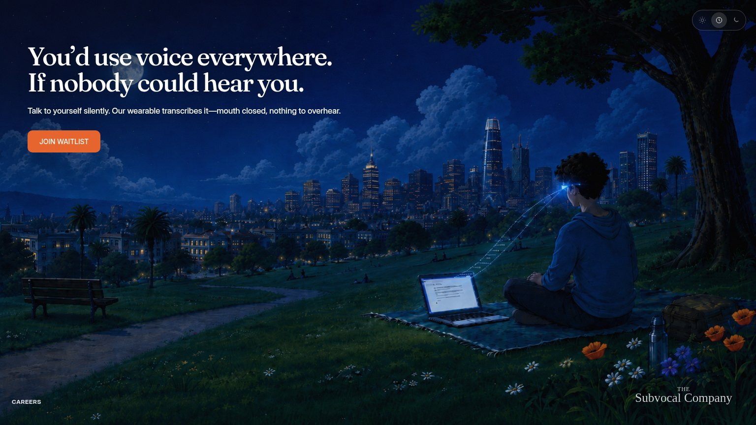
76FairCopy, size, verb, cost-feel — does the primary CTA earn the click?
Problems
- 'waitlist' signals deferred payoff
- no benefit or urgency in label
Value props
78FairTitle, subtitle, hero — do they sell the product's true value?
The Subvocal Company’s headline sells
You'd use voice everywhere. If nobody could hear you.
Talk to yourself silently. Our wearable transcribes it—mouth closed, nothing to overhear.
Working
- Names the real barrier: being overheard
- Subhead explains the mechanism plainly
- Hero image shows the product working
Could improve
- No numbers: speed, accuracy, latency
- No proof points anywhere in fold
- Doesn't say where transcripts go
Mobile web
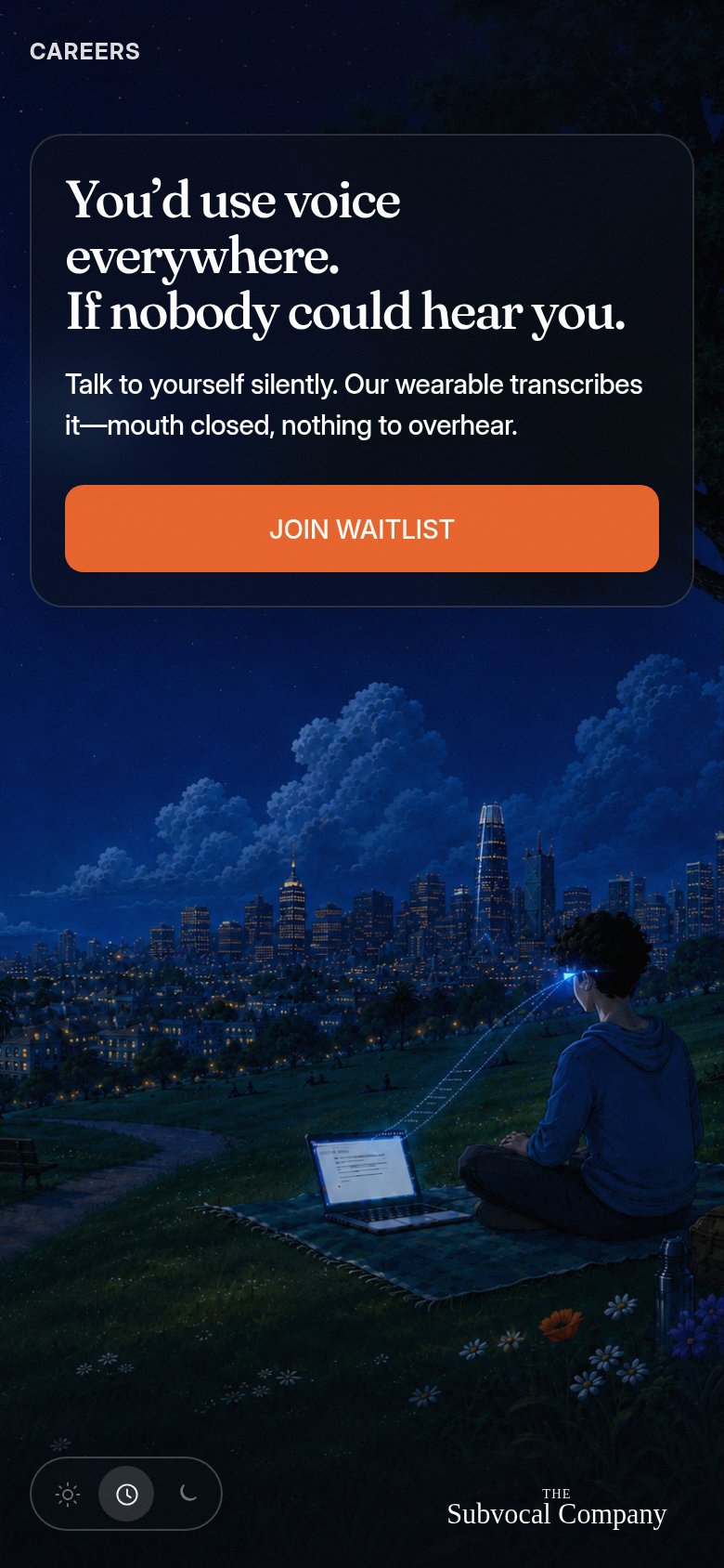
86StrongThe phone experience as a first-class citizen.
 12
- Theme toggle pill — Three-button light/dark control does no conversion work and competes with the footer brand mark on a phone.
- CAREERS top link — A single bare nav link floats at the top instead of collapsing into a standard menu pattern.
Information hierarchy
88StrongDoes the design help or inhibit what the page is trying to say?
123- JOIN WAITLIST button — Small footprint for a 1536px canvas; underweights the sole conversion action versus its full-width mobile treatment.
- Theme toggle cluster — Three-state control in the prime top-right corner draws first-glance attention to a utility, not the message.
- CAREERS footer link — An exit path inside the conversion fold; even styled quietly it competes with the single CTA.