
Your landing page’s weakest score is Trust.
How Roma ranks
75Growth scoreupdated
category scores
category scoresShowHide
Score over time
Trust
62FairProof that the product is real, competent, and safe to try.
| Trust read | |
|---|---|
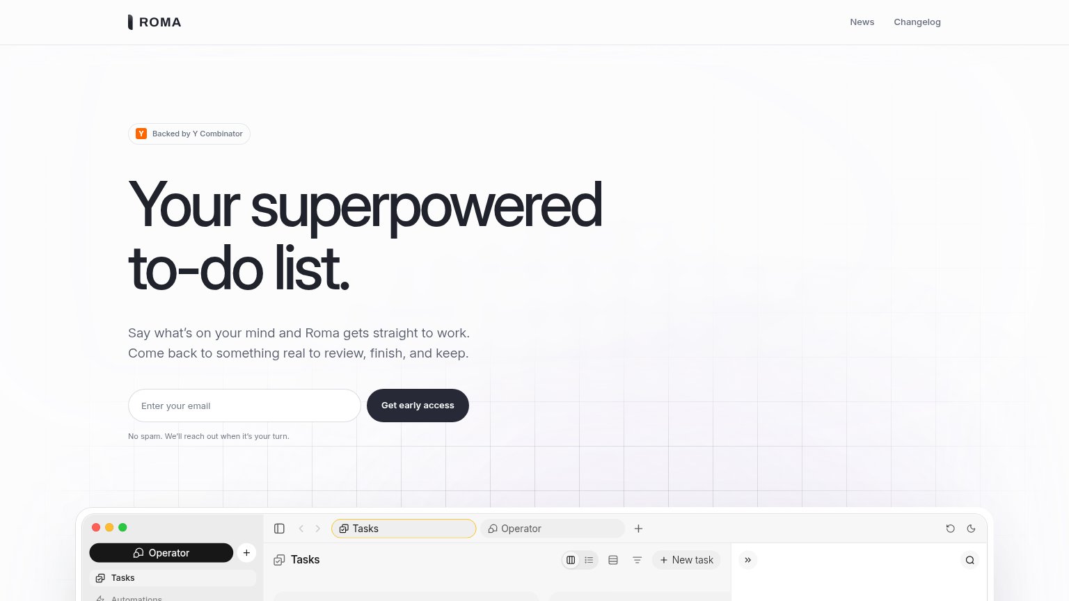
| Roma | "Backed by Y Combinator" badge above the headline |
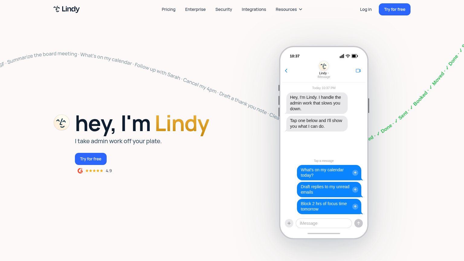
| G2 badge with 4.9 star rating below the "Try for free" CTA | |
| "Open the App Store" link implying shipped, reviewable apps | |
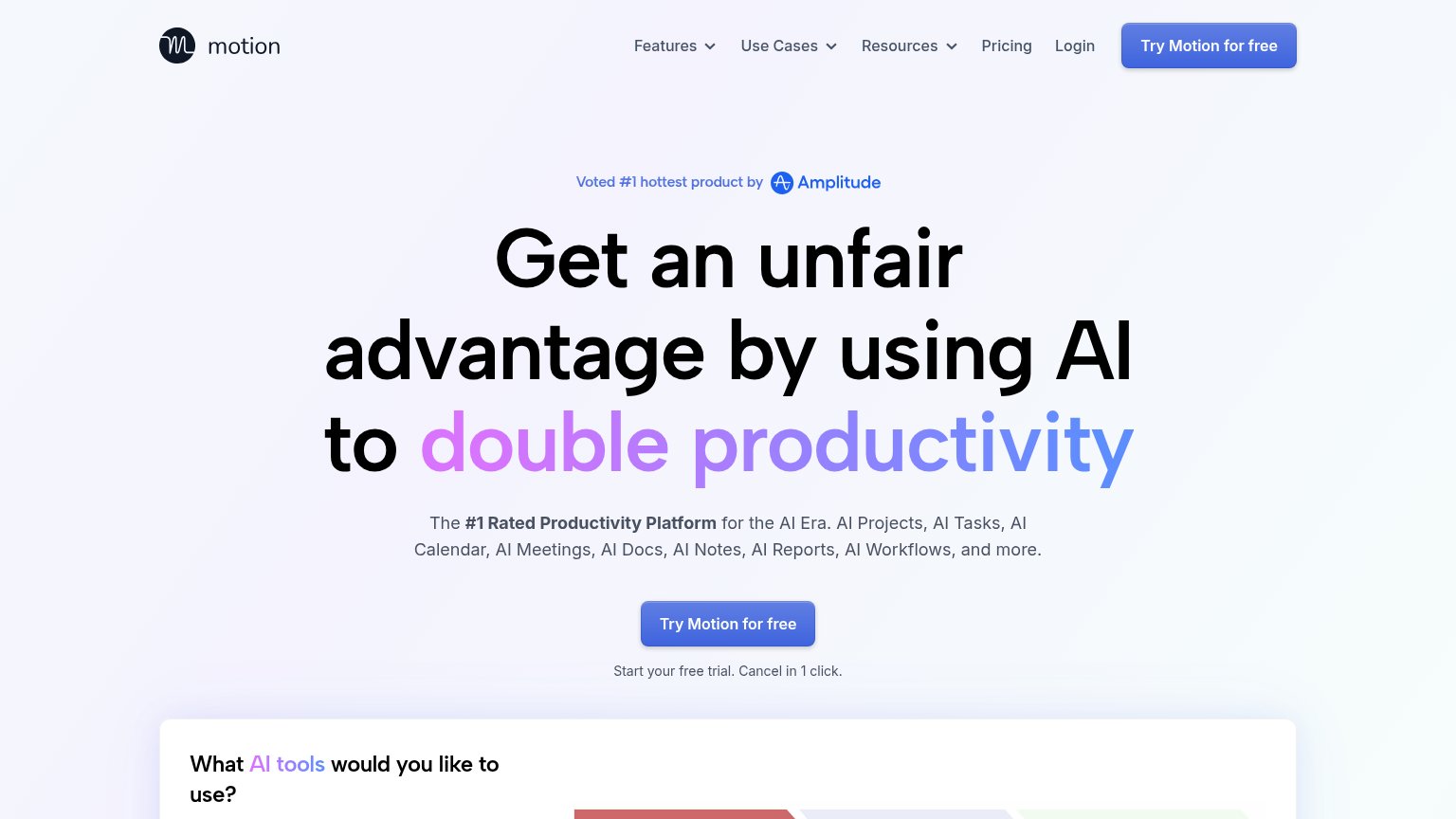
| "Voted #1 hottest product by Amplitude" badge | |
| Detailed product screenshot of the "Today's Brief - Oct 10 2024" inbox digest with summary, Important Information cards, | |
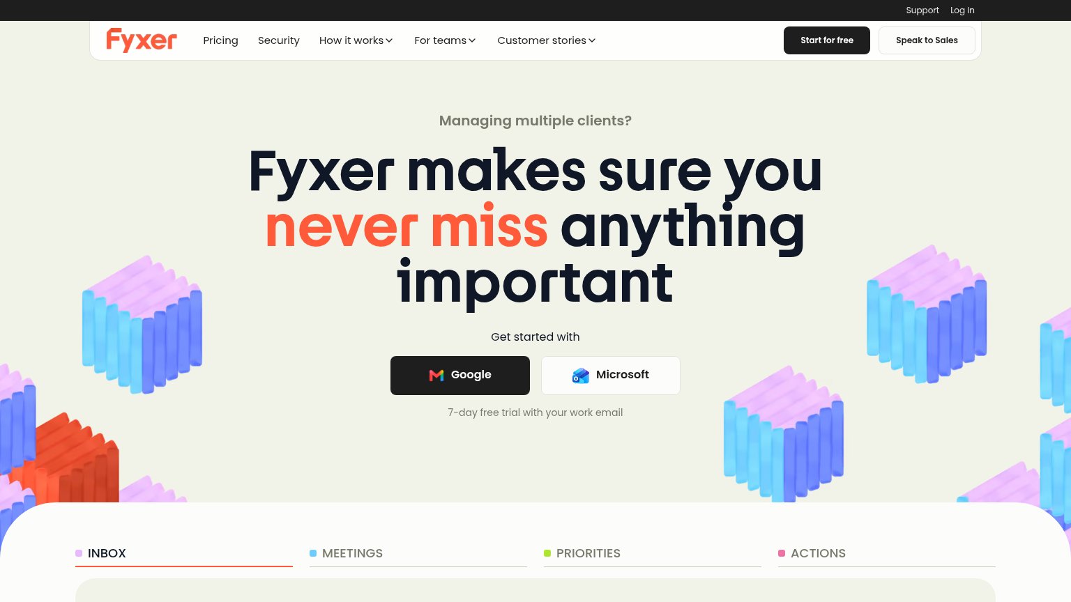
| Product UI demo with INBOX/MEETINGS/PRIORITIES/ACTIONS tabs showing a real email tagged "To Respond" from Elena Marsh |
Value props
68FairTitle, subtitle, hero — do they sell the product's true value?
Roma’s headline undersells
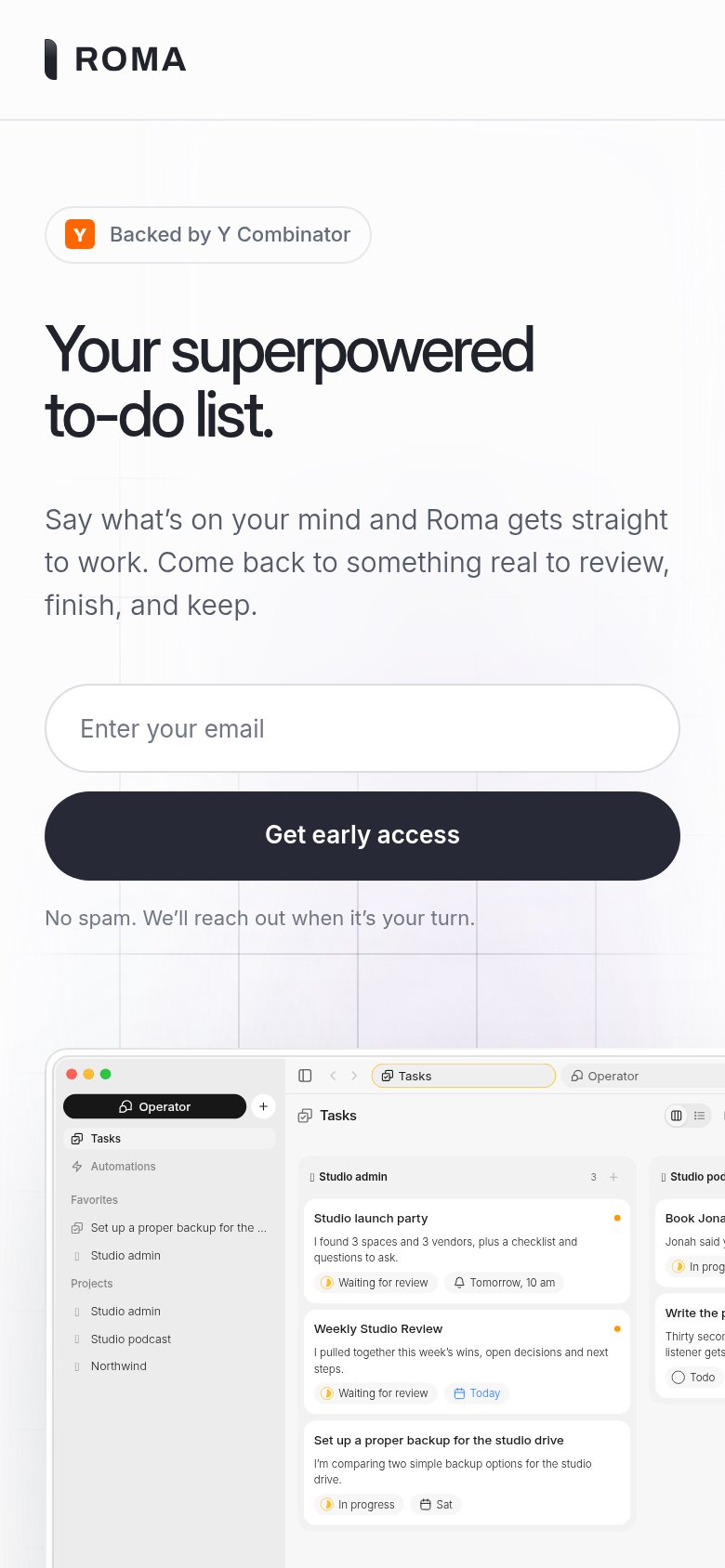
Your superpowered to-do list.
Say what's on your mind and Roma gets straight to work. Come back to something real to review, finish, and keep.
Working
- Subhead implies tasks get done for the user
- Screenshot shows real task states in progress
- "Something real to review" hints at relief
Could improve
- "Superpowered" is a generic abstraction
- No numbers or concrete task examples
- H1 buries the agent-does-the-work value
CTA
76FairCopy, size, verb, cost-feel — does the primary CTA earn the click?
Problems
- 'early access' signals a wait
- small vs headline on desktop
- no payoff word in label
Information hierarchy
82StrongDoes the design help or inhibit what the page is trying to say?
12- Product screenshot cropped — The app preview is cut off at the fold showing only a toolbar strip, communicating nothing about what Roma actually produces.
- News/Changelog nav links — Two nav exits sit at equal prominence with no styled CTA in the header, leaking attention before the email capture.
Mobile web
86StrongThe phone experience as a first-class citizen.
 12
- Desktop app screenshot — Desktop UI shrunk to phone width; sidebar text truncates and cards bleed off the right edge.
- Logo-only header — Nav links (News, Changelog) are dropped entirely instead of collapsed into a menu.