
Your landing page’s weakest score is Trust.
How Cora ranks
Trust
54FairProof that the product is real, competent, and safe to try.
| Trust read | |
|---|---|
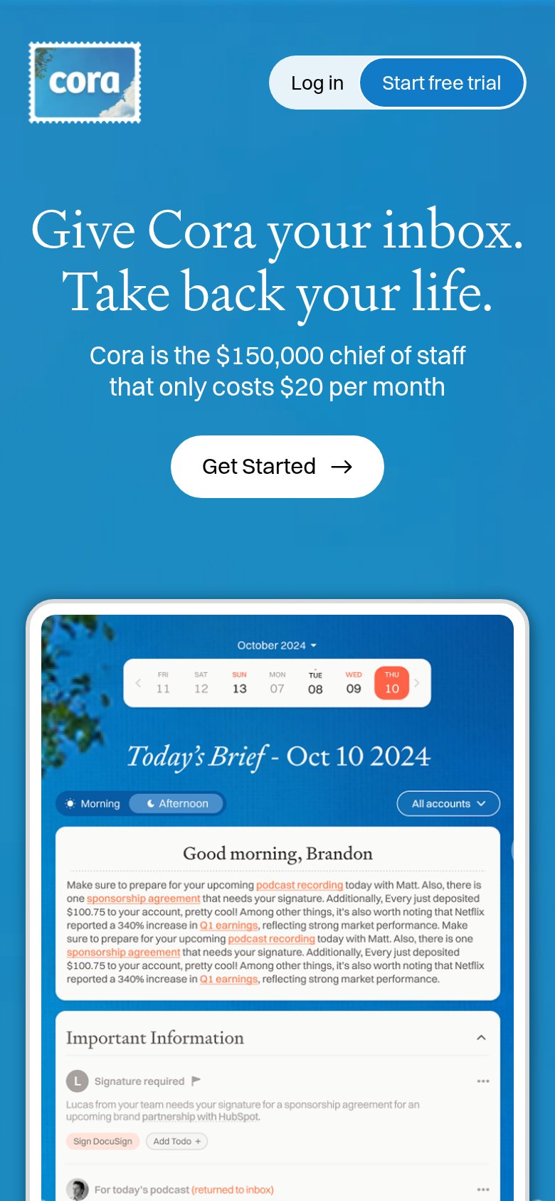
| Cora | Detailed product screenshot of the "Today's Brief - Oct 10 2024" inbox digest with summary, Important Information cards, |
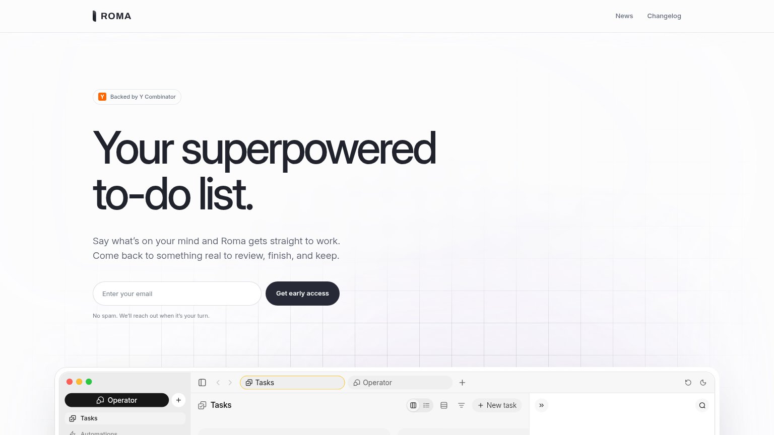
| "Backed by Y Combinator" badge above the headline | |
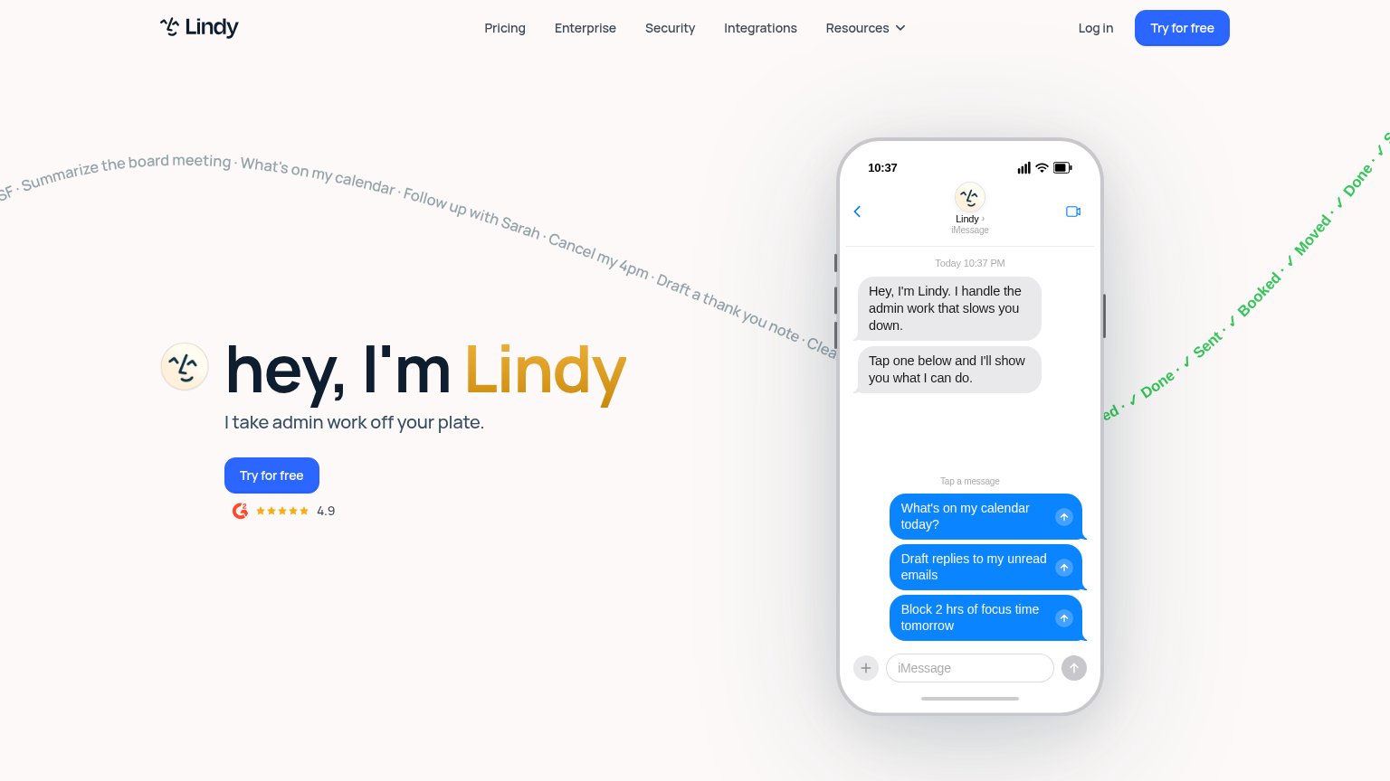
| G2 badge with 4.9 star rating below the "Try for free" CTA | |
| "Open the App Store" link implying shipped, reviewable apps | |
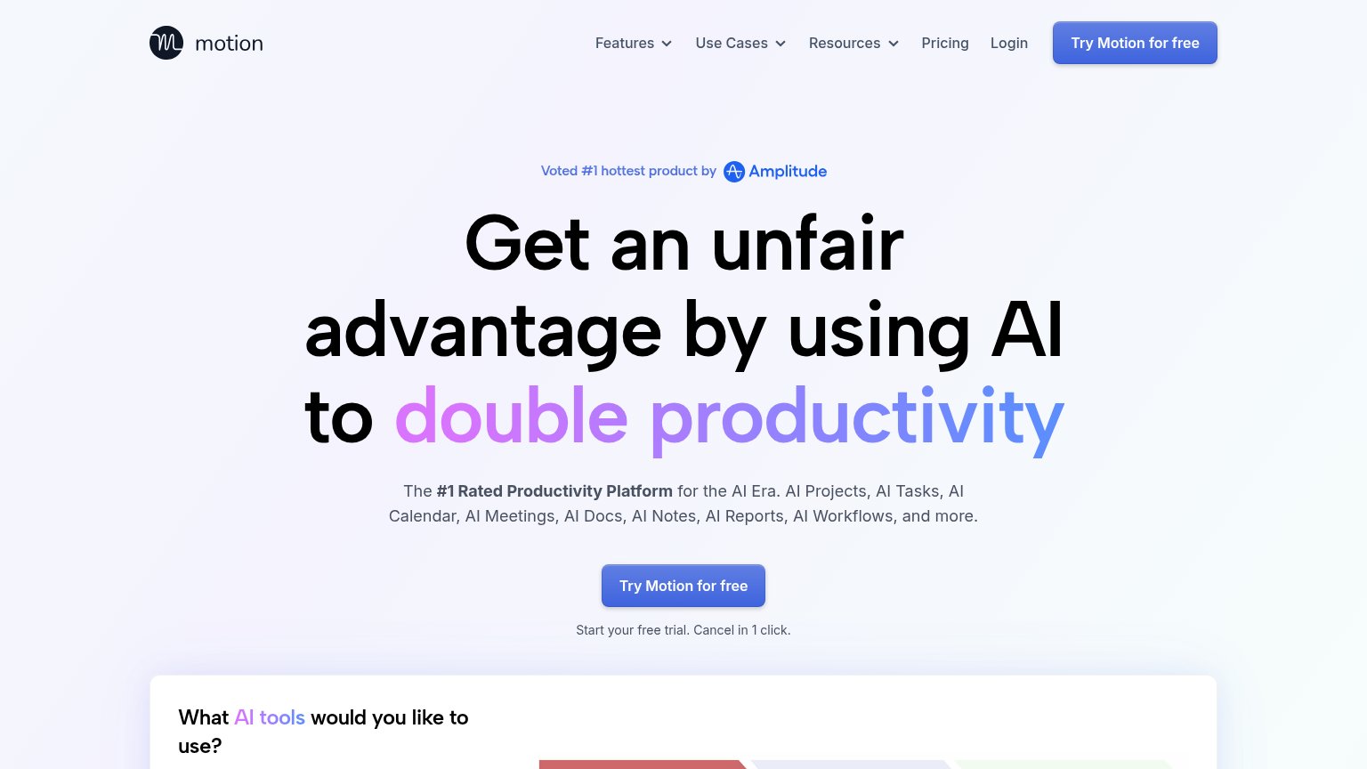
| "Voted #1 hottest product by Amplitude" badge | |
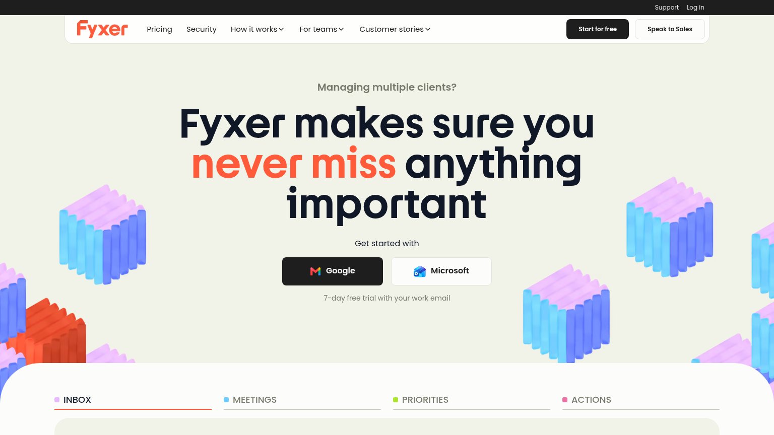
| Product UI demo with INBOX/MEETINGS/PRIORITIES/ACTIONS tabs showing a real email tagged "To Respond" from Elena Marsh |
CTA
72FairCopy, size, verb, cost-feel — does the primary CTA earn the click?
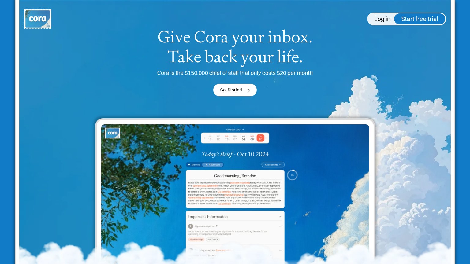
Problems
- no 'free' despite free trial
- label differs from nav CTA
- $20/mo line raises cost feel
Mobile web
82StrongThe phone experience as a first-class citizen.
What works
What to improve
Information hierarchy
84StrongDoes the design help or inhibit what the page is trying to say?
What works
What to improve
Value props
86StrongTitle, subtitle, hero — do they sell the product's true value?
Cora’s headline
Give Cora your inbox. Take back your life.
Cora is the $150,000 chief of staff that only costs $20 per month
Working
Could improve