
Your landing page’s weakest score is Trust.
How Orca Aerospace ranks
- 1.
Orca Aerospace68
- 2.
Cognitive Space67
- 3.
Antaris64
- 4.
Quindar62
- 5.
Kayhan Space62
68Growth scoreupdated
category scores
category scoresShowHide
Score over time
Trust
48PoorProof that the product is real, competent, and safe to try.
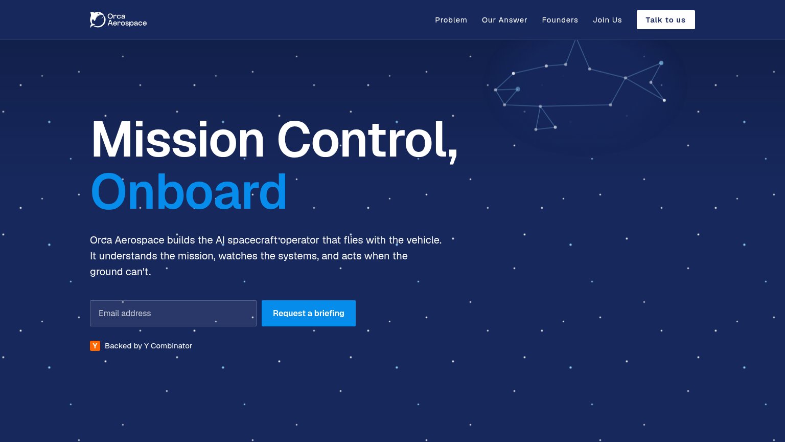
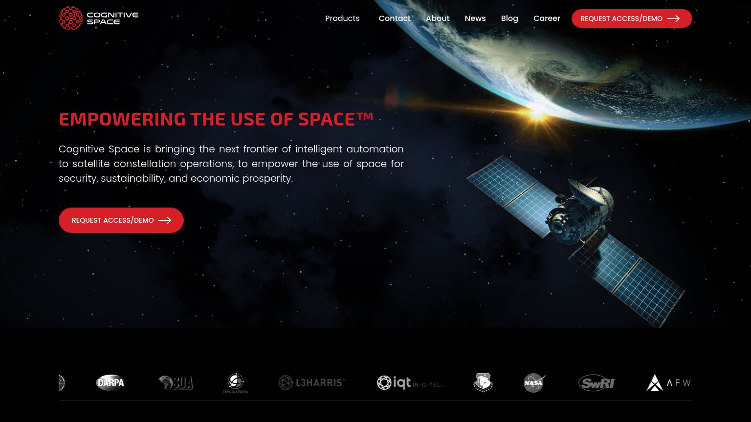
| Trust read | |
|---|---|
| Orca Aerospace | "Backed by Y Combinator" badge below the CTA |
| "Play Video" demo card captioned "MONITOR, CONTROL, AND AUTOMATE SPACECRAFT OPERATIONS" | |
| Laptop screenshot showing Antaris's real mission-visualization UI with orbital constellation plots | |
| Logo bar with DARPA, SDA, L3Harris, In-Q-Tel, NASA, SwRI, and Terran Orbital | |
| Announcement bar: "our new free-to-use spaceflight intelligence exchange: Satcat!" |
CTA
72FairCopy, size, verb, cost-feel — does the primary CTA earn the click?
Problems
- 'Request' feels costly, not receiving
- competes with header 'Talk to us'
- no payoff implied by 'briefing'
Value props
72FairTitle, subtitle, hero — do they sell the product's true value?
Orca Aerospace’s headline sells
Mission Control, Onboard
Orca Aerospace builds the AI spacecraft operator that flies with the vehicle. It understands the mission, watches the systems, and acts when the ground can't.
Working
- Headline compresses the value in 3 words
- Subhead names what the AI actually does
- "When the ground can't" hits real fear
Could improve
- Zero numbers or proof points in the fold
- Hero art decorates, doesn't demonstrate
- Headline needs domain knowledge to parse
Mobile web
72FairThe phone experience as a first-class citizen.
 123
- Uncollapsed nav link row — Full desktop link row stacks under the logo, forming a tall double-decker header that pushes the hero down.
- Oversized wrapping headline — "Mission Control, Onboard" wraps to three tall lines, pushing the email form and CTA below the first viewport.
- Five-line hero paragraph — Long supporting paragraph adds to the vertical stack that displaces the "Request a briefing" button off-screen.
Information hierarchy
78FairDoes the design help or inhibit what the page is trying to say?
123- Talk to us button — White pill outshines the blue 'Request a briefing' CTA, splitting the fold between two competing asks.
- Nav anchor links — Four equal-weight links (Problem, Our Answer, Founders, Join Us) leak attention before the email capture.
- Email address field — Dark low-contrast fill blends into the background, weakening the start of the conversion flow.