
Your landing page’s weakest score is Trust.
How Oasive ranks
70Growth scoreupdated
category scores
category scoresShowHide
Trust
58FairProof that the product is real, competent, and safe to try.
| Trust read | |
|---|---|
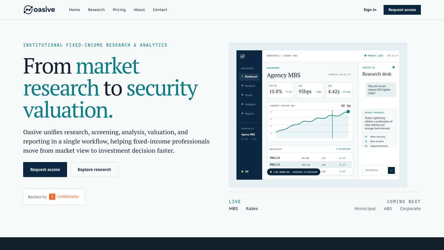
| Oasive | "Backed by Y Combinator" badge beneath the Request access CTA |
| implicit context Intex may benefit from pre-existing familiarity among its target audience. | |
| No visible trust signal identified. | |
| Live share-price ticker: "8,246.0 GBX -16.0 (-0.2%) LSEG Sep 20, 2026" | |
| "senior investors across BlackRock's active fixed income platform" expertise framing in the hero copy |
CTA
68FairCopy, size, verb, cost-feel — does the primary CTA earn the click?
Problems
- 'Request' feels gated, high-cost
- no payoff implied in the click
- secondary CTA feels cheaper to click
Mobile web
72FairThe phone experience as a first-class citizen.
 123
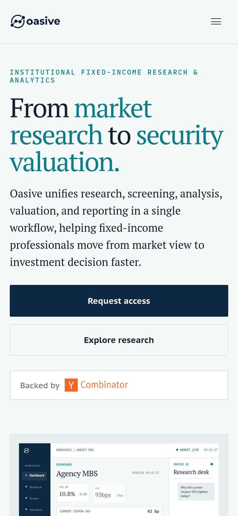
- Hero headline block — Serif headline wraps to five tall lines and pushes the primary CTA below the first viewport.
- Subheadline paragraph — Five lines of large body copy add another full screen-width block before the CTA.
- Explore research button — Full-width secondary button matches the primary's weight and stretches the scroll to the product shot.
Value props
74FairTitle, subtitle, hero — do they sell the product's true value?
Oasive’s headline sells
From market research to security valuation.
Oasive unifies research, screening, analysis, valuation, and reporting in a single workflow, helping fixed-income professionals move from market view to investment decision faster.
Working
- Names the exact workflow span it covers
- Subhead lists the five unified steps
- Hero image demos real MBS analytics
Could improve
- 'Faster' is unquantified
- No emotional pull or pain named
- Zero proof numbers beyond YC badge
Information hierarchy
76FairDoes the design help or inhibit what the page is trying to say?
123- Explore research button — Same-size secondary button beside 'Request access' splits the primary action's pull.
- Live/Coming Next strip — Uppercase 'LIVE'/'COMING NEXT' labels with MBS/Rates/Municipal tokens read as clickable exits with no clear purpose.
- Dashboard mockup detail — Dense micro-copy (OAS, CPR 3M, watchlist rows) at illegible sizes adds density without communicating at a glance.