
Your landing page’s weakest score is CTA.
How Micora ranks
- 1.
5B (Maverick)65
- 2.
BoxPower65
- 3.
Micora55
- 4.
Erthos54
55Growth scoreupdated
category scores
category scoresShowHide
Score over time
CTA
42PoorCopy, size, verb, cost-feel — does the primary CTA earn the click?


Problems
- scroll cue, not a conversion CTA
- no action verb or value promise
- tiny footprint vs. huge headline
- hero never points to Order path
Trust
42PoorProof that the product is real, competent, and safe to try.

| Trust read | |
|---|---|
| Micora | Micora-branded container on a truck illustrating the 'solar farms in a box' product |
| "up to 2x more power per hectare annually than conventional solar tracking technologies*... *DNV Energy Systems modellin | |
| Hero drone photo of a real installed Erthos ground-mounted solar array | |
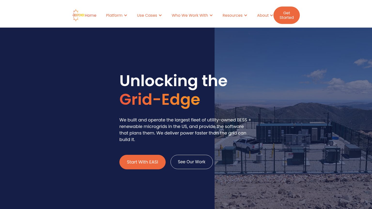
| Hero photo of a real fenced BESS/microgrid installation on a mountain site |
Mobile web
58FairThe phone experience as a first-class citizen.
 12
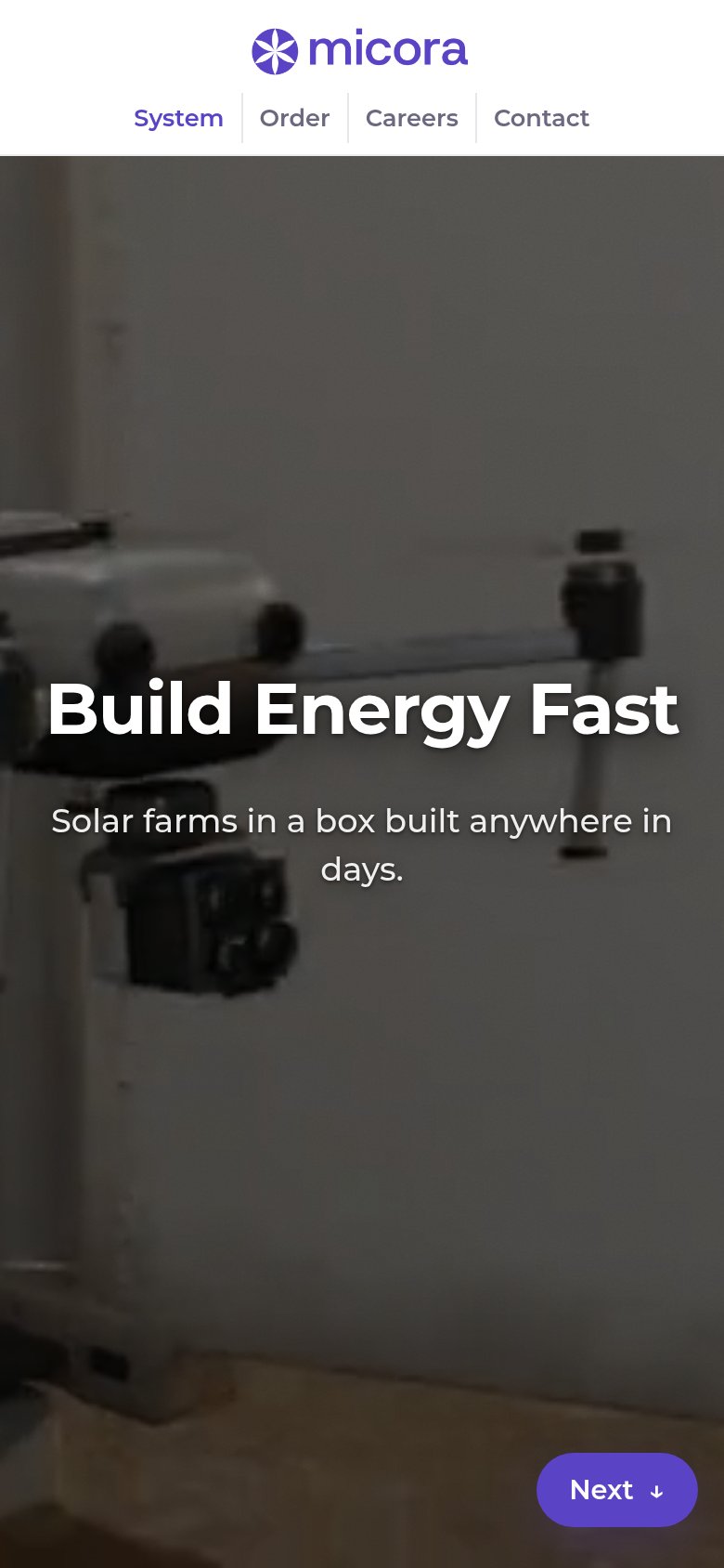
- Next pill button — Small desktop-proportioned scroll cue is the only action; no full-width conversion CTA in the fold.
- Uncollapsed nav row — Four desktop links crammed under the logo form a double-decker header instead of a hamburger.
Information hierarchy
62FairDoes the design help or inhibit what the page is trying to say?
123- Next pager button — The only styled button in the fold advances a slideshow instead of converting, and sits in the bottom-right corner outside the scan path.
- Order nav link — The actual conversion action is a plain nav link at the same weight as Careers and Contact, invisible as the primary action.
- Subheadline over truck — "Solar farms in a box built anywhere in days" overlaps the bright container/trailer, cutting its legibility mid-sentence.
Value props
72FairTitle, subtitle, hero — do they sell the product's true value?
Micora’s headline sells
Build Energy Fast
Solar farms in a box built anywhere in days.
Working
- Speed benefit named in three words
- 'In a box' is concrete and memorable
- Desktop hero shows the container arriving
Could improve
- No numbers: capacity, cost, or timeline
- 'Energy' is vaguer than 'solar power'
- Mobile hero crop shows unclear machinery