
Your landing page’s weakest score is CTA.
How Kailash Labs ranks
47Growth scoreupdated
category scores
category scoresShowHide
Score over time
CTA
42PoorCopy, size, verb, cost-feel — does the primary CTA earn the click?
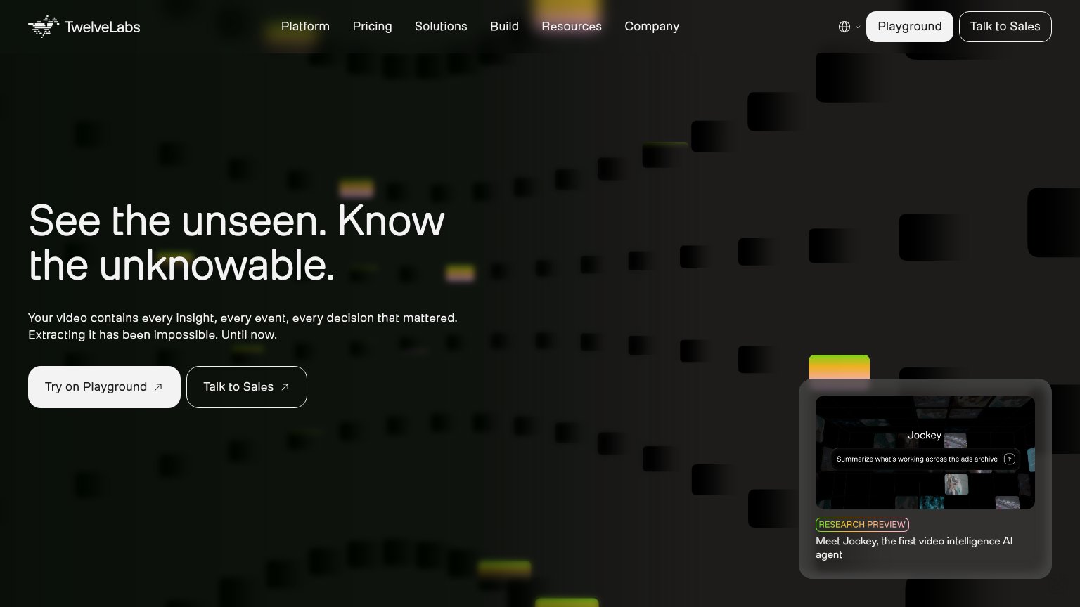
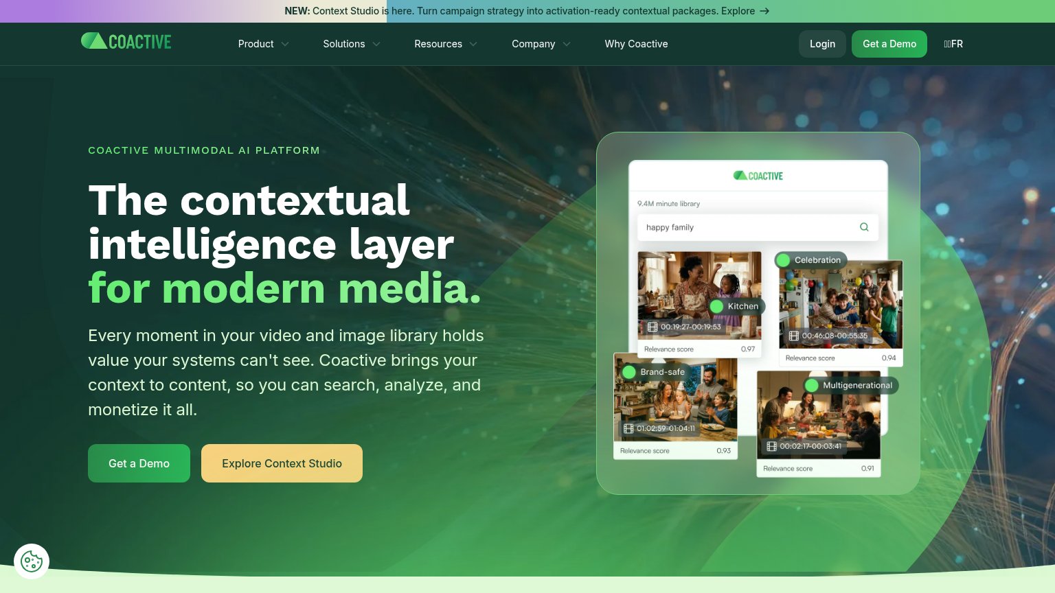
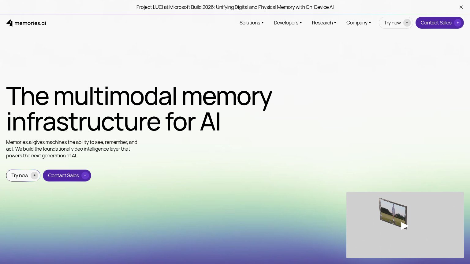
Problems
- no CTA anywhere in either fold
- nav has no contact/demo link
- mission text ends with no next step
Trust
44PoorProof that the product is real, competent, and safe to try.
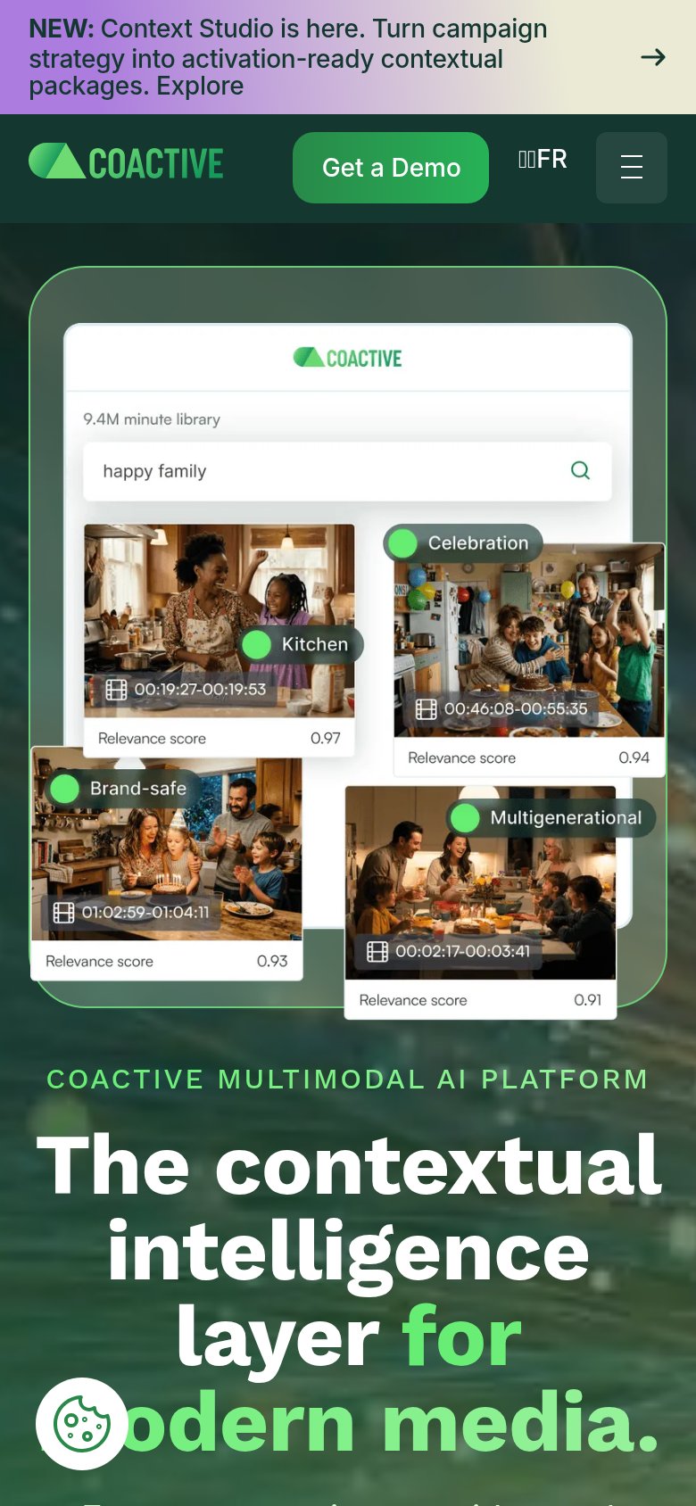
| Trust read | |
|---|---|
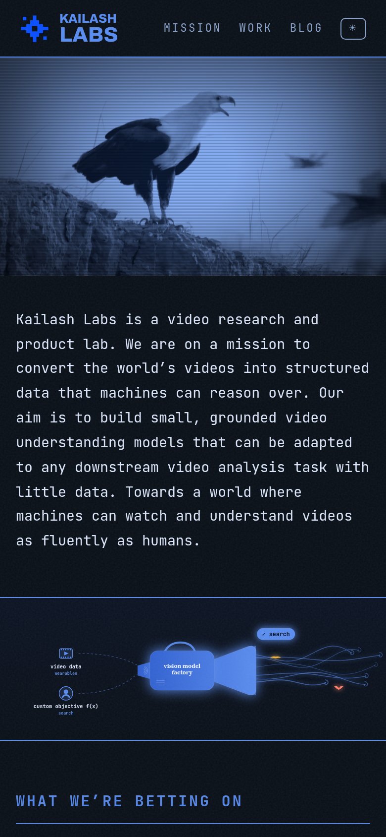
| Kailash Labs | "vision model factory" pipeline diagram showing video data and custom objective inputs |
| Jockey demo card with prompt UI "Summarize what's working across the ads archive" | |
| Product UI mock showing search for "happy family" across a "9.4M minute library" with relevance scores and tags like "Br | |
| Banner: "Project LUCI at Microsoft Build 2026: Unifying Digital and Physical Memory with On-Device AI" |
Value props
48PoorTitle, subtitle, hero — do they sell the product's true value?
Working
- Names the real product: video-to-structured-data
- Concrete differentiator: small models, little data
- Vision line adds emotional pull
Could improve
- No headline — value buried in a paragraph
- No numbers, benchmarks, or proof points
- Hero video decorates, shows no output
Mobile web
48PoorThe phone experience as a first-class citizen.
12- Uncollapsed nav row — Full desktop link row (MISSION / WORK / BLOG) sits inline instead of a hamburger, crowding the header on a phone.
- Mission paragraph block — Ten lines of monospace body copy stack as the sole fold message with no headline or action to anchor it.
Information hierarchy
54FairDoes the design help or inhibit what the page is trying to say?
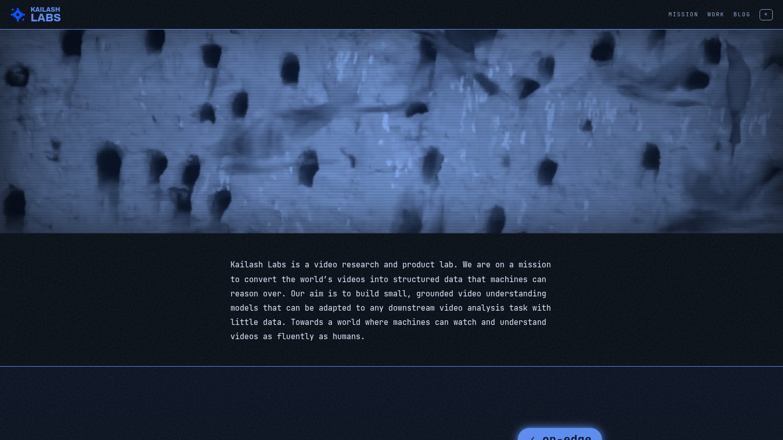 123
- Mission paragraph block — Six lines of same-weight monospace text serve as the only value prop — no headline hierarchy, so nothing is glanceable.
- Clipped bottom-right button — The only button-styled element ('on-edge...') is cut off at the fold edge, ambiguous in purpose and outside the scan path.
- Grainy video banner — Roughly half the fold is a low-contrast surveillance-style clip that communicates atmosphere but outranks any statement of what the product does.