
Your landing page’s weakest score is CTA.
How Degla Inc ranks
48Growth scoreupdated
category scores
category scoresShowHide
Score over time
CTA
32PoorCopy, size, verb, cost-feel — does the primary CTA earn the click?

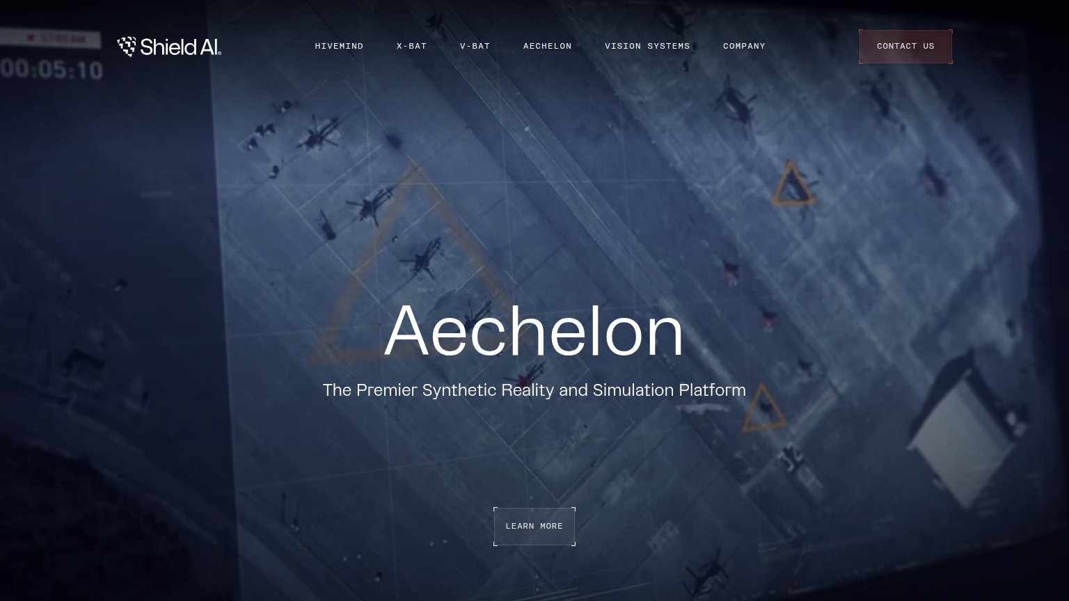
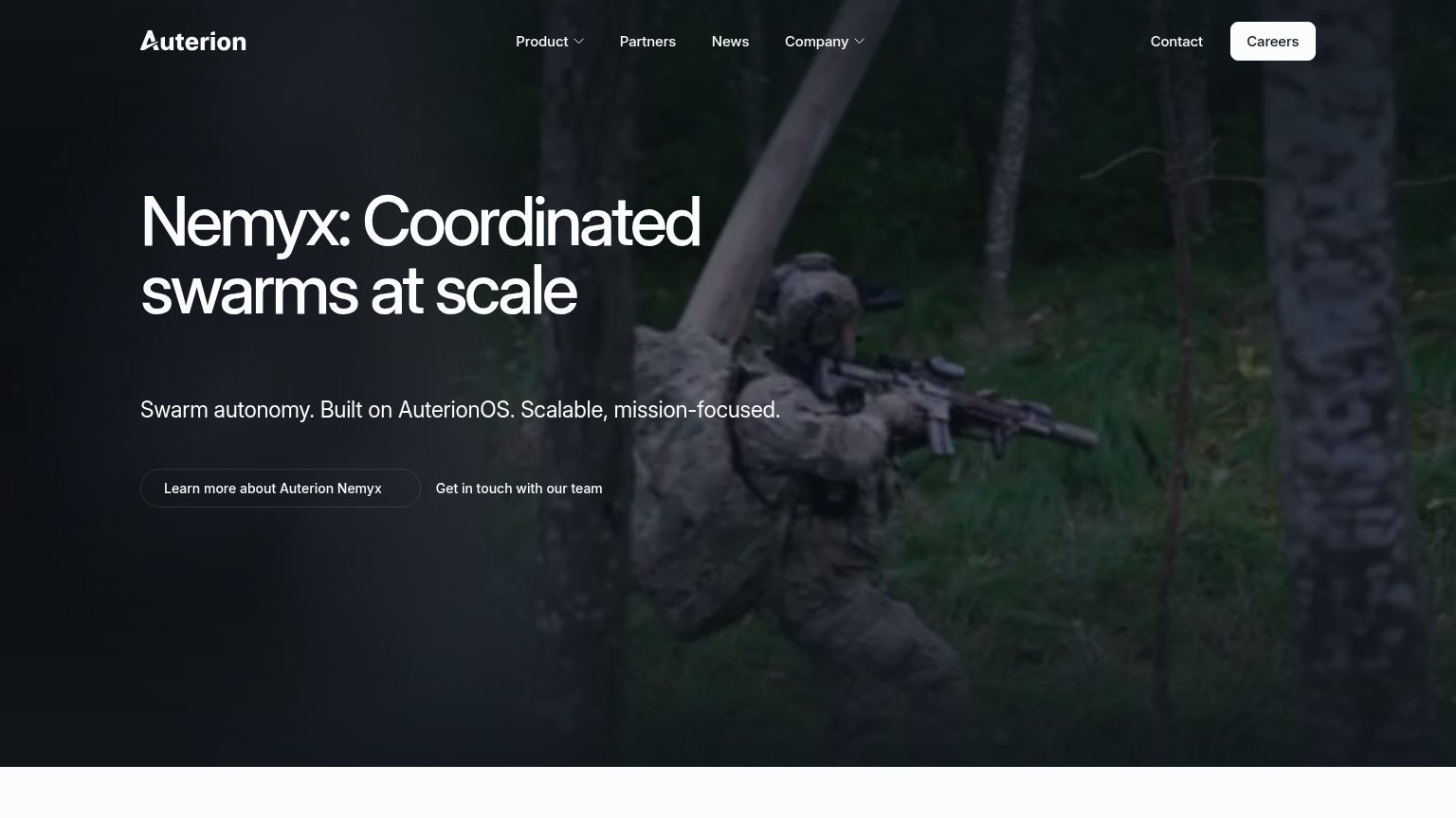
Problems
- no CTA anywhere above the fold
- only clickable is unlabeled '+' icon
- headline promise has no next step
Trust
42PoorProof that the product is real, competent, and safe to try.
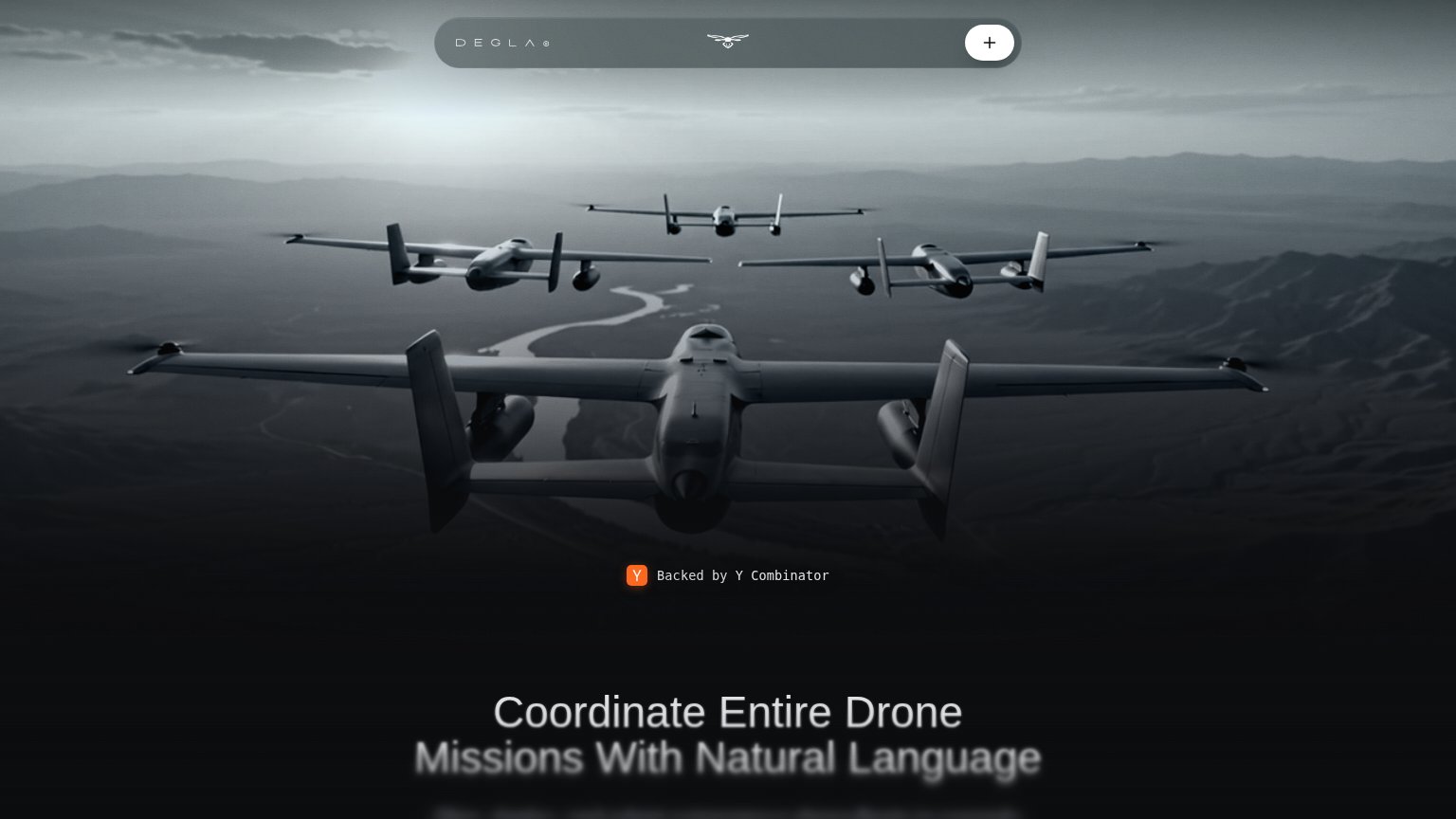
| Trust read | |
|---|---|
| Degla Inc | "Backed by Y Combinator" badge |
| implicit context Auterion may benefit from pre-existing familiarity among its target audience. | |
| implicit context Anduril (Lattice) may benefit from pre-existing familiarity among its target audience. | |
| implicit context Shield AI may benefit from pre-existing familiarity among its target audience. | |
| "One country. Thousands of autonomous trucks. A new era for intelligent infrastructure begins now." paired with the HUMA |
Mobile web
44PoorThe phone experience as a first-class citizen.
 123
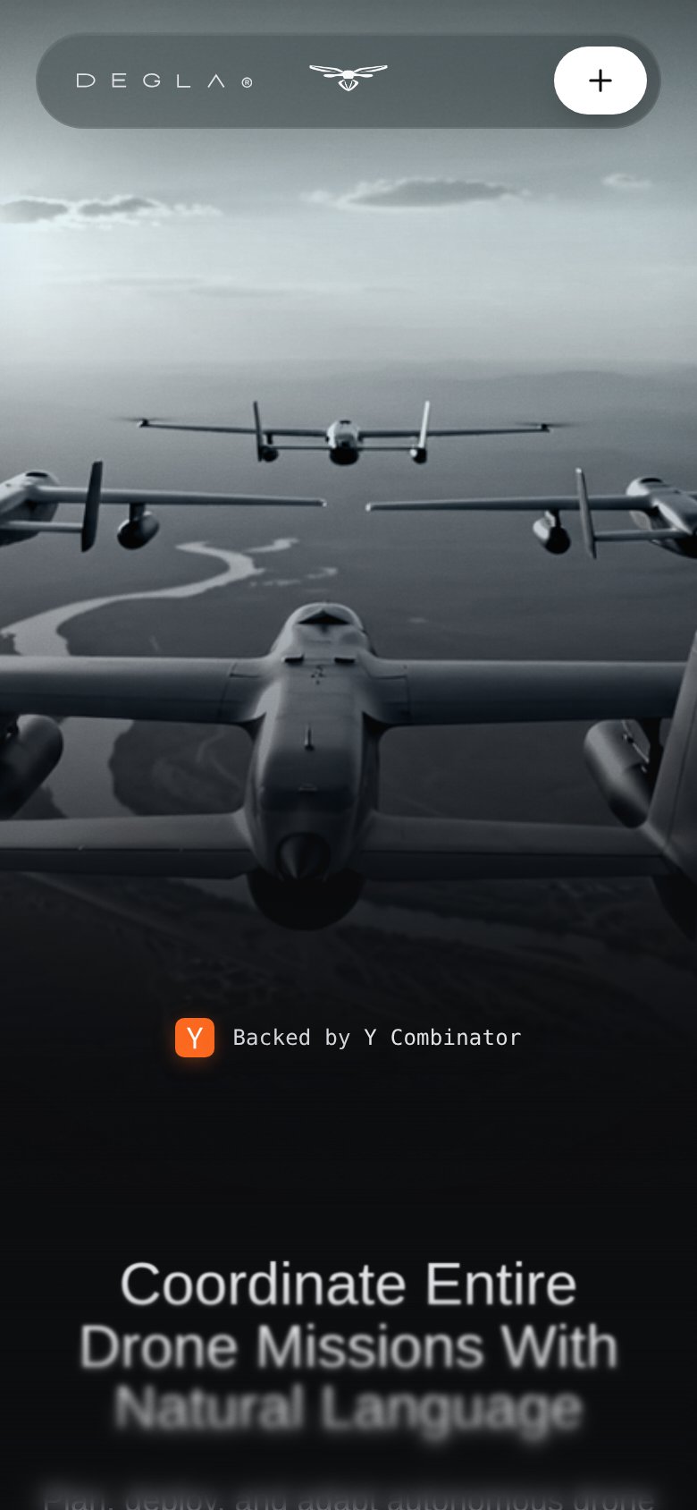
- Blurred headline at fold — The value statement sits half-faded at the bottom edge with no CTA anywhere in the viewport.
- Cut-off subheadline text — "Plan, deploy, and adapt..." is clipped mid-fade, leaving the pitch unreadable in the first view.
- Unlabeled plus button — The only tappable nav control is an ambiguous "+" icon that signals nothing about menu or action.
Information hierarchy
48PoorDoes the design help or inhibit what the page is trying to say?
123- Blurred bottom headline — 'Coordinate Entire Drone Missions With Natural Language' sits at the fold edge, half-blurred and cut off, so the value prop never lands at a glance.
- Unlabeled plus button — The only actionable control in the fold is an anonymous '+' icon — no visitor can identify the primary action within one second.
- Y Combinator badge — The credibility badge floats alone mid-page with more prominence than the headline, inverting the trust-signal-supports-message hierarchy.
Value props
72FairTitle, subtitle, hero — do they sell the product's true value?
Degla Inc’s headline sells
Coordinate Entire Drone Missions With Natural Language
Plan, deploy, and adapt autonomous drone...
Working
- Names mechanism: natural language control
- Hero image shows drone fleet in flight
- YC badge lends startup credibility
Could improve
- Subhead cut off below the fold
- No numbers or proof points visible
- No emotional payoff for operators