
Your landing page’s weakest score is Trust.
How Applied Kinetics ranks
- 1.
Applied Kinetics68
- 2.
C3 AI67
- 3.
Cognite61
- 4.
Beyond Limits51
- 5.
SparkCognition (Avathon)49
68Growth scoreupdated
category scores
category scoresShowHide
Score over time
Trust
48PoorProof that the product is real, competent, and safe to try.
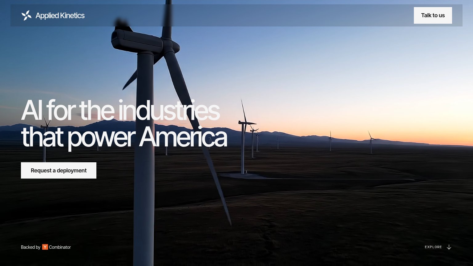
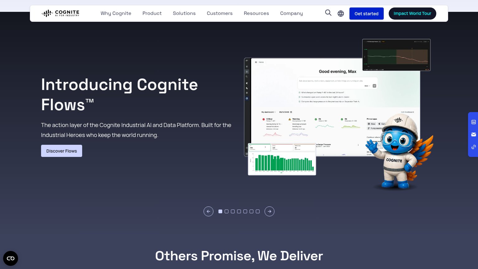
| Trust read | |
|---|---|
| Applied Kinetics | "Backed by Y Combinator" badge in the footer |
| No visible trust signal identified. | |
| implicit context C3 AI may benefit from pre-existing familiarity among its target audience. | |
| Detailed Cognite Flows dashboard screenshot showing alarm cards ("Critical — Pump P-401") and AI query prompts | |
| Announcement bar: "We're heading to LNG Operations North America Summit" |
Value props
52FairTitle, subtitle, hero — do they sell the product's true value?
Applied Kinetics’s headline vague
AI for the industries that power America
Working
- Hero footage shows the actual industry served
- "Request a deployment" implies real-world hardware
- YC badge adds credibility in the fold
Could improve
- No subhead — zero specifics on what it does
- "AI for industries" fits almost any product
- No outcome, number, or proof point named
CTA
68FairCopy, size, verb, cost-feel — does the primary CTA earn the click?
Problems
- 'Request' feels like petitioning sales
- 'deployment' reads heavy/committal
- no low-commitment path for browsers
- two labels split the ask
Information hierarchy
84StrongDoes the design help or inhibit what the page is trying to say?
123- Talk to us button — Filled white button styled at the same weight as the primary CTA, splitting the first click between two doors.
- Headline over horizon — White type crosses the bright sunset band, dropping contrast on 'industries' at a glance.
- Request a deployment CTA — White fill matches the header button and turbine tones; no accent color to make it the unmistakable single action.
Mobile web
86StrongThe phone experience as a first-class citizen.
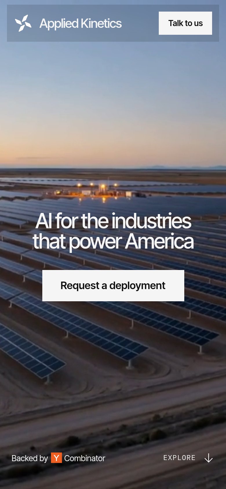 12
- Hero headline contrast — White type sits on a bright sky/panel background with no scrim, hurting legibility outdoors.
- Washed-out header bar — The pale translucent header blends into the sky, muting the white "Talk to us" pill's edges.