
Your landing page’s weakest score is Trust.
How Parametric ranks
- 1.
Parametric59
- 2.
Other Life (OtherLife / Automated businesses)36
59Growth scoreupdated
category scores
category scoresShowHide
Trust
42PoorProof that the product is real, competent, and safe to try.

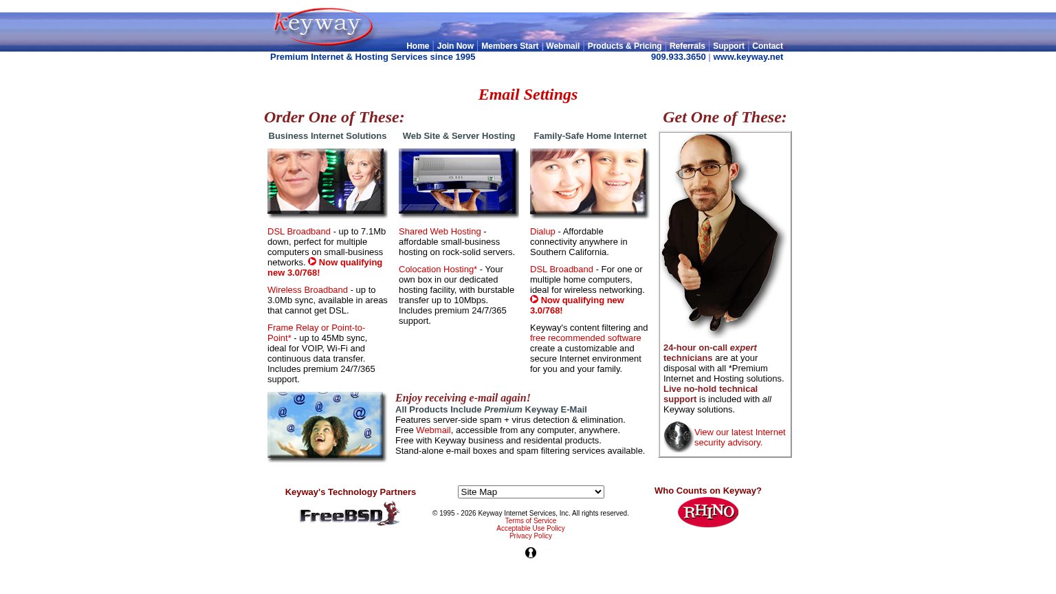
| Trust read | |
|---|---|
| Parametric | Y COMBINATOR F25 |
| "Who Counts on Keyway?" customer logos (Rhino, Coldwell Banker) |
Value props
52FairTitle, subtitle, hero — do they sell the product's true value?
Parametric’s headline vague
Physical businesses that run themselves.
A PUBLIC BENEFIT CORPORATION IN SAN FRANCISCO
Working
- Outcome-first, memorable headline
- No buzzword filler
- YC F25 badge adds early credibility
Could improve
- Subhead states legal form, not value
- No hint of the mechanism or product
- Zero numbers, proof, or visuals
CTA
55FairCopy, size, verb, cost-feel — does the primary CTA earn the click?
Problems
- styled as text link, not button
- points to content, not product
- four words, includes 'our'
- tiny footprint vs headline
Mobile web
72FairThe phone experience as a first-class citizen.
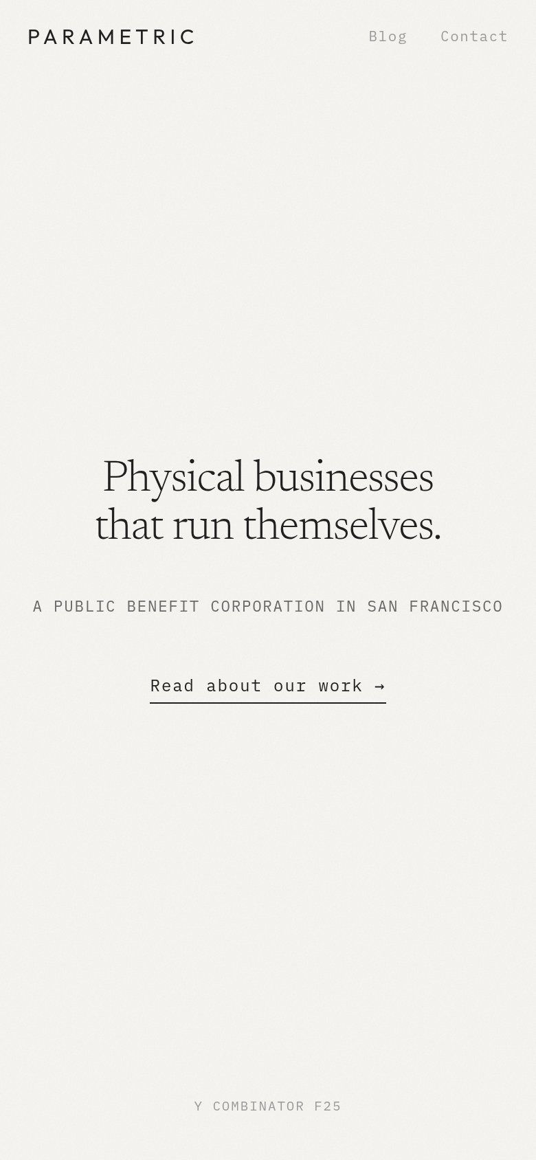 123
- Uncollapsed nav links — Full desktop link row ("Blog", "Contact") is kept on mobile instead of a hamburger, and both links render in low-contrast gray.
- Text-link primary CTA — "Read about our work →" is an underlined text link, not a full-width thumb-friendly button, giving a small tap target.
- Subheadline tracking — "A PUBLIC BENEFIT CORPORATION IN SAN FRANCISCO" runs edge-to-edge in wide-tracked caps, straining readability at arm's length.
Information hierarchy
76FairDoes the design help or inhibit what the page is trying to say?
123- Read about our work — Primary CTA styled as small underlined text at the same weight as the kicker — it reads as a footnote, not the page's action.
- Y Combinator F25 tag — Faint gray credential floats detached at the bottom edge, too low-contrast to lend authority and easy to miss entirely.
- Blog Contact nav — Nav links match the CTA's visual weight, so the fold's two exits compete evenly with its one conversion path.
Competitors
inferred from product, audience, and value prop#1Parametric59
#2