
Your landing page’s weakest score is Mobile web.
How Other Life (OtherLife / Automated businesses) ranks
- 1.
Parametric59
- 2.
Other Life (OtherLife / Automated businesses)36
36Growth scoreupdated
category scores
category scoresShowHide
Mobile web
22PoorThe phone experience as a first-class citizen.
 1234
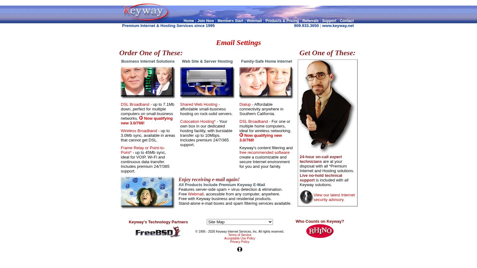
- Desktop nav link row — Full eight-link desktop nav row is crammed across the phone header with no hamburger collapse; each link is a tiny tap target.
- Three-column content grid — The desktop three-column layout renders unshrunk on the phone, cramming three competing product columns into the first viewport.
- Tiny body text columns — Body copy scales down to squint-small type wrapping in narrow 4-5 word lines ('Frame Relay or Point-to-Point*').
- Site Map dropdown — The only interactive control resembling an action is a small desktop-proportioned select box — no tappable CTA button anywhere in the fold.
Information hierarchy
32PoorDoes the design help or inhibit what the page is trying to say?
 1234
- Nine-link nav row — 'Join Now' is buried among eight equal-weight exits with no styled primary CTA anywhere on the page.
- Email Settings headline — The page's only title mislabels the fold and buries the actual value proposition entirely.
- Three product columns — Twelve same-weight red links compete simultaneously, reading as a feature index instead of one argument.
- Footer inside fold — Site Map dropdown, policy links, and partner logos leak attention before any conversion action exists.
Value props
38PoorTitle, subtitle, hero — do they sell the product's true value?
Other Life (OtherLife / Automated businesses)’s headline
Email Settings
Order One of These:
Working
Could improve
CTA
42PoorCopy, size, verb, cost-feel — does the primary CTA earn the click?
How Other Life (OtherLife / Automated businesses) compares
Recommended rewrites
Trust
44PoorProof that the product is real, competent, and safe to try.
How Other Life (OtherLife / Automated businesses) compares
Trust read