
Your landing page’s weakest score is Trust.
How Locus ranks
62Growth scoreupdated
category scores
category scoresShowHide
Score over time
Trust
44PoorProof that the product is real, competent, and safe to try.
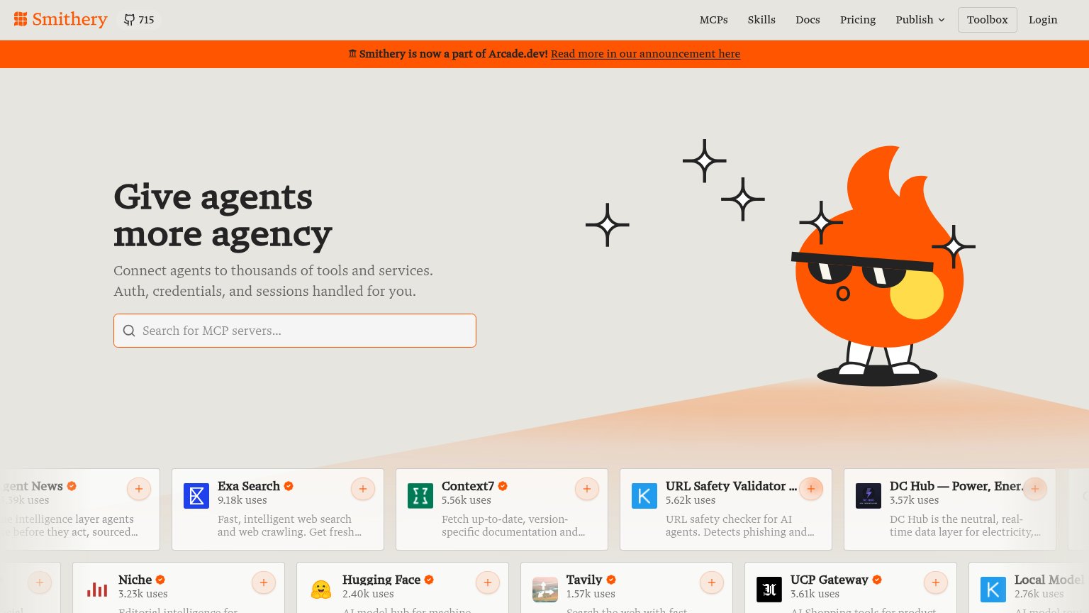
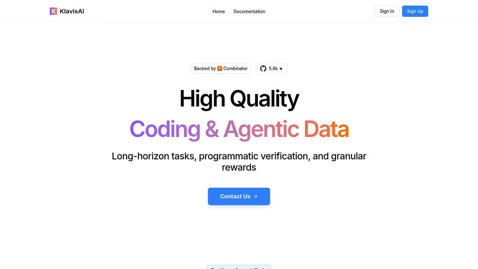
| Trust read | |
|---|---|
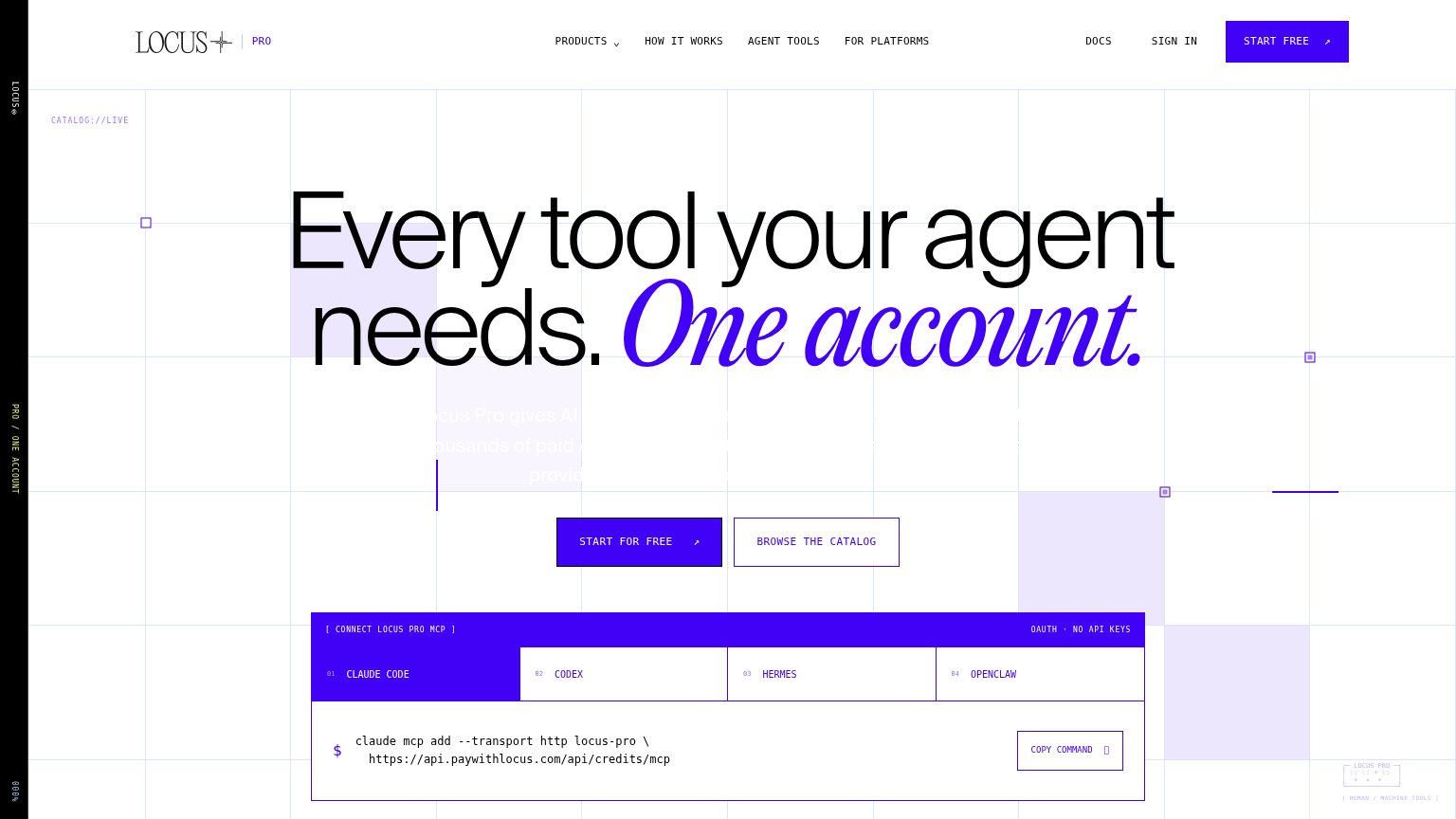
| Locus | MCP install widget with real command "claude mcp add --transport http locus-pro" and "OAUTH · NO API KEYS" label |
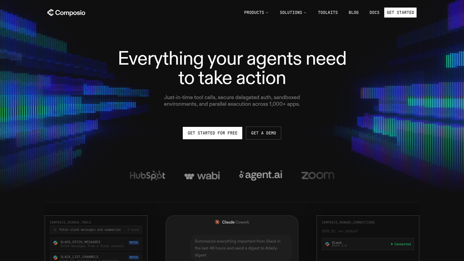
| Customer logo strip: HubSpot, wabi, agent.ai, Zoom | |
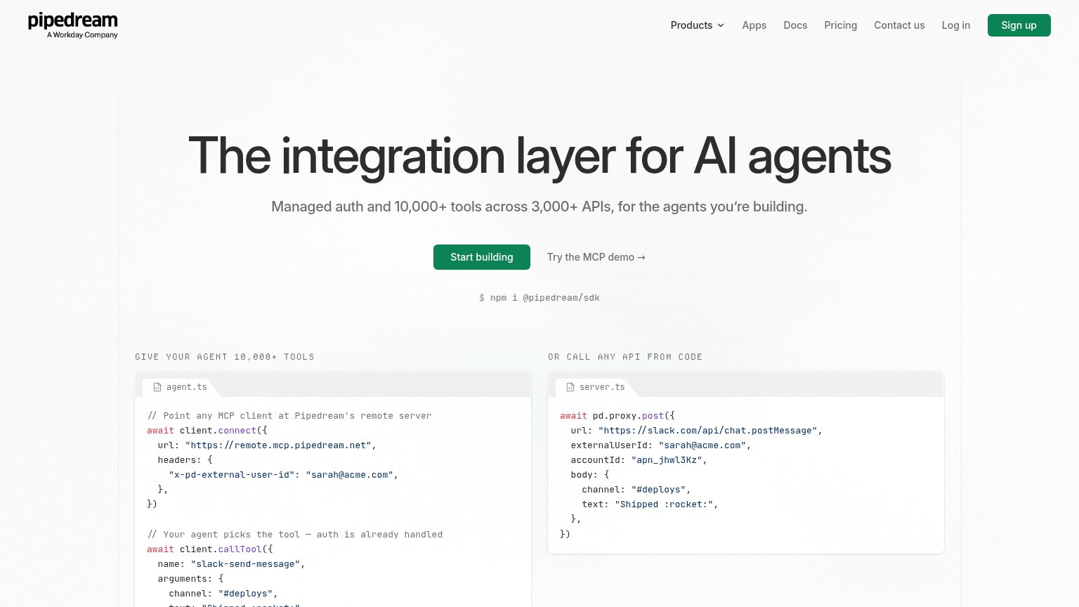
| "A Workday Company" mark under the Pipedream logo | |
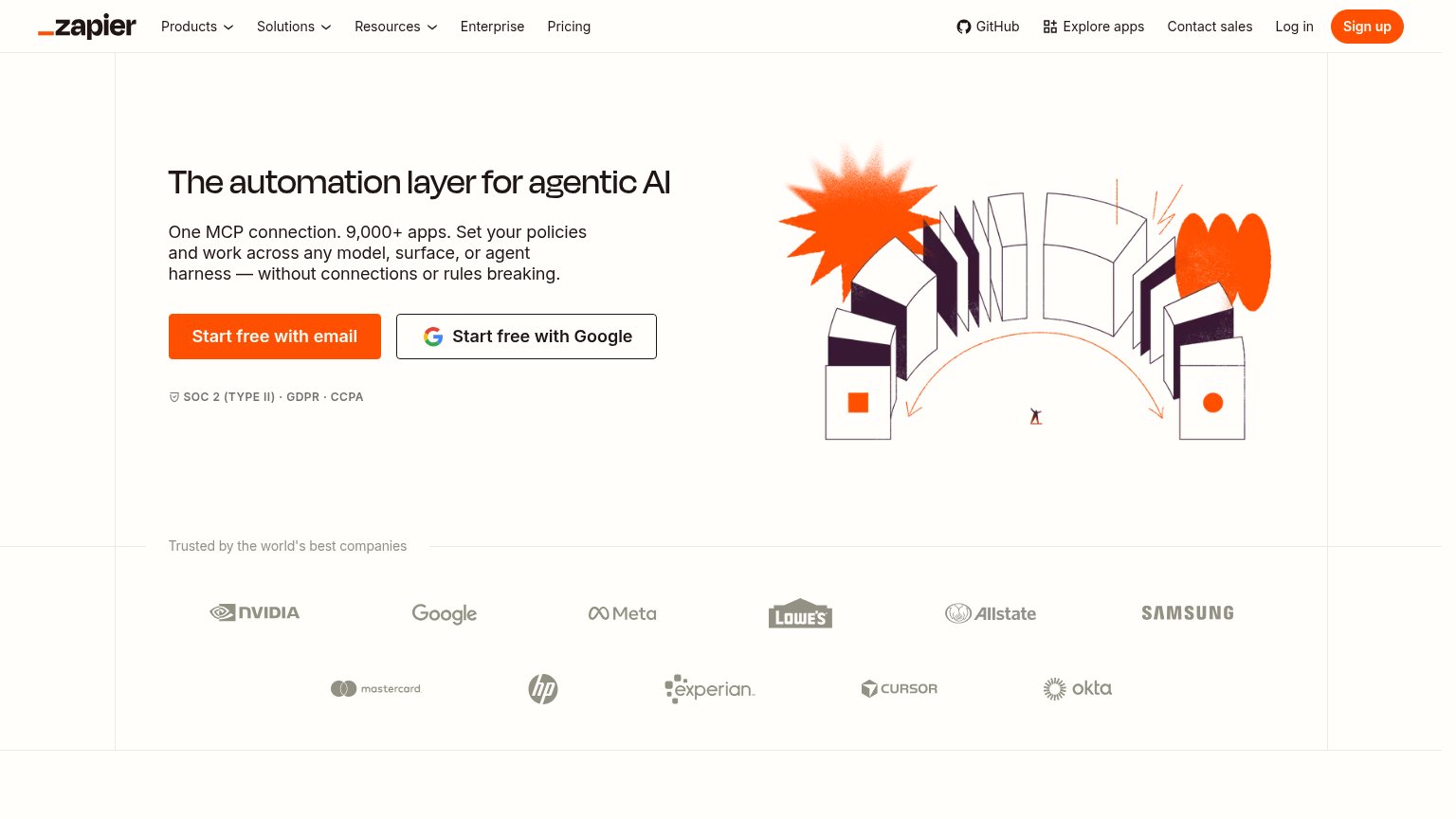
| "Trusted by the world's best companies" logo wall (NVIDIA, Google, Meta, Lowe's, Allstate, Samsung, Mastercard, HP, Expe | |
| MCP server cards with usage counts, e.g. "Exa Search — 9.18k uses" and "OneSignal — 22.49k uses" | |
| "Backed by Y Combinator" badge with GitHub "5.8k ★" pill above the headline |
Mobile web
58FairThe phone experience as a first-class citizen.
 1
- One account line — Oversized script overlaps the headline's descenders and crowds the paragraph below it.
Value props
62FairTitle, subtitle, hero — do they sell the product's true value?
Locus’s headline undersells
Every tool your agent needs. One account.
Locus Pro gives AI ... thousands of paid ... provid...
Working
- Outcome-led: one account, no API keys
- Copy-paste MCP command shows the product
- Agent-audience targeting is instant
Could improve
- Subhead is illegible against background
- No concrete numbers in the fold
- Catalog size and providers unnamed
Information hierarchy
64FairDoes the design help or inhibit what the page is trying to say?
1234- Washed-out subheadline text — White text on the pale grid background makes the value-prop paragraph unreadable.
- Browse the Catalog button — Same size as the primary CTA beside it, splitting the one action into two equal choices.
- Nav Start Free button — Duplicates the hero CTA at full weight, adding a second purple target before the headline is read.
- MCP install widget — Four tabs plus a terminal command compete for attention inside the first viewport before the CTA converts.
CTA
84StrongCopy, size, verb, cost-feel — does the primary CTA earn the click?
Problems
- nav says 'START FREE', hero differs
- terminal block competes for attention
- hero button smaller than MCP widget