
Your landing page’s weakest score is Trust.
How Forge Robotics ranks
- 1.
Forge Robotics70
- 2.
Hadrian62
- 3.
Bright Machines58
- 4.
Isembard56
70Growth scoreupdated
category scores
category scoresShowHide
Score over time
Trust
44PoorProof that the product is real, competent, and safe to try.
| Trust read | |
|---|---|
| Forge Robotics | Photorealistic robotic arm product image beneath the hero |
| No visible trust signal identified. | |
| No visible trust signal identified. | |
| Multi-location timezone bar listing CA, AZ, AL, and DC facilities with live local times |
Value props
72FairTitle, subtitle, hero — do they sell the product's true value?
Forge Robotics’s headline sells
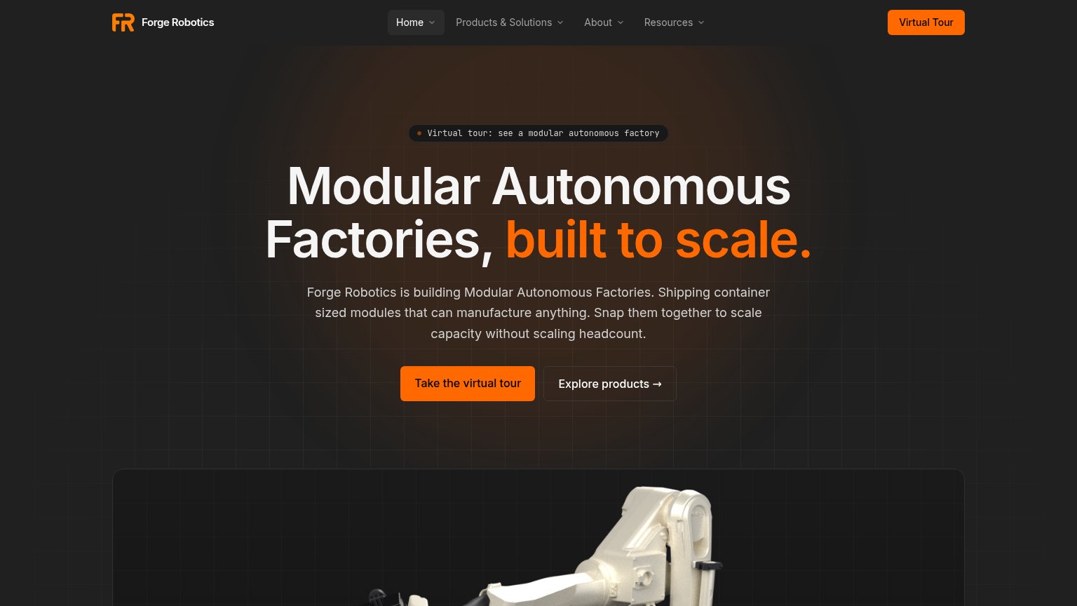
Modular Autonomous Factories, built to scale.
Forge Robotics is building Modular Autonomous Factories. Shipping container sized modules that can manufacture anything. Snap them together to scale capacity without scaling headcount.
Working
- Concrete 'shipping container' mental model
- 'Without scaling headcount' names real outcome
- Category-defining, not buzzword soup
Could improve
- No numbers anywhere in the fold
- 'Manufacture anything' is unproven overclaim
- Hero image shows a part, not the modular system
CTA
76FairCopy, size, verb, cost-feel — does the primary CTA earn the click?
Problems
- 4 words, past single-fixation ideal
- nav says 'Virtual Tour', hero differs
- tour is a demo, not product entry
Mobile web
78FairThe phone experience as a first-class citizen.
 123
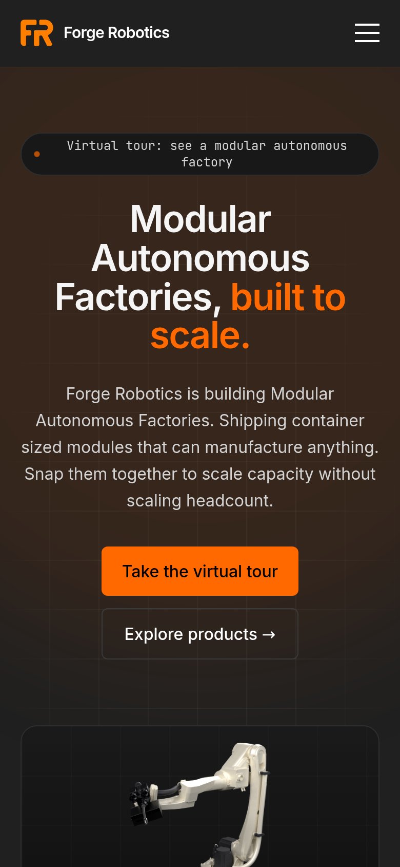
- Hero headline wrap — Desktop-sized type wraps into four uneven lines with 'scale.' orphaned on its own line.
- Virtual tour pill — Monospace eyebrow wraps to two lines, duplicating the CTA's message and crowding the headline.
- Body paragraph block — Seven lines of body copy push the primary CTA toward the bottom of the fold.
Information hierarchy
82StrongDoes the design help or inhibit what the page is trying to say?
123- Header Virtual Tour button — Duplicates the hero's primary CTA in the same orange, splitting the fold's one action across two targets.
- Explore products button — Secondary button sits at near-equal size beside the primary CTA, pulling clicks away from the tour.
- Four dropdown nav items — Four expandable menus above the hero multiply exit paths before the visitor reaches the CTA.