
Your landing page’s weakest score is CTA.
How Exonic ranks
46Growth scoreupdated
category scores
category scoresShowHide
Score over time
CTA
30PoorCopy, size, verb, cost-feel — does the primary CTA earn the click?
Problems
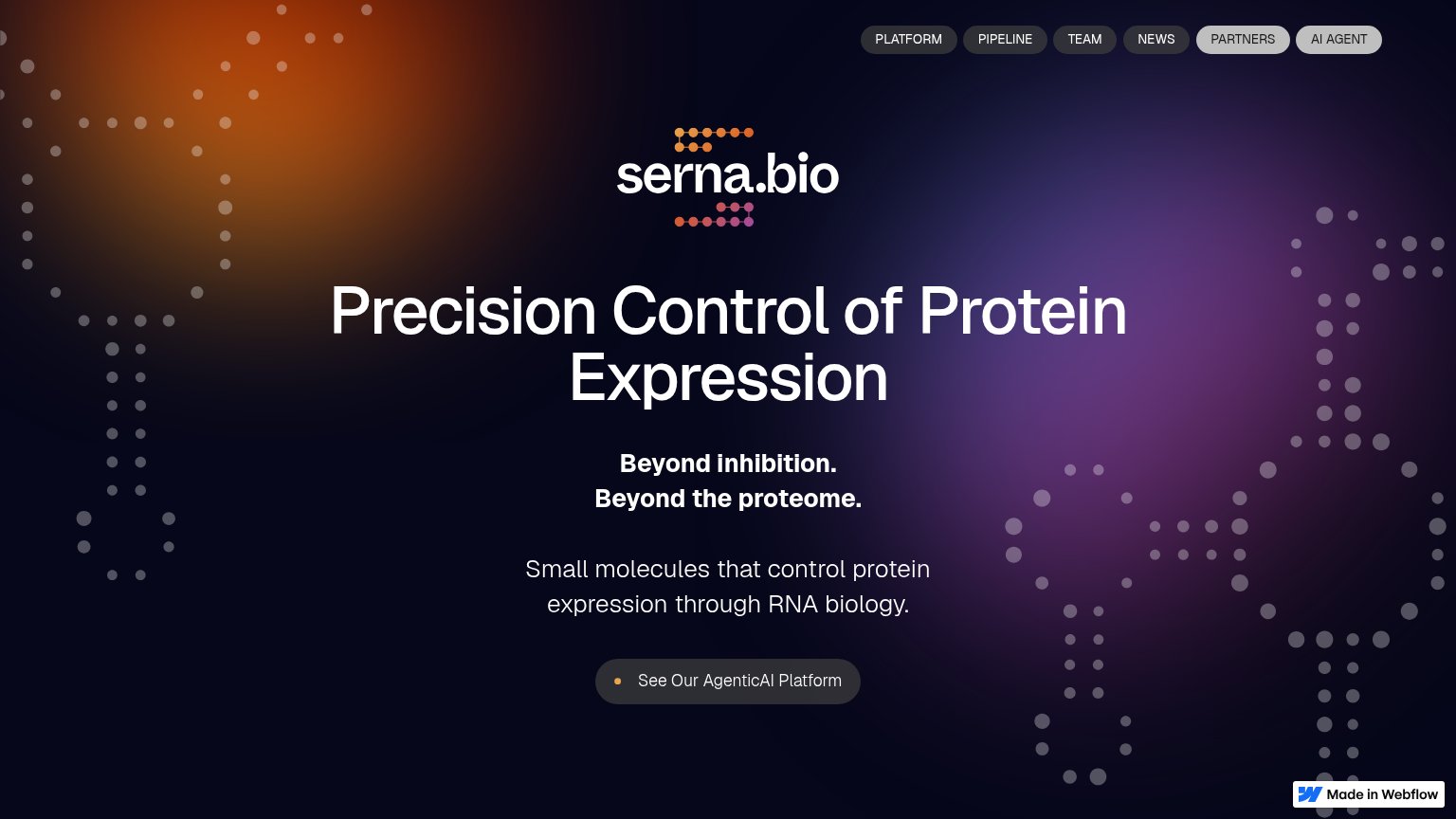
- no CTA anywhere on the fold
- nav links only path forward
- headline promise has no next step
Value props
48PoorTitle, subtitle, hero — do they sell the product's true value?
Exonic’s headline vague
Imagine if medicine could sense and adapt to disease
Working
- Evocative, emotionally resonant vision line
- Blue highlight on "sense and adapt" focuses the claim
- YC badge lends early credibility
Could improve
- No subhead saying what Exonic actually builds
- "Imagine if" is hypothetical, not a claim
- Hero visual decorates, doesn't demonstrate
Trust
48PoorProof that the product is real, competent, and safe to try.
| Trust read | |
|---|---|
| Exonic | "Backed by Y Combinator" badge with YC logo |
| "Strand is a clinical-stage biotechnology company with a pipeline of breakthrough mRNA therapeutics for cancers and auto | |
| "Senti Bio is a clinical-stage company developing a new generation of cell and gene therapies" copy on mobile | |
| No visible trust signal identified. |
Mobile web
48PoorThe phone experience as a first-class citizen.
 123
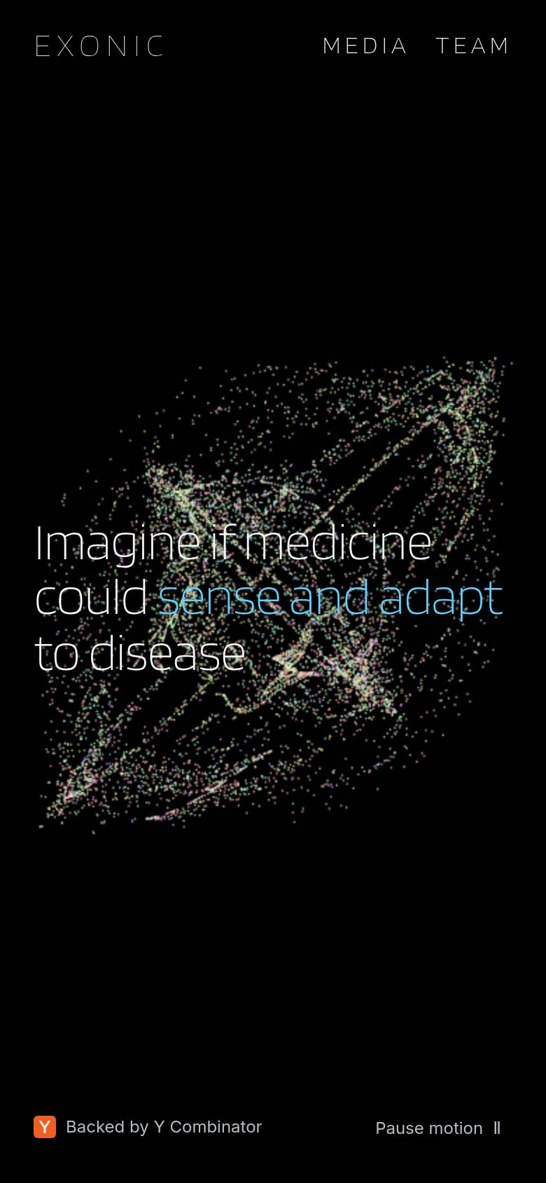
- Headline over particles — Hero copy sits on the dense particle field with no visible CTA anywhere in the fold — the blue 'sense and adapt' span blends into the busy texture.
- Uncollapsed nav row — Desktop 'MEDIA TEAM' links carried into the phone header instead of a hamburger, with wide letter-spacing eating the header width.
- Pause motion control — A utility control gets the bottom-corner slot a conversion CTA should own; it competes with the YC badge as the only footer actions.
Information hierarchy
58FairDoes the design help or inhibit what the page is trying to say?
 12
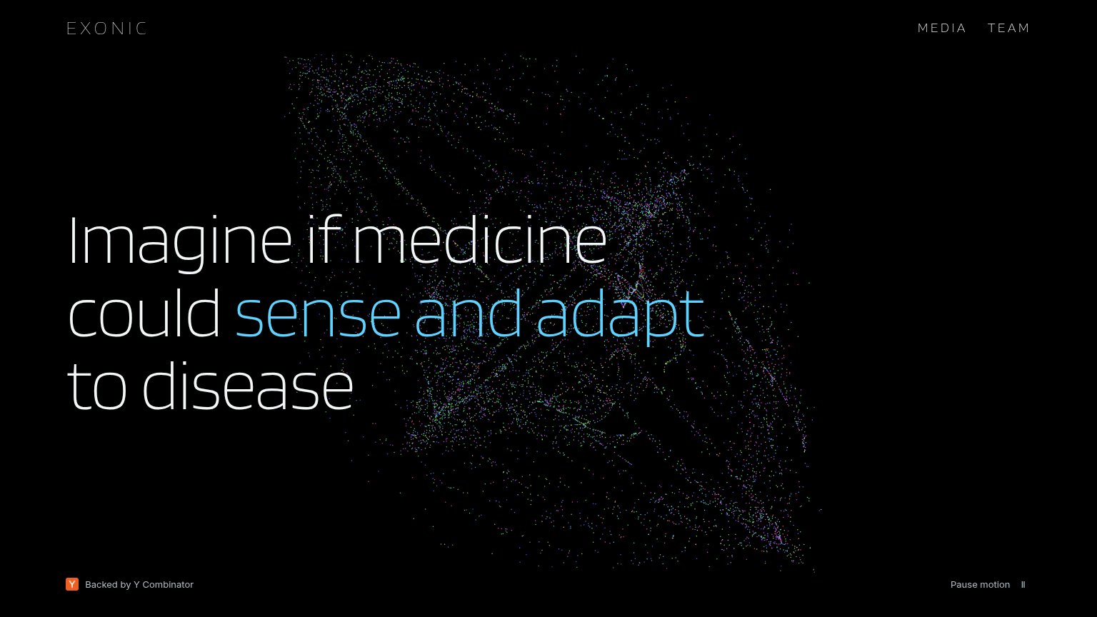
- MEDIA TEAM nav — The only prominent buttons on the page lead away from any conversion, making exits the default action.
- Headline over particles — The dot field runs behind 'sense and adapt', softening legibility of the accented key phrase.