
Your landing page’s weakest score is Trust.
How Denki ranks
73Growth scoreupdated
category scores
category scoresShowHide
Score over time
Trust
62FairProof that the product is real, competent, and safe to try.

| Trust read | |
|---|---|
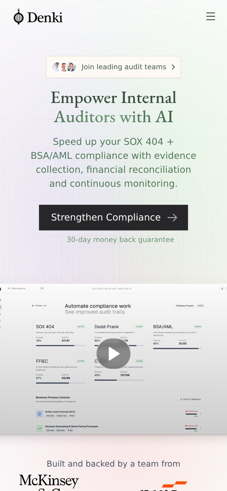
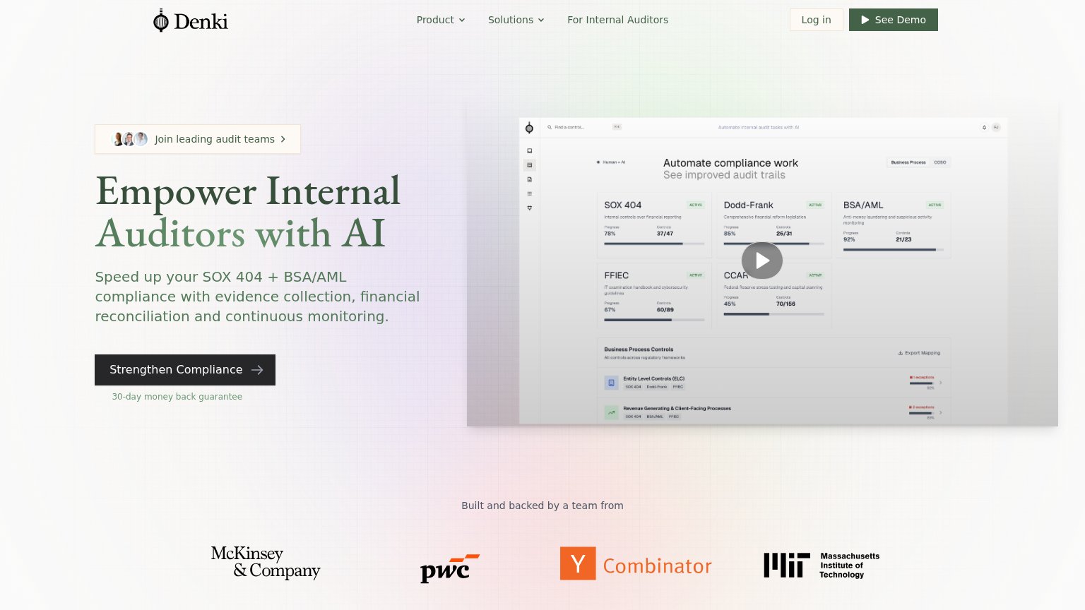
| Denki | Detailed product dashboard screenshot showing SOX 404, Dodd-Frank, and BSA/AML controls with progress and exception coun |
| "Trusted by 3,500+ global companies" logo bar (lululemon, DoorDash, Shopify, HubSpot, Roblox, Twilio) | |
| Product workflow UI showing "Upload Evidence / Test Autonomously / Generate Workpaper" with a NetSuite User Access Revie | |
| implicit context Workiva may benefit from pre-existing familiarity among its target audience. | |
| No visible trust signal identified. | |
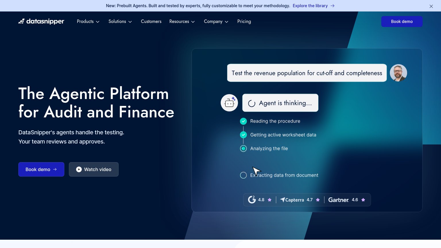
| Review-score strip in the hero demo: G2 4.8, Capterra 4.7, Gartner 4.6 |
CTA
70FairCopy, size, verb, cost-feel — does the primary CTA earn the click?
Problems
- click outcome is vague
- competes with 'See Demo' in nav
- abstract verb, no product value cue
Information hierarchy
76FairDoes the design help or inhibit what the page is trying to say?
123- See Demo nav button — Styled at equal weight to the hero CTA, splitting the primary action between two dark buttons.
- Join audit teams pill — Sits directly above the headline in the scan path and pulls the first glance before the value prop lands.
- Video play overlay — Low-contrast play button floats over dense dashboard cards, making it unclear whether the screenshot is clickable.
Value props
76FairTitle, subtitle, hero — do they sell the product's true value?
Denki’s headline sells
Empower Internal Auditors with AI
Speed up your SOX 404 + BSA/AML compliance with evidence collection, financial reconciliation and continuous monitoring.
Working
- Subhead names SOX 404 + BSA/AML explicitly
- Hero image shows real control dashboards
- Audience named directly in headline
Could improve
- 'Empower...with AI' is a generic frame
- No quantified outcome or time saved
- No emotional hook for audit pain
Mobile web
82StrongThe phone experience as a first-class citizen.
123- Announcement pill banner — The 'Join leading audit teams' pill sits above the headline, pushing the H1 down and the CTA near the bottom edge of the first viewport.
- Strengthen Compliance button — The primary CTA lands at the very bottom of the fold; any slightly shorter viewport clips it entirely.
- Product screenshot text — The embedded dashboard capture scales down to illegible micro-type on the phone, adding noise without communicating anything.