Where do apps place upsells around checkout — and how common is it?
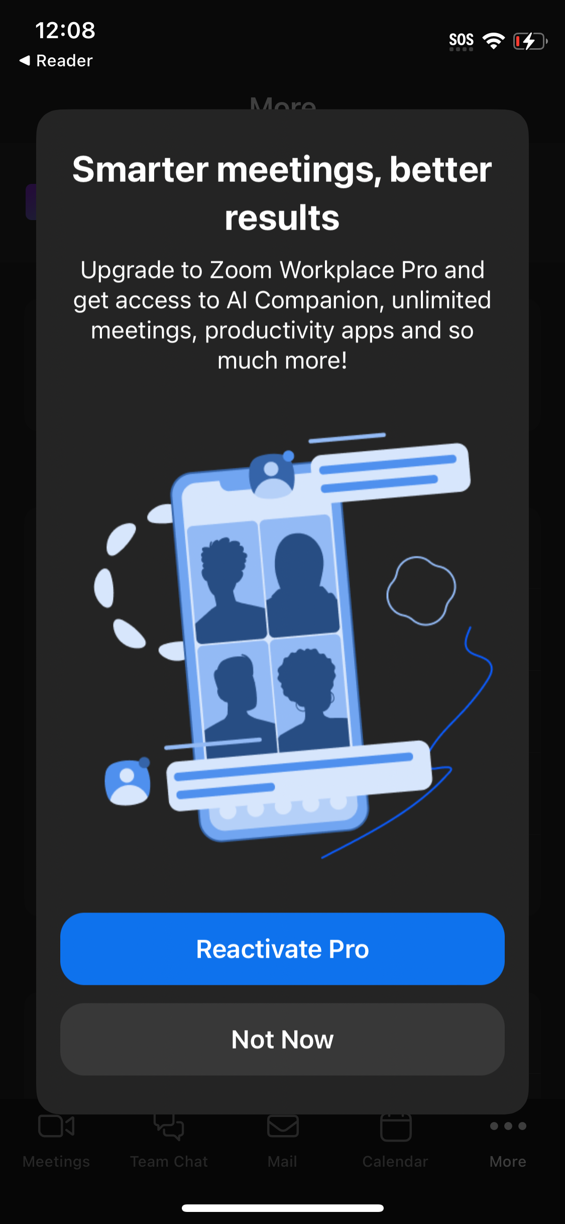
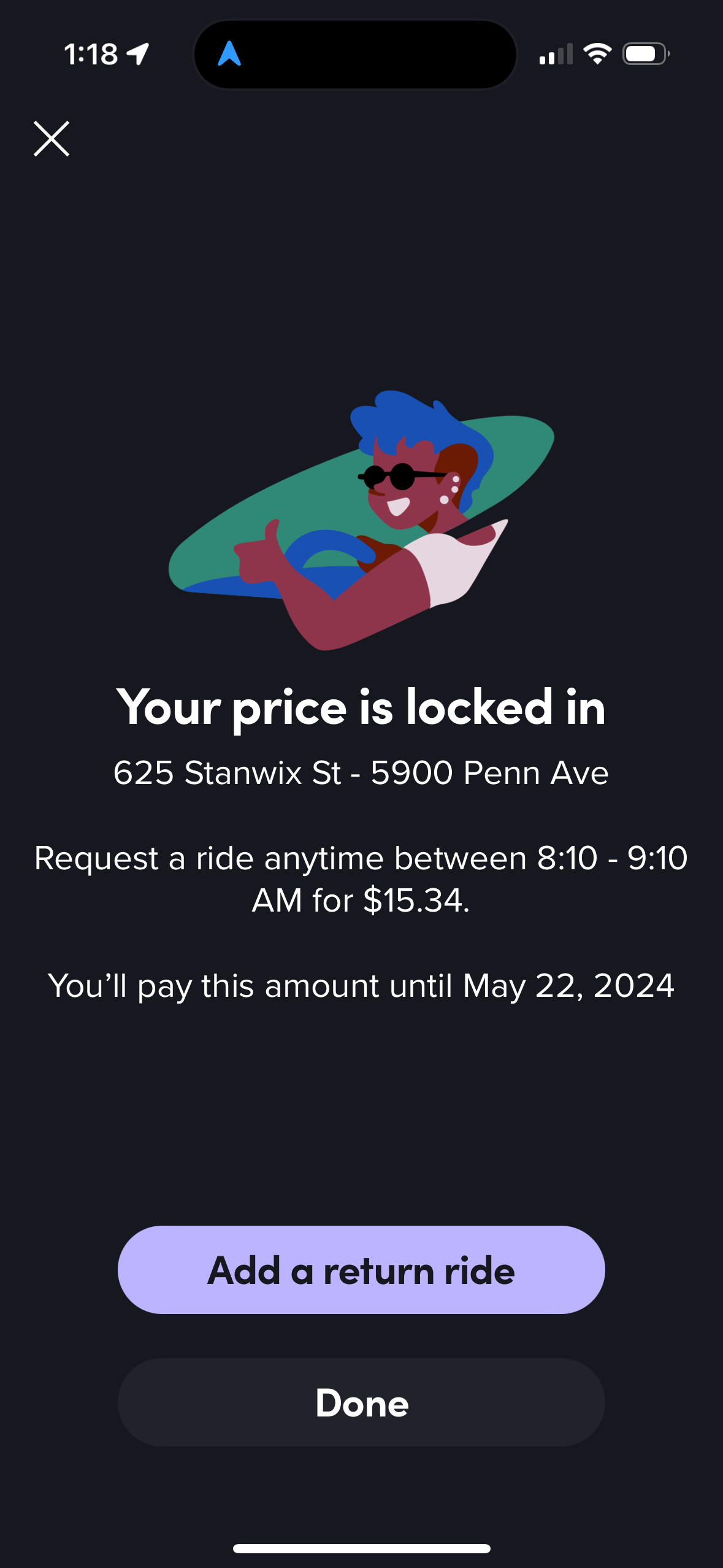
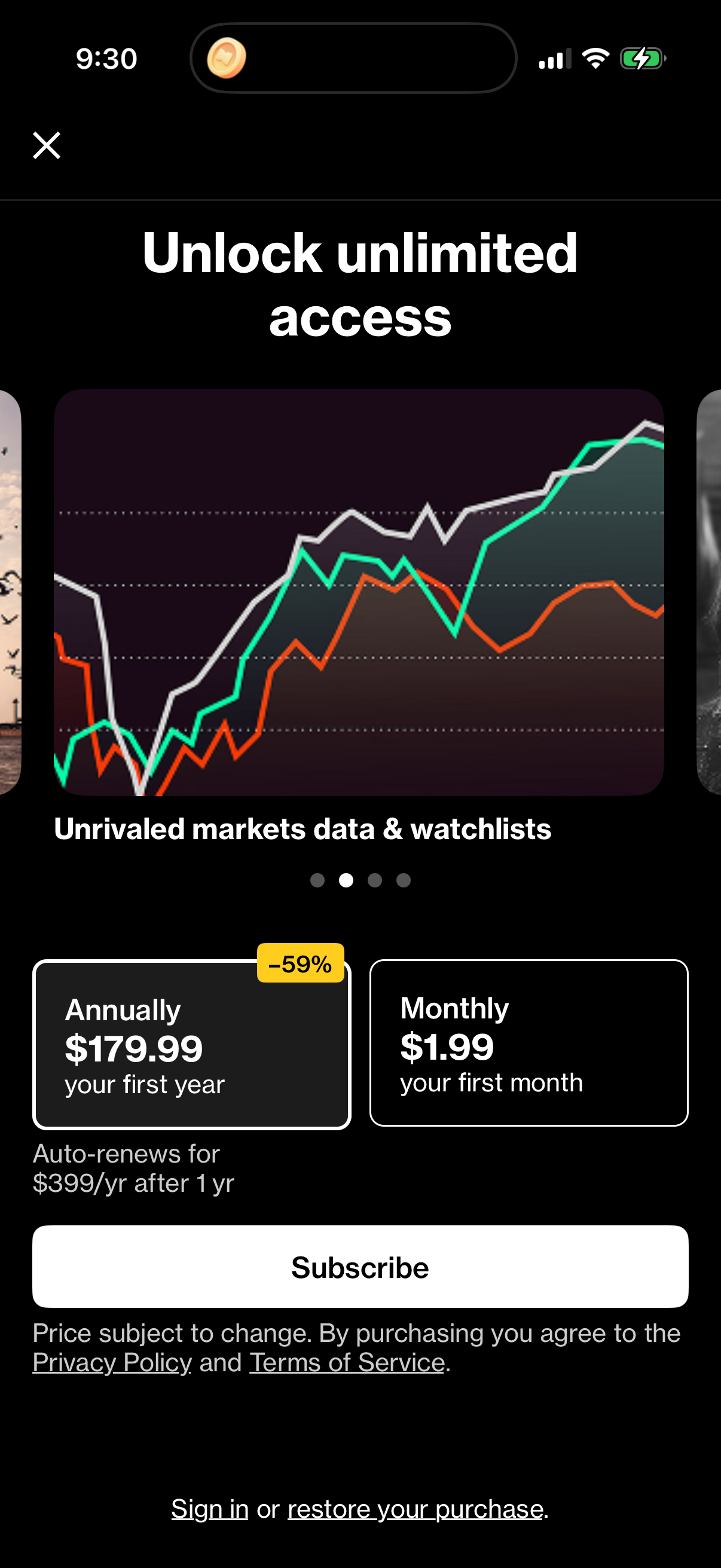
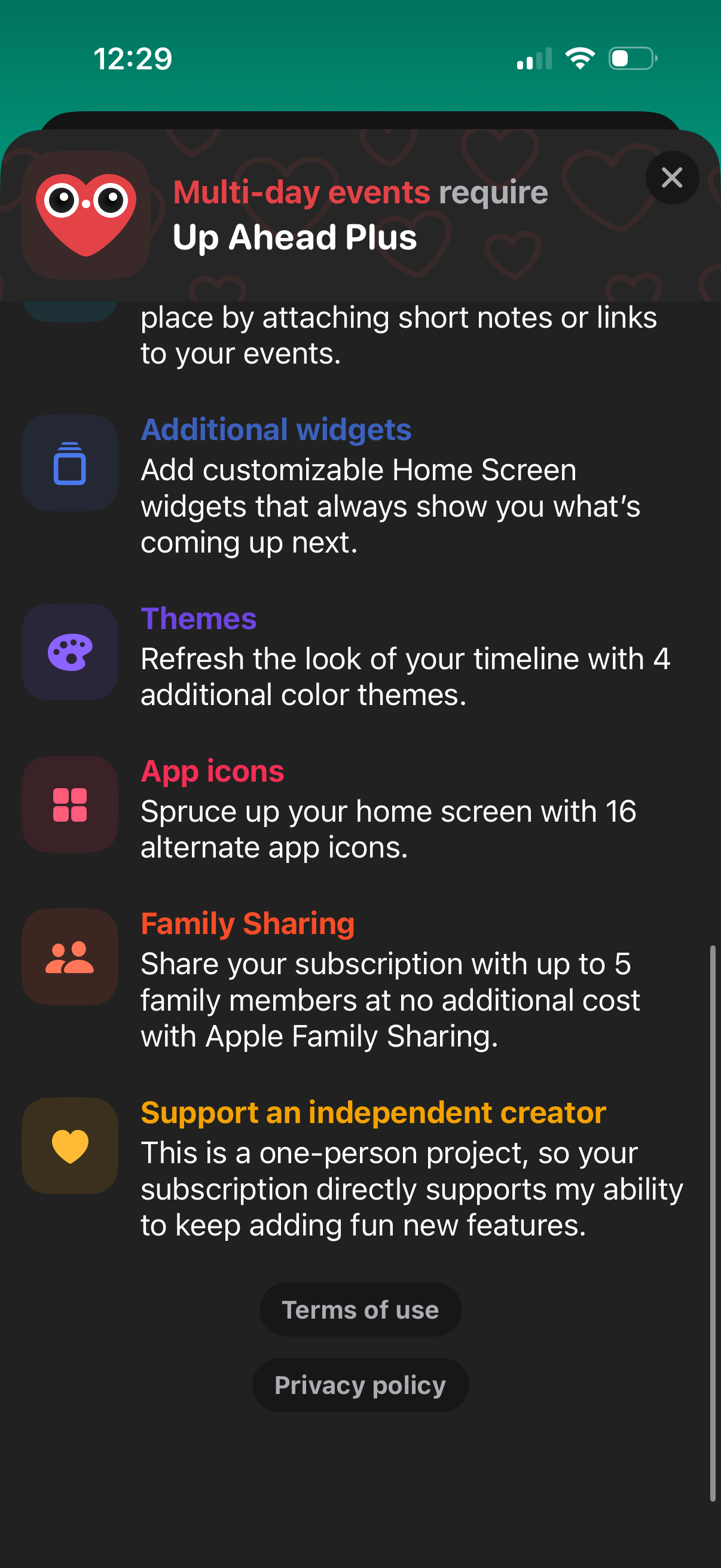
Checkout upsell is the single largest checkout sub-category in the corpus: 70 of 169 canonical checkout screens (41%) are 'checkout upsell', spanning 33 apps [1]. That is more screens than the core 'checkout' category itself (43) [2]. Upsells surfaced at or near checkout are the norm, not the exception, among tracked apps.
70 of 169 canonical checkout screens (41%) are checkout upsells across 33 apps — the largest checkout sub-category, Lazyweb Research, July 2026.
| Item | Screens |
|---|---|
| Checkout upsell | 70 |
| Checkout | 43 |
| Apple payment modal | 18 |
| Cart | 14 |
| Make a payment | 8 |
| Choose payment | 7 |
| Order confirmation | 3 |
| Payment method | 3 |
The finding: upsells outnumber plain checkout screens
Breaking the 169-screen checkout cluster into categories, 'checkout upsell' is the biggest bucket at 70 screens across 33 apps — larger than the core 'checkout' category (43) [1][2].
| Category | Screens |
|---|---|
| Checkout upsell | 70 |
| Checkout | 43 |
| Apple payment modal | 18 |
| Cart | 14 |
| Make a payment | 8 |
| Choose payment | 7 |
| Order confirmation | 3 |
| Payment method | 3 |
The volume of upsell screens indicates apps invest heavily in surfacing an offer at or near the moment of purchase [1].
How to apply this
Two qualitative teardowns show what these upsells look like in practice. doordash tightened displayed delivery-time estimates and increased shown DashPass savings at the checkout/order-summary step; instacart moved a restaurant upsell card from a seasonal, deadline-bound offer to evergreen Instacart+ savings copy with a later expiry [3]. The pattern to borrow: pair the upsell with concrete, quantified value (savings amount, tighter delivery window) at the order-summary moment rather than a generic 'upgrade' prompt. Both are observed changes with inferred rationale, so treat them as design precedent, not conversion proof.
Caveats
The corpus categorizes screens as 'checkout upsell' but the underlying keyword for placement ('order summary') undercounts apps that say 'order details' or 'order total', so this page does not publish an order-summary-placement percentage [3]. Sample is 33 apps for upsell screens; the doordash and instacart examples are single-company observed UI changes with LLM-inferred rationale, not measured A/B lift [3].
The numbers
| Stat | Computed from |
|---|---|
| 70 of 169 checkout screens (41%) are checkout upsell, across 33 apps | checkout_upsell_screens (70 screens / 33 companies); 70/169 = 41.4% |
| 43 core 'checkout' screens; 18 apple payment modal; 14 cart | app_checkout_category_breakdown: checkout 43, apple payment modal 18, cart 14 |
| doordash and instacart reworked checkout/upsell value framing (observed changes) | qualitative: doordash tighter delivery windows + larger DashPass savings; instacart seasonal->evergreen Instacart+ upsell |
Sources & citations
- [1] Lazyweb Research analysis of 169 canonical checkout screens across 77 mobile apps (mobile app corpus), July 2026. 70 canonical 'checkout upsell' screens across 33 companies within the 169-screen checkout cluster. ↩
- [2] Lazyweb Research analysis of 169 canonical checkout screens across 77 mobile apps (mobile app corpus), July 2026. Category breakdown of the checkout/payment/cart cluster (checkout 43, apple payment modal 18, cart 14, etc.). ↩
- [3] Lazyweb Research analysis of 81 detected checkout experiments across 19 companies (mobile app corpus), July 2026. doordash and instacart qualitative teardowns; order-summary keyword undercounts, so no placement percentage is published. ↩
Source: Lazyweb Research — proprietary analysis of real, in-market app screens. Cite as Lazyweb Research, 2026-07-07.