How did Uber Eats test a benefit list against a benefit grid in its subscription paywall?
Author: Ali Abouelatta
Tags: monetization, paywall, subscription, conversion
The screenshots show the observed design change, not a measured winner.
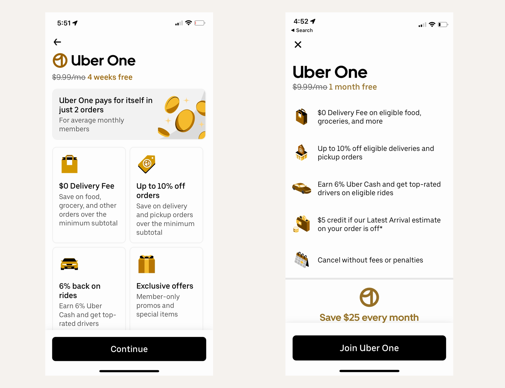
Short answer: Uber Eats tested a denser Uber One benefit list against a four-card grid, while also changing the free-period label, adding a monthly savings claim, and renaming the CTA to Join Uber One. The screenshots show the observed design change, not a measured winner.
Evidence
Lazyweb Research compared Uber Eats control and experiment screenshots from its mobile A/B test library. The experiment replaced a card grid with a list that puts more value claims above the fold and aligns the CTA with membership intent.
What changed
- Control: a four-card benefit grid, four-week-free framing, and generic Continue CTA.
- Experiment: a longer benefit list, one-month-free framing, explicit monthly savings, and Join Uber One CTA.
- The layout shifted from visual grouping to faster vertical scanning.
Why it matters
- The variant tests whether a vertical list can reduce comparison effort while keeping more benefit detail visible above the fold.
- A membership-specific CTA makes the intended action more explicit than Continue; teams can test whether that specificity helps their own checkout.
Sources
- [1] Lazyweb Research: Most up to date mobile A/B test library tracking +1000 apps weekly. Get access here
Methodology. Product-experiment write-up by Ali Abouelatta, dated on June 3, 2026. Source links are listed below. Lazyweb Research: mobile A/B test library