How Many Signup and Login Screen Experiments Do Top Apps Run?
Lazyweb Research detected 347 before/after auth-screen experiments across 85 companies in the tracked corpus[1]. Observed changes cluster around brand-first welcome redesigns, provider-button contrast, pre-filled inputs, and moving incentives onto the signup form itself[2]. These are observed UI changes with inferred rationale, not measured conversion lift — use them as a pattern library, not as proof of what wins.
347 detected auth-screen experiments across 85 companies — Lazyweb Research, July 2026.

The finding
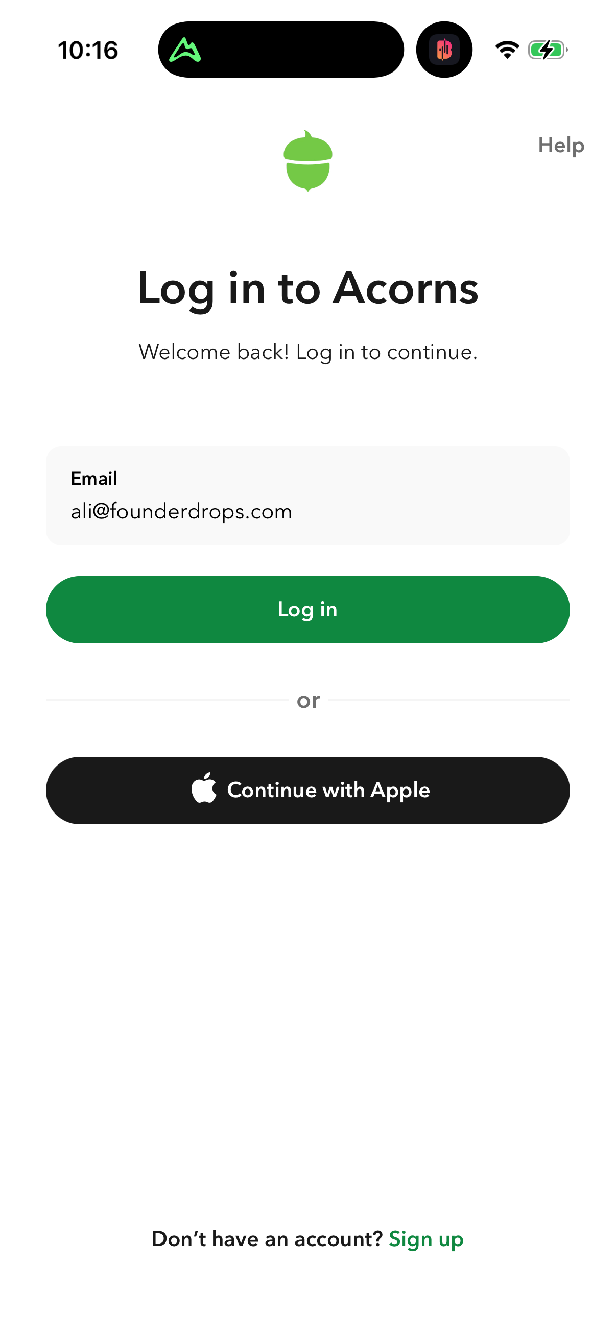
Across the corpus, 347 before/after UI experiments were detected on signup/login screens, spanning 85 companies[1]. That is a high experimentation rate for a single surface, underscoring that the auth screen is one of the most actively tested moments in a mobile funnel. Each detection is a captured visual diff plus an LLM-inferred rationale — not a measured result[2].
Observed change patterns
Recurring, real observed changes in the detected set include:
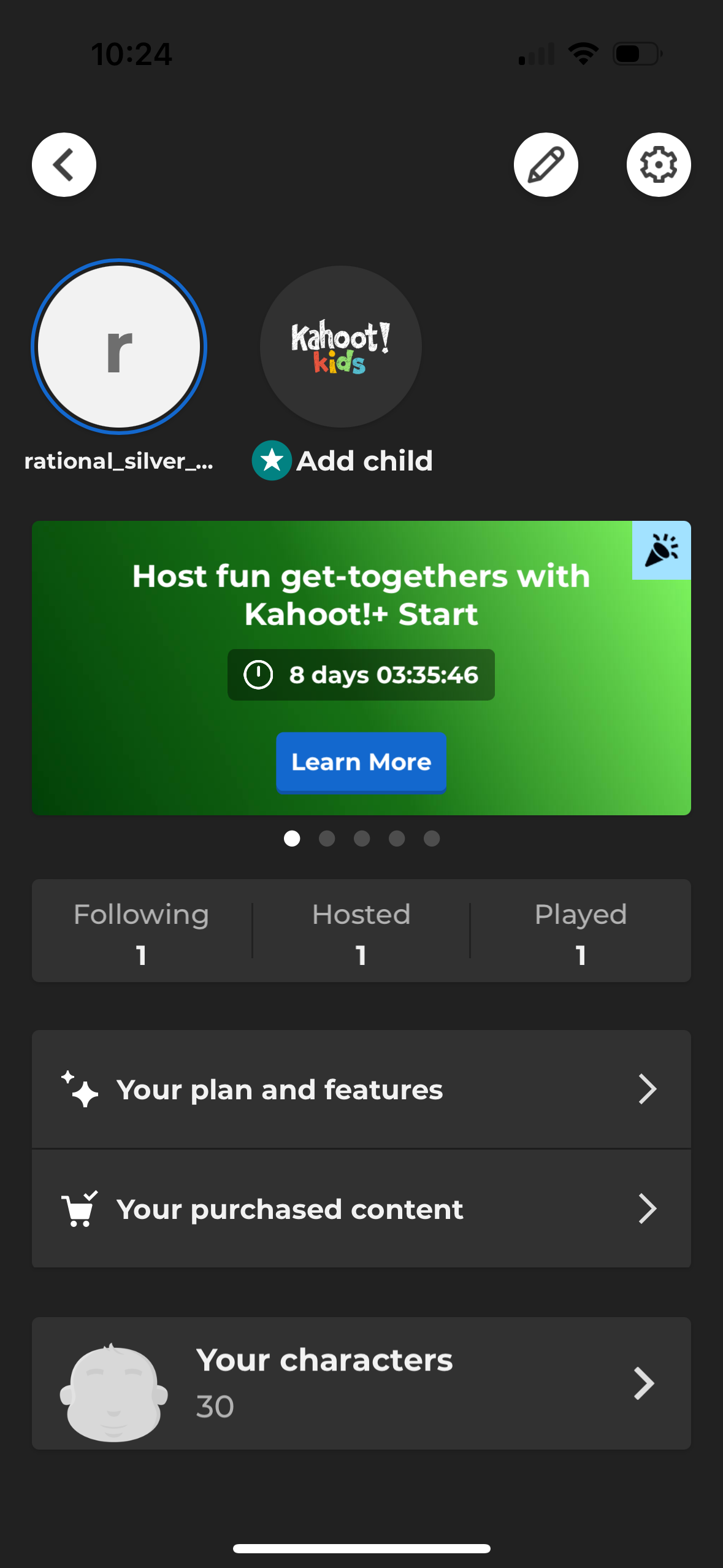
- Brand-first welcome redesigns — replacing avatar/profile entry cards with a centered-logo welcome plus Google/Apple buttons and a prominent email CTA (observed at Yelp and CapCut)[2].
- Incentive on the form — swapping a marketing carousel for a signup form carrying a concrete discount, e.g. 'up to 40% off your first order' (observed at DoorDash)[2].
- Pre-filled vs neutral inputs — pre-filled example phone numbers and numeric keypads tested against empty/neutral placeholders (observed at Cash App and Crumbl)[2].
- Provider-button contrast — social buttons shifted to higher-contrast light-on-dark styling for easier tapping (observed at Ancestry)[2].
How to apply it
Use these as a hypothesis backlog for your own auth screen: brand-first welcome, incentive-on-form, input pre-fill, and button contrast are the moves peers are actively testing. But run your own A/B test before believing any direction — the corpus records that a change happened and infers why, not whether it lifted conversion. Note some diffs reverted (e.g. Cash App reverting a pre-filled placeholder to empty), which is itself a signal that these are genuinely uncertain bets.
Caveats
The 347 count is detected before/after diffs, not confirmed live experiments, and rationales are LLM-inferred[2]. Company anecdotes here are drawn only from the recorded qualitative diffs; no lift figures exist in this dataset, so do not treat any pattern as a proven winner.
The numbers
| Stat | Computed from |
|---|---|
| 347 detected auth-screen experiments across 85 companies | auth_experiments_count stat |
| observed change patterns (brand-first welcome, incentive-on-form, pre-filled vs neutral inputs, button contrast) | qualitative diffs: yelp, capcut, doordash, cash-app, crumbl, ancestry |
Sources & citations
- [1] Lazyweb Research analysis of 347 detected auth-screen experiments across 85 companies, July 2026. Before/after UI diffs on signup/login screens; detected changes, not measured conversion lift. ↩
- [2] Lazyweb Research analysis of qualitative auth-screen diffs (Yelp, CapCut, DoorDash, Cash App, Crumbl, Ancestry), July 2026. Observed visual changes with LLM-inferred rationale; some diffs later reverted. ↩
Source: Lazyweb Research — proprietary analysis of real, in-market app screens. Cite as Lazyweb Research, 2026-07-07.