
Your landing page’s weakest score is Value props.
How Zenbu ranks
40Growth scoreupdated
category scores
category scoresShowHide
Value props
22PoorTitle, subtitle, hero — do they sell the product's true value?
Zenbu’s headline vague
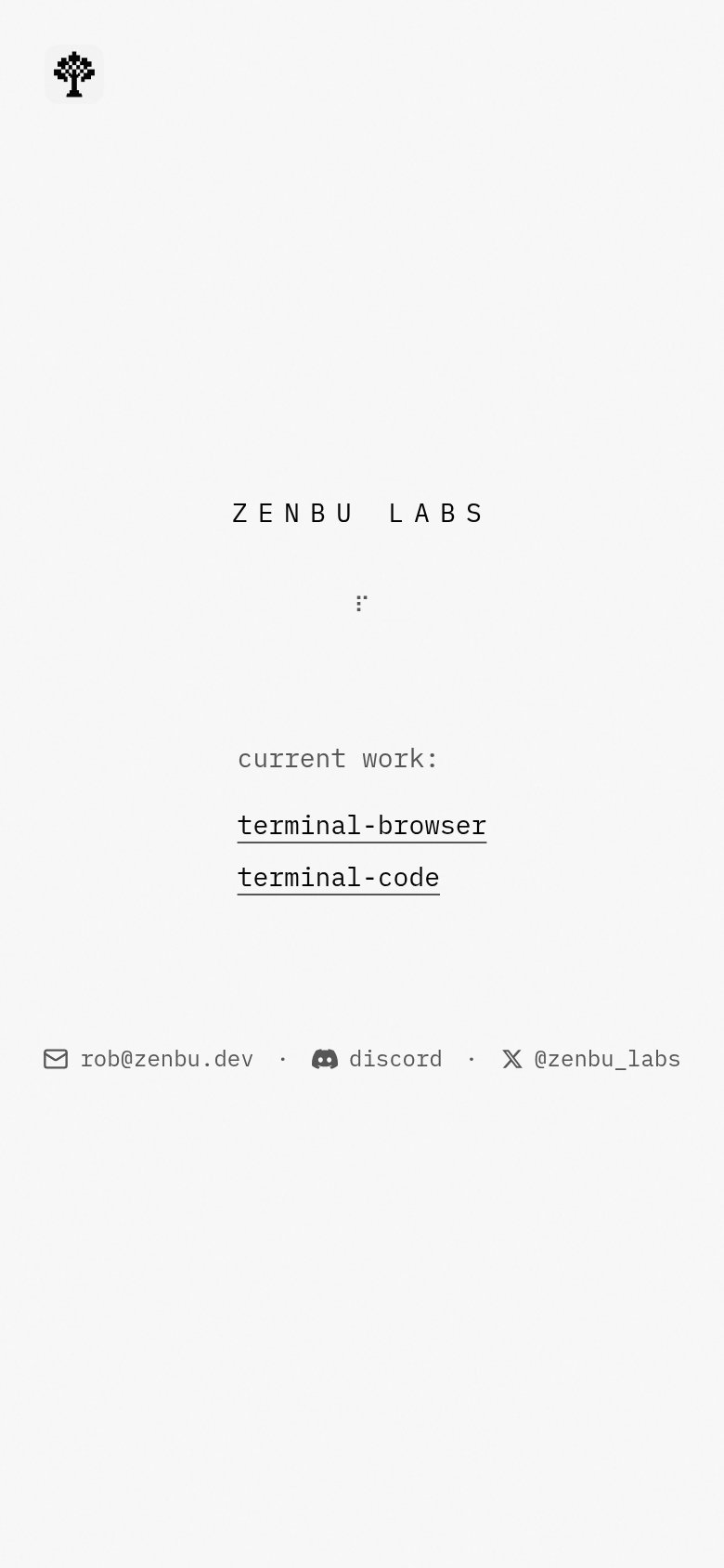
ZENBU LABS
Working
- Minimal page focuses eyes on two projects
- Project names hint at terminal-native tools
- Direct contact links build indie credibility
Could improve
- No sentence says what Zenbu does
- Project links lack any description
- Zero numbers, outcomes, or proof
Trust
38PoorProof that the product is real, competent, and safe to try.


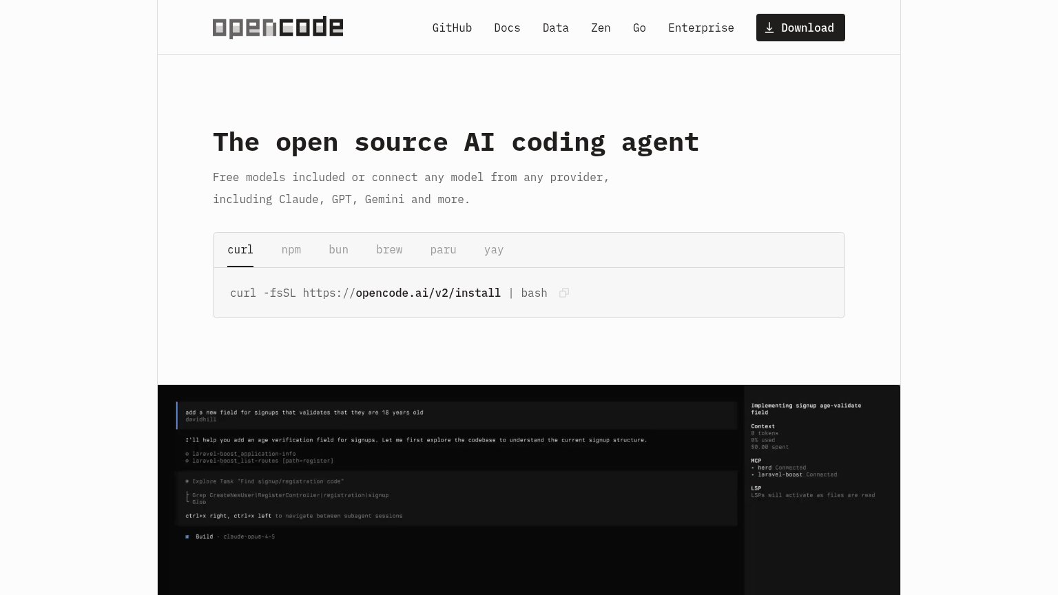
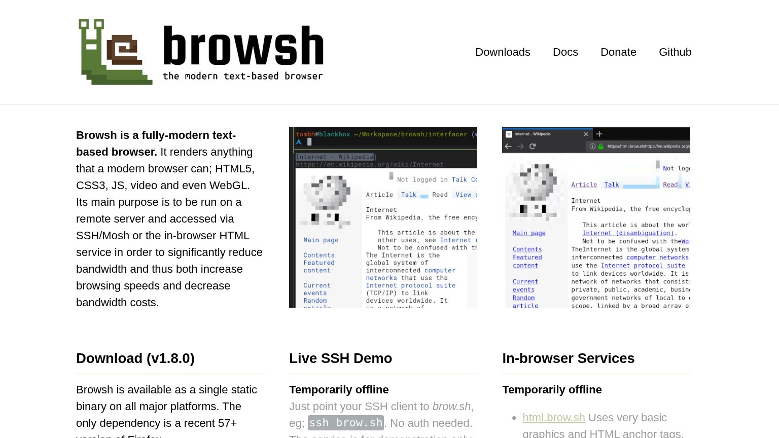
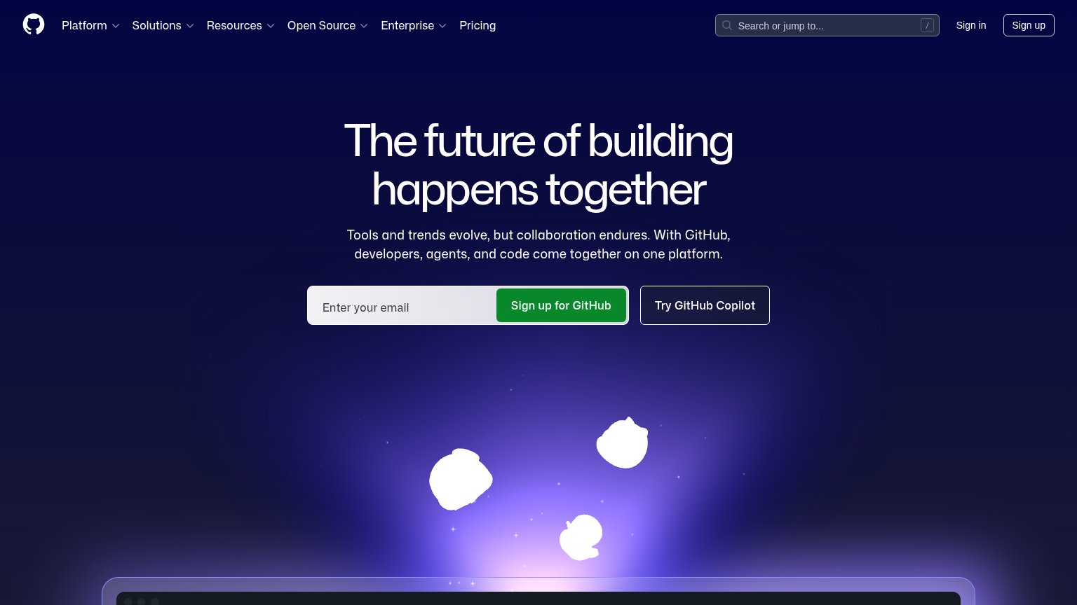
| Trust read | |
|---|---|
| Zenbu | Contact row with "rob@zenbu.dev", Discord, and "@zenbu_labs" links |
| Real terminal screenshots of Browsh rendering Wikipedia (text-based browser demo) | |
| Code editor screenshot with tabs "game.ts", "characters.module.css", "bonus-level.ts" | |
| Stat badges: "GITHUB STARS 44K", "INSTALLS 6.8M", "TOKENS/WEEK 15B" | |
| Real terminal demo showing the agent completing the task "add a new field for signups that validates that they are 18 ye |
CTA
42PoorCopy, size, verb, cost-feel — does the primary CTA earn the click?
How Zenbu compares
Recommended rewrites
Information hierarchy
44PoorDoes the design help or inhibit what the page is trying to say?
What works
What to improve
Mobile web
54FairThe phone experience as a first-class citizen.
What works
What to improve