
Your landing page’s weakest score is Trust.
How Zed ranks
76Growth scoreupdated
category scores
category scoresShowHide
Trust
62FairProof that the product is real, competent, and safe to try.
| Trust read | |
|---|---|
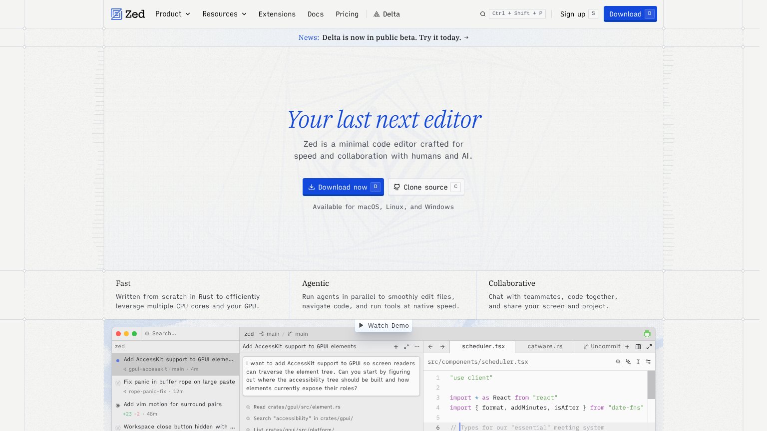
| Zed | Real editor screenshot showing an agent task "Add AccessKit support to GPUI elements" with live file tree and code |
| Embedded product demo window showing a Co-Pilot session inside "PulseCRM" with model picker ("Prometheus") | |
| Detailed 'Cursor Desktop' product UI showing the 'Plan Mission Control' agent workflow and Cursor CLI output | |
| Detailed product screenshot of the Sessions board with 'Running', 'Waiting for review', and 'Done' columns | |
| "Anthropic is a public benefit corporation dedicated to securing its benefits and mitigating its risks." | |
| "Backed by Y Combinator" badge below the CTAs |
Information hierarchy
76FairDoes the design help or inhibit what the page is trying to say?
 1234
- Duplicate Download buttons — Nav 'Download' and hero 'Download now' split primary CTA weight; nav version competes at the same visual priority.
- News beta banner — The 'Delta is now in public beta' banner is the first exit path visitors hit before the headline or CTA.
- Clone source button — Sits at nearly equal size and weight beside 'Download now', diluting the single-action scan path.
- Nav link row — Seven exits (Product, Resources, Extensions, Docs, Pricing, Delta, Sign up) leak attention above the CTA.
Value props
76FairTitle, subtitle, hero — do they sell the product's true value?
Zed’s headline
Your last next editor
Zed is a minimal code editor crafted for speed and collaboration with humans and AI.
Working
Could improve
CTA
82StrongCopy, size, verb, cost-feel — does the primary CTA earn the click?
How Zed compares
Recommended rewrites
Mobile web
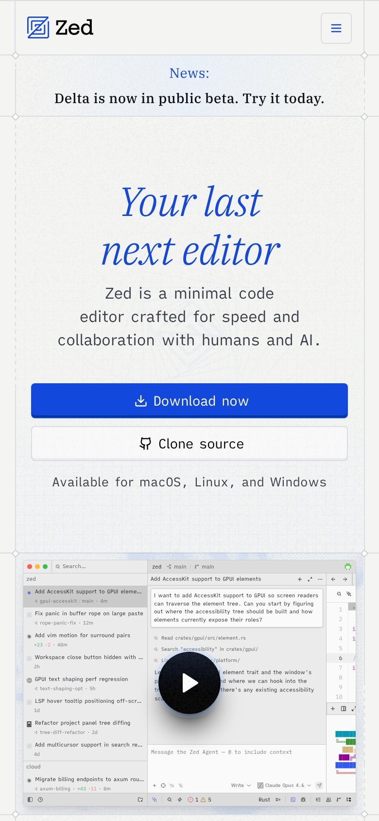
86StrongThe phone experience as a first-class citizen.
What works
What to improve