
Your landing page’s weakest score is CTA.
How Yseop ranks
73Growth scoreupdated
category scores
category scoresShowHide
CTA
63FairCopy, size, verb, cost-feel — does the primary CTA earn the click?
Problems
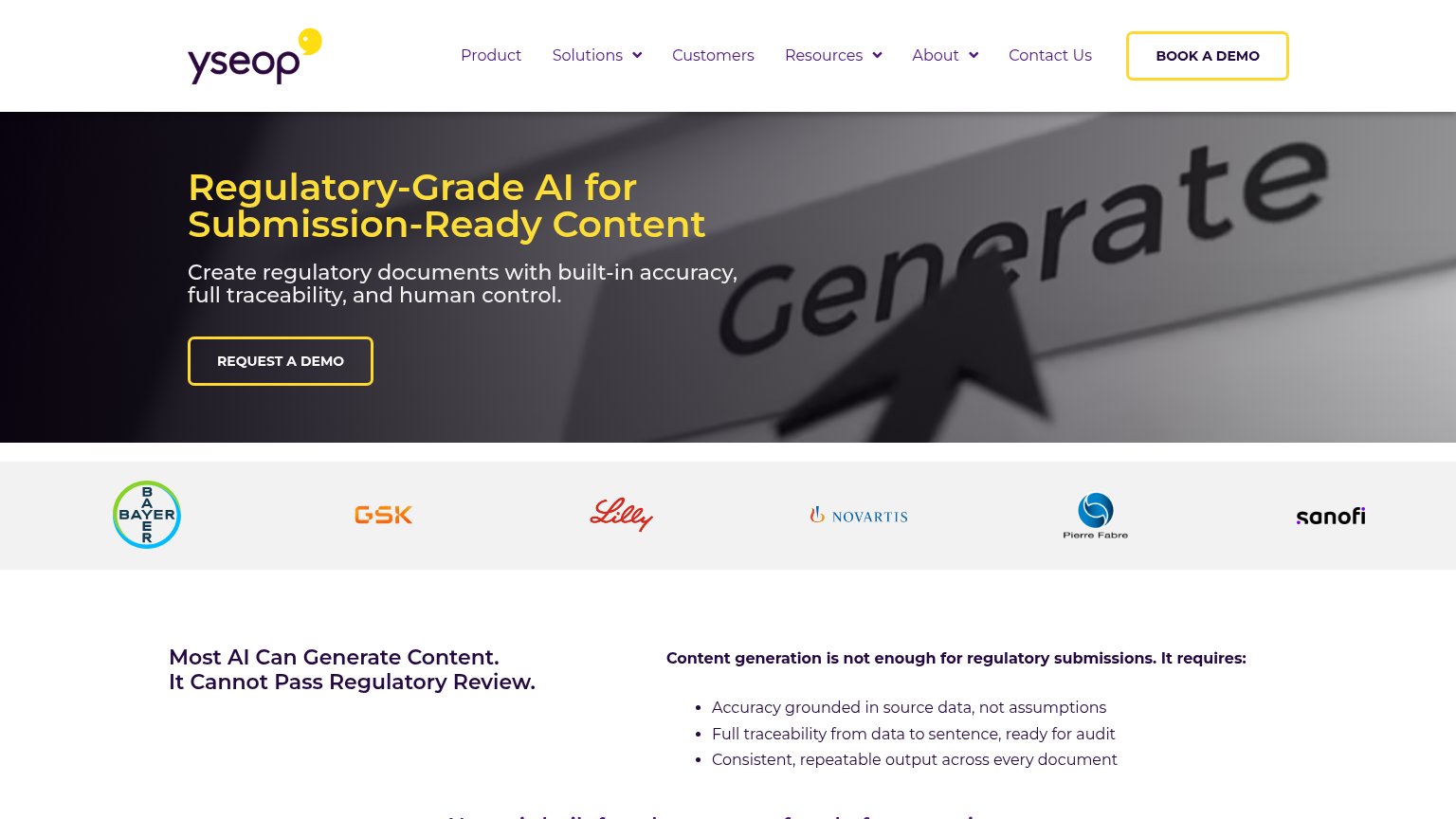
- 'Request' feels costly, gated
- hollow outline button, weak fill
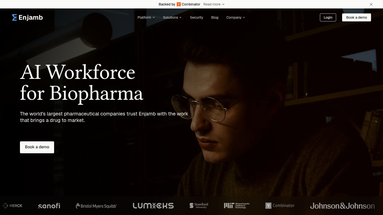
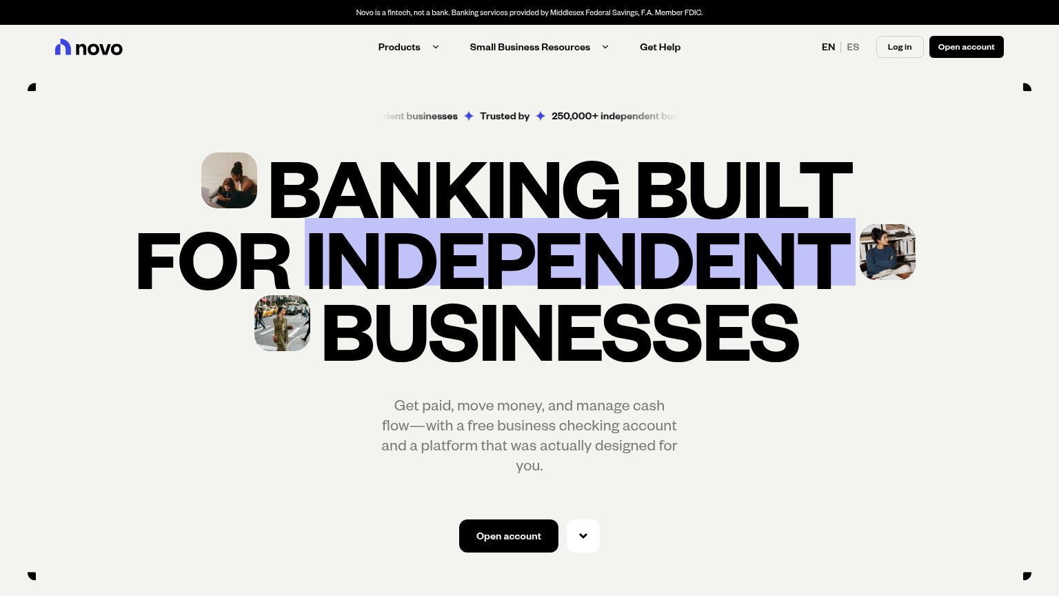
- label differs from nav 'Book a demo'
- no product value in the click
Information hierarchy
72FairDoes the design help or inhibit what the page is trying to say?
123- REQUEST A DEMO button — Ghost outline with transparent fill recedes into the dark hero; the primary action lacks the visual weight to be found in one second.
- BOOK A DEMO button — Duplicates the hero CTA with a different label, splitting the fold's action into two equally styled targets.
- Six-item nav row — Four dropdown menus plus Customers and Contact Us open exit paths before the visitor reaches the demo request.
Trust
72FairProof that the product is real, competent, and safe to try.
How Yseop compares
Trust read
Value props
78FairTitle, subtitle, hero — do they sell the product's true value?
Yseop’s headline
Regulatory-Grade AI for Submission-Ready Content
Create regulatory documents with built-in accuracy, full traceability, and human control.
Working
Could improve
Mobile web
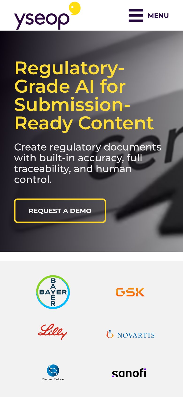
78FairThe phone experience as a first-class citizen.
What works
What to improve