
Your landing page’s weakest score is Information hierarchy.
How You.com ranks
74Growth scoreupdated
category scores
category scoresShowHide
Information hierarchy
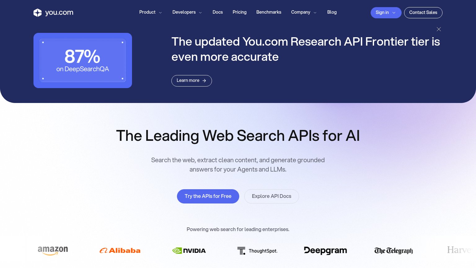
64FairDoes the design help or inhibit what the page is trying to say?
 1234
- Announcement banner — Occupies the top third of the fold, so "Learn more" outranks the actual value prop and primary CTA.
- Seven-link nav row — Product, Developers, Docs, Pricing, Benchmarks, Company, and Blog give attention seven exits before the hero loads.
- Sign in button — Filled in the same blue as "Try the APIs for Free", stealing visual priority from the primary conversion.
- 87% stat card — Sits at the same visual weight as the banner headline, splitting the top block into two competing focal points.
Trust
74FairProof that the product is real, competent, and safe to try.
| Trust read | |
|---|---|
| You.com | Enterprise logo wall: Amazon, Alibaba, NVIDIA, ThoughtSpot, Deepgram, The Telegraph |
| Live in-product prompt interface with "Flash" model selector and categorized AI tool grid (AI Docs, AI Slides, AI Images | |
| "Access to State-Of-The-Art LLMs" grid listing specific models (GPT, Sonnet, Gemini) with provider logos | |
| Product Hunt "#1 Product of the Day" badge | |
| Live product UI: working prompt bar with feature suite (AI Slides, AI Sheets, GenMail, Dashboards & CRM) | |
| Rows of named model tiles with provider icons (GPT-5.6-Sol, Claude-Opus-5, Kimi-K3, Grok-4.5) |
Mobile web
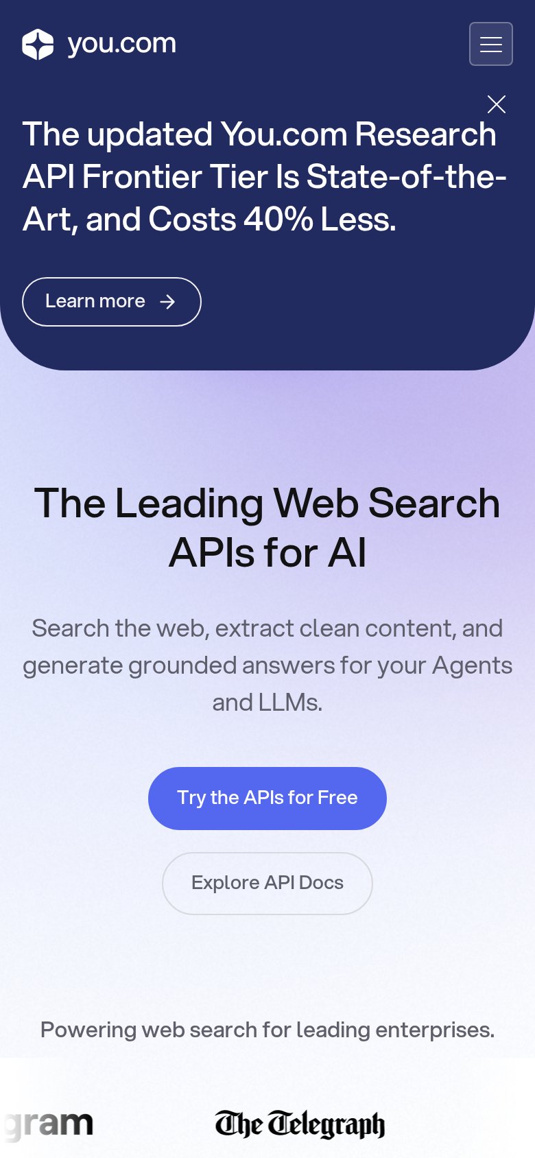
74FairThe phone experience as a first-class citizen.
What works
What to improve
Value props
76FairTitle, subtitle, hero — do they sell the product's true value?
You.com’s headline
The Leading Web Search APIs for AI
Search the web, extract clean content, and generate grounded answers for your Agents and LLMs.
Working
Could improve
CTA
83StrongCopy, size, verb, cost-feel — does the primary CTA earn the click?
How You.com compares
Recommended rewrites