
Your landing page’s weakest score is Mobile web.
How Xtime ranks
Mobile web
48PoorThe phone experience as a first-class citizen.
 1234
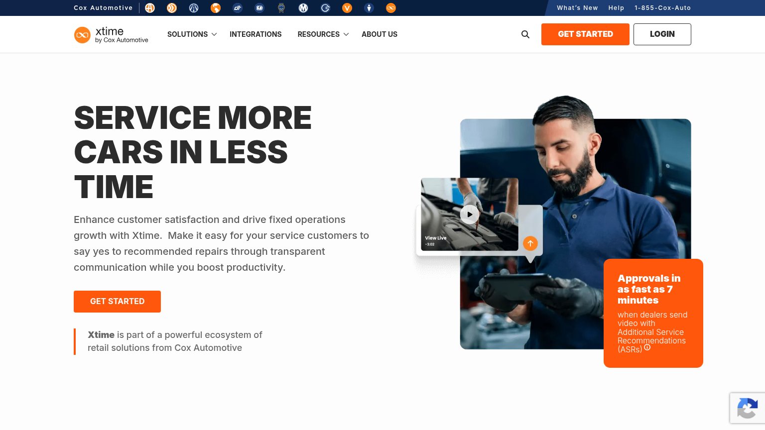
- Headline pushed below fold — The "SERVICE MORE CARS IN LESS TIME" headline and its CTA sit at the bottom of the viewport, so no action is tappable on first load.
- Double-decker sticky header — Two stacked blue utility bars (Cox Automotive row plus phone/Get Started/Login row) eat the top of the viewport before the brand header even starts.
- Oversized hero image block — The technician photo with orange stat card consumes most of the first viewport, displacing the value statement and primary CTA.
- Cramped ASR fine print — The "when dealers send video with Additional Service Recommendations (ASRs)" line wraps awkwardly with an info icon breaking mid-word.
Trust
58FairProof that the product is real, competent, and safe to try.
| Trust read | |
|---|---|
| Xtime | "Approvals in as fast as 7 minutes" when dealers send video with Additional Service Recommendations (ASRs) |
| No visible trust signal identified. | |
| Mobile hero product screenshot of the Job Board UI showing real repair orders and totals | |
| No visible trust signal identified. | |
| "Certified with Honda, Acura, Hyundai, Genesis, Audi, and more." | |
| No visible trust signal identified. |
Information hierarchy
62FairDoes the design help or inhibit what the page is trying to say?
What works
What to improve
CTA
72FairCopy, size, verb, cost-feel — does the primary CTA earn the click?
How Xtime compares
Recommended rewrites
Value props
78FairTitle, subtitle, hero — do they sell the product's true value?
Xtime’s headline
SERVICE MORE CARS IN LESS TIME
Enhance customer satisfaction and drive fixed operations growth with Xtime. Make it easy for your service customers to say yes to recommended repairs through transparent communication while you boost productivity.
Working
Could improve