
Your landing page’s weakest score is Mobile web.
How WireMock (WireMock Cloud) ranks
- 1.
Mockoon80
- 2.
WireMock (WireMock Cloud)71
- 3.
Archal67
- 4.
Speedscale66
- 5.
Mountebank / Blackbird by Ambassador58
71Growth scoreupdated
category scores
category scoresShowHide
Mobile web
58FairThe phone experience as a first-class citizen.
 1234
- Six-line hero headline — Desktop-sized headline wraps into six cramped lines, pushing both CTAs far below the first viewport.
- Promo banner — Sticky webinar banner consumes the top of the screen before the logo, delaying the hero and its CTA.
- Seven-line subhead paragraph — Long paragraph adds another full screen of text between the headline and the CTA pair.
- Chat bubble over CTA — Intercom bubble overlaps the corner of the Start free button, risking mis-taps on the primary action.
Information hierarchy
72FairDoes the design help or inhibit what the page is trying to say?
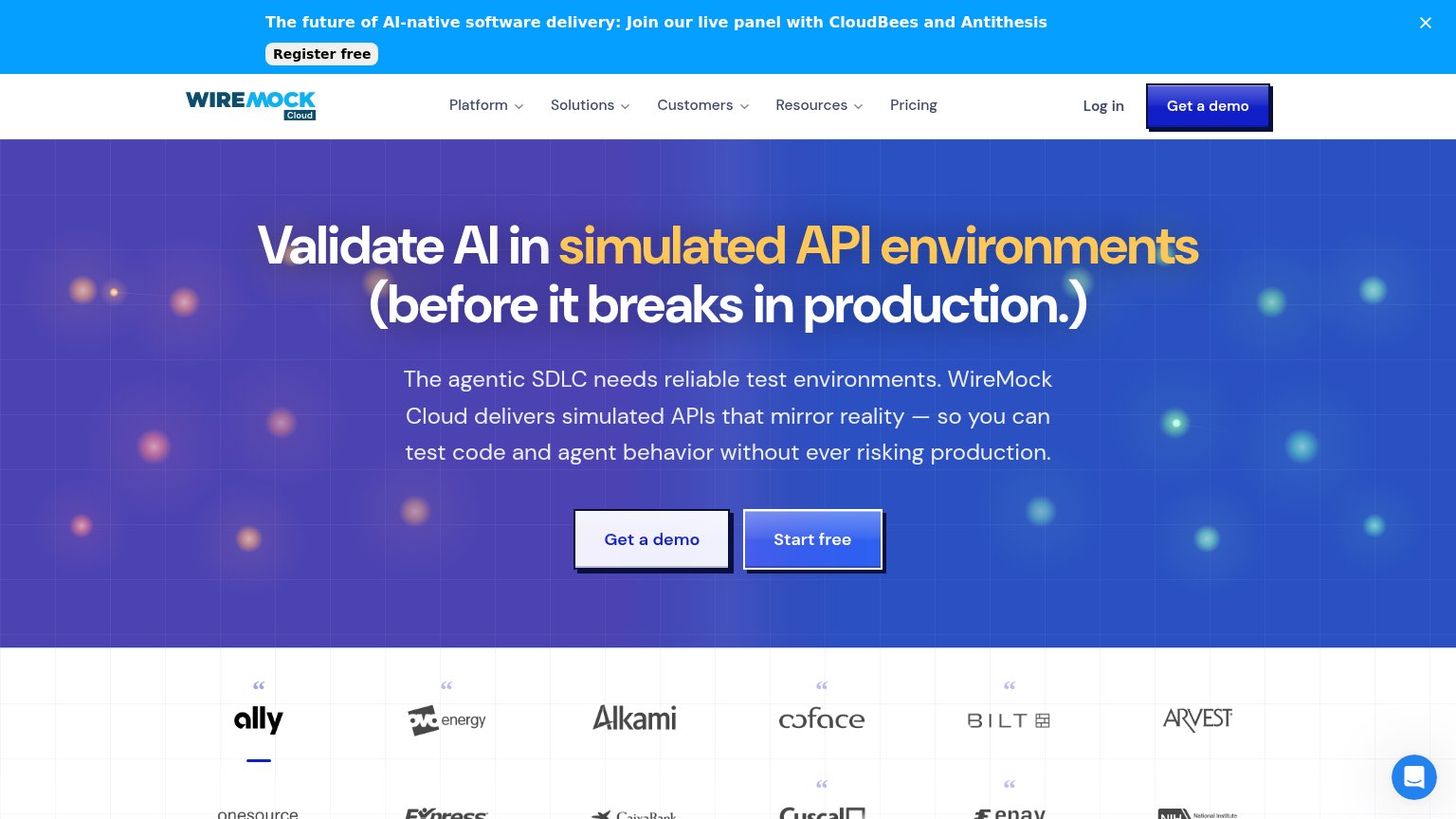 1234
- Paired hero CTAs — "Get a demo" and "Start free" share identical weight and size, splitting the one action the fold should direct.
- Webinar announcement banner — "Register free" is the first button in the scan path and exits to a webinar before the value prop is read.
- Nav Get a demo — Third demo/free button in the fold — duplicates the hero pair and adds noise to the scan path.
- Nav dropdown row — Five dropdown menus plus Pricing and Log in give eight exit paths before the headline.
Trust
72FairProof that the product is real, competent, and safe to try.
How WireMock (WireMock Cloud) compares
Trust read
CTA
76FairCopy, size, verb, cost-feel — does the primary CTA earn the click?
How WireMock (WireMock Cloud) compares
Recommended rewrites
Value props
76FairTitle, subtitle, hero — do they sell the product's true value?
WireMock (WireMock Cloud)’s headline
Validate AI in simulated API environments (before it breaks in production.)
The agentic SDLC needs reliable test environments. WireMock Cloud delivers simulated APIs that mirror reality — so you can test code and agent behavior without ever risking production.
Working
Could improve