
Your landing page’s weakest score is Trust.
How Webflow ranks
Trust
68FairProof that the product is real, competent, and safe to try.
| Trust read | |
|---|---|
| Webflow | implicit context Webflow may benefit from pre-existing familiarity among its target audience. |
| "Backed by Y Combinator" badge above the hero headline | |
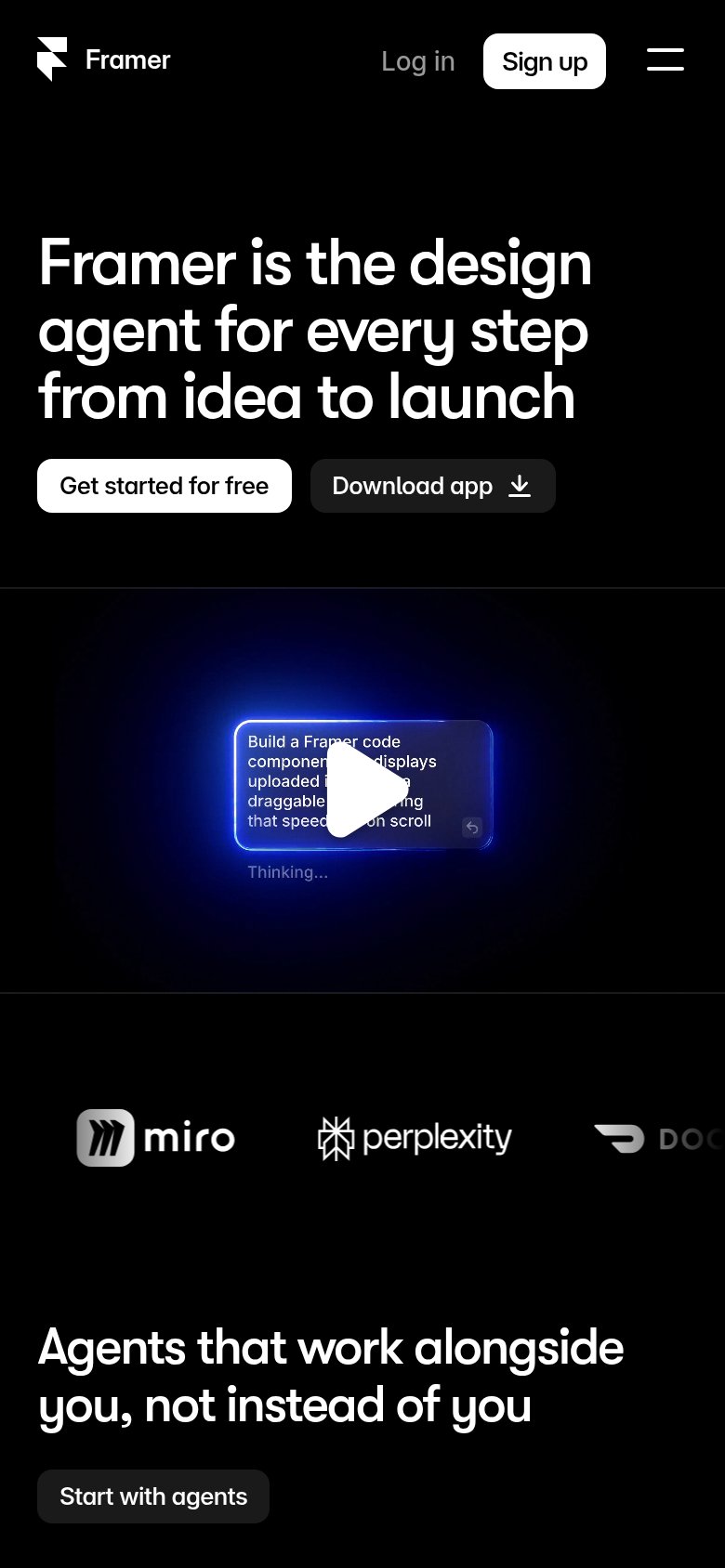
| Customer logo strip on mobile showing Miro, Perplexity, and DoorDash | |
| "Product of the day 1st" and "Product of the week 2nd" laurel award badges above the headline | |
| Template gallery with usage counts — "Brillance SaaS Landing Page — 14.5K · 2.1K" |
Mobile web
68FairThe phone experience as a first-class citizen.
 123
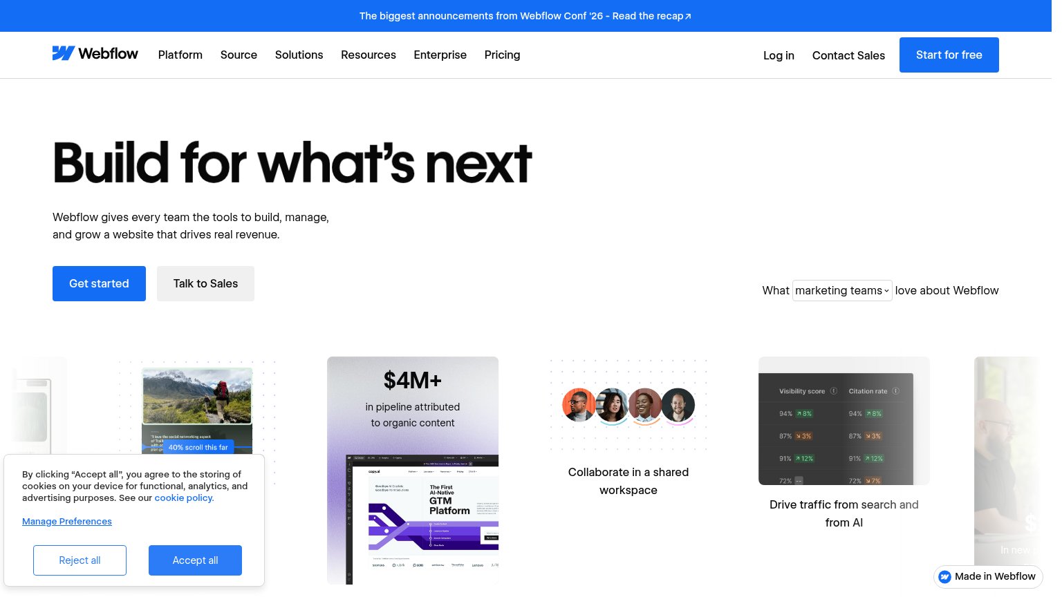
- Cookie consent banner — Dead blocker covering the bottom third of the fold with no conversion-valuable CTA.
- Get started button — Half-width and paired with Talk to Sales instead of a full-bleed thumb target.
- Announcement banner — Two-line promo bar stacks with the header and eats vertical space before the hero.
Information hierarchy
72FairDoes the design help or inhibit what the page is trying to say?
What works
What to improve
CTA
72FairCopy, size, verb, cost-feel — does the primary CTA earn the click?
How Webflow compares
Recommended rewrites
Value props
72FairTitle, subtitle, hero — do they sell the product's true value?
Webflow’s headline
Build for what's next
Webflow gives every team the tools to build, manage, and grow a website that drives real revenue.
Working
Could improve