
Your landing page’s weakest score is Mobile web.
How Wayco ranks
Mobile web
18PoorThe phone experience as a first-class citizen.
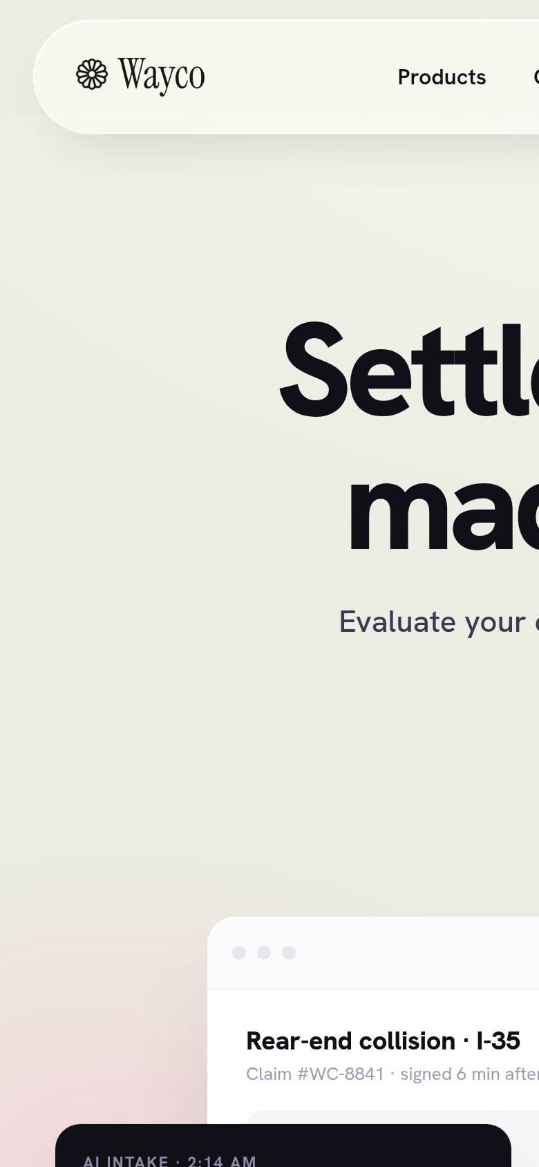 1234
- Oversized hero headline — Desktop headline barely scaled down — 'Settlement claims' overflows the viewport and is cut off mid-word.
- Uncollapsed desktop nav — Full link row ('Products', 'C…') runs off the right edge instead of collapsing into a hamburger menu.
- Overflowing subheadline — 'Evaluate Wayco's c…' clips at the right edge — body copy is not reflowing to the mobile column.
- Clipped product mockup — Browser-mockup card and claim text extend past the right edge, confirming a fixed desktop-width layout.
Trust
48PoorProof that the product is real, competent, and safe to try.

| Trust read | |
|---|---|
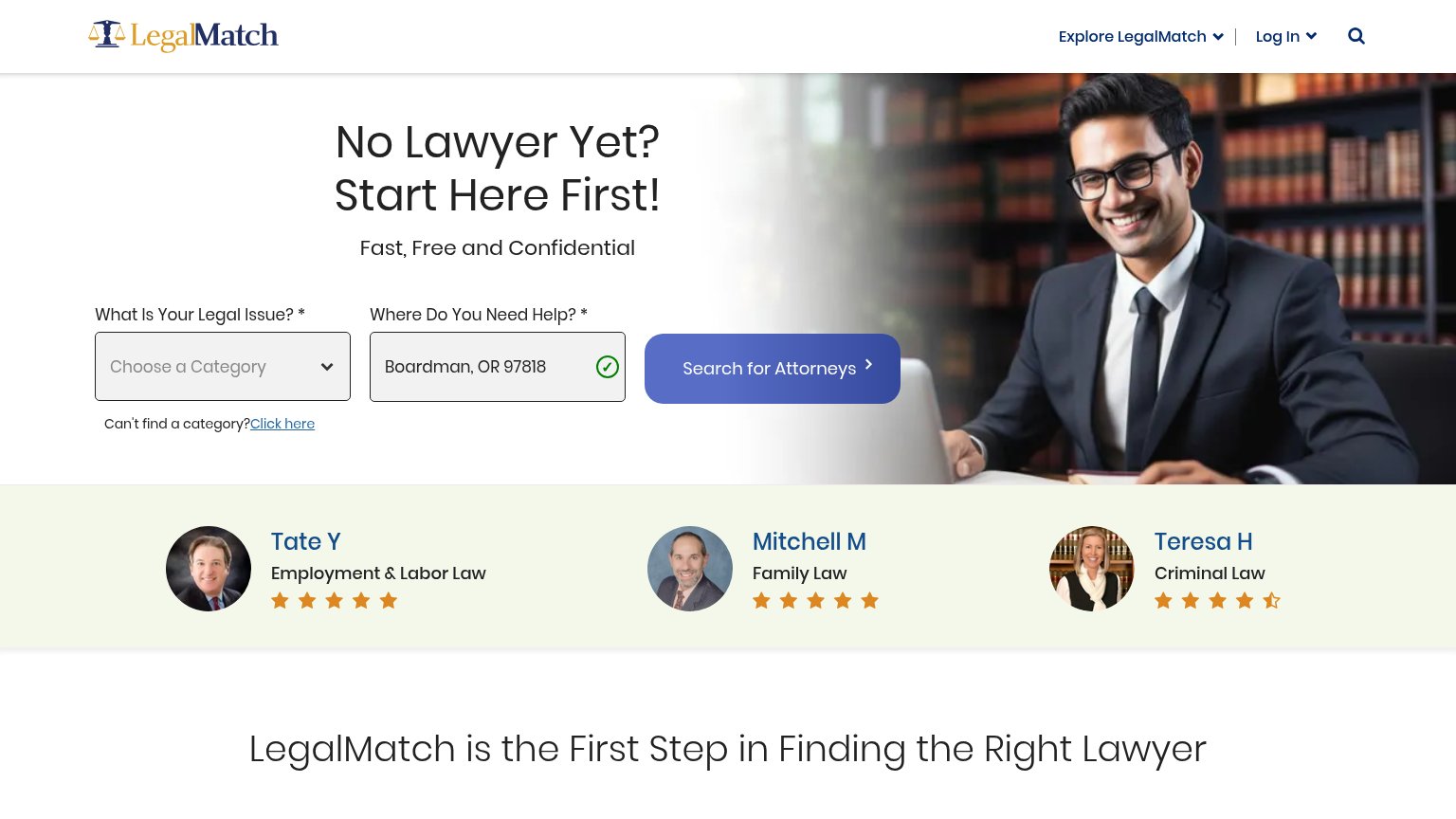
| Wayco | Product demo showing "Claim #WC-8841 · signed 6 min after first contact" with evidence and attorney-match panels |
| Phone mockup showing Mighty product UI with a "New Insurance Offer" card and "$45,000" live estimate | |
| Attorney profile cards with photos and star ratings ("Tate Y — Employment & Labor Law") | |
| No visible trust signal identified. |
Information hierarchy
72FairDoes the design help or inhibit what the page is trying to say?
What works
What to improve
Value props
72FairTitle, subtitle, hero — do they sell the product's true value?
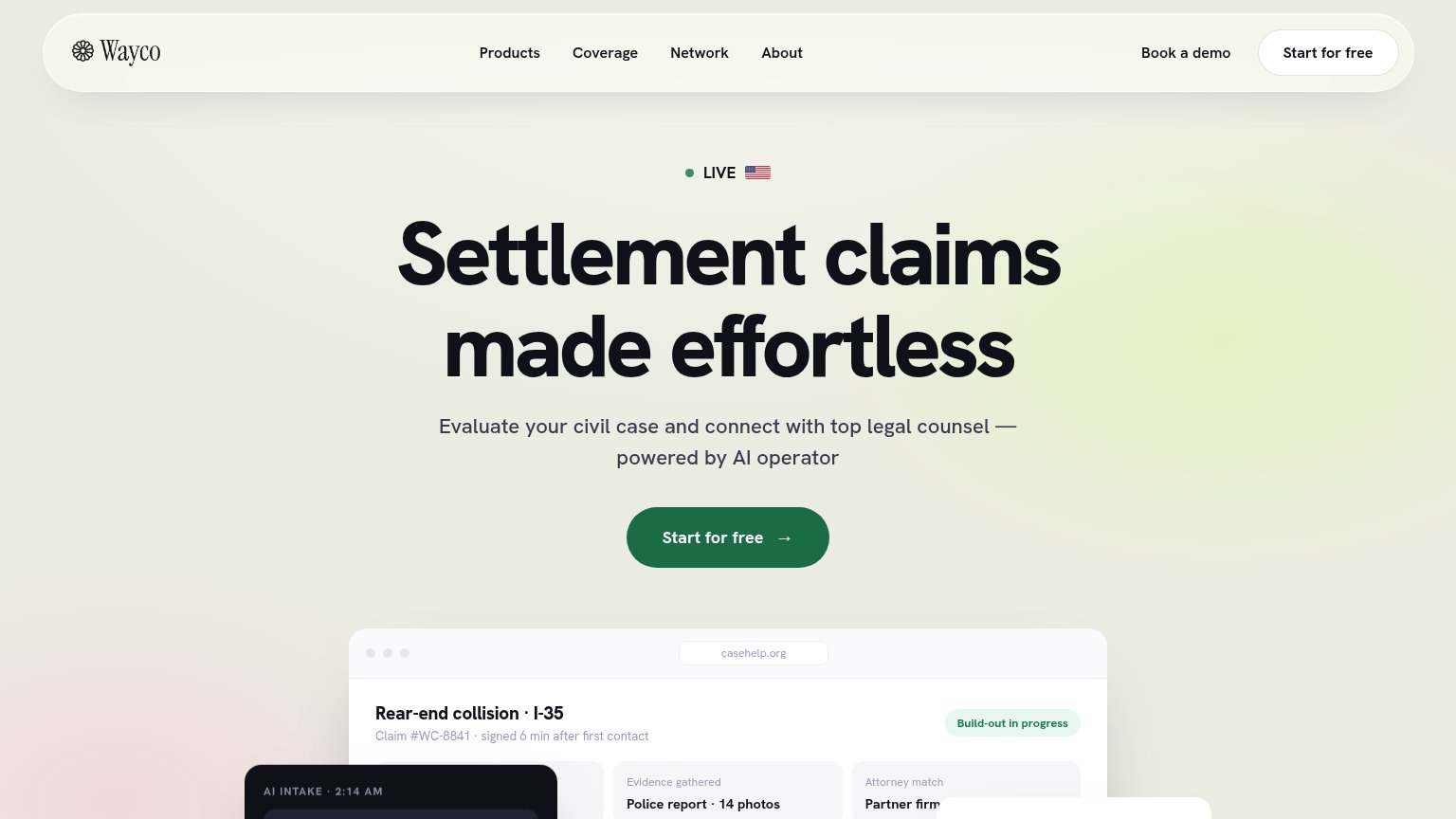
Wayco’s headline
Settlement claims made effortless
Evaluate your civil case and connect with top legal counsel — powered by AI operator
Working
Could improve
CTA
82StrongCopy, size, verb, cost-feel — does the primary CTA earn the click?
How Wayco compares
Recommended rewrites