
Your landing page’s weakest score is Trust.
How Voicebrook ranks
Trust
42PoorProof that the product is real, competent, and safe to try.
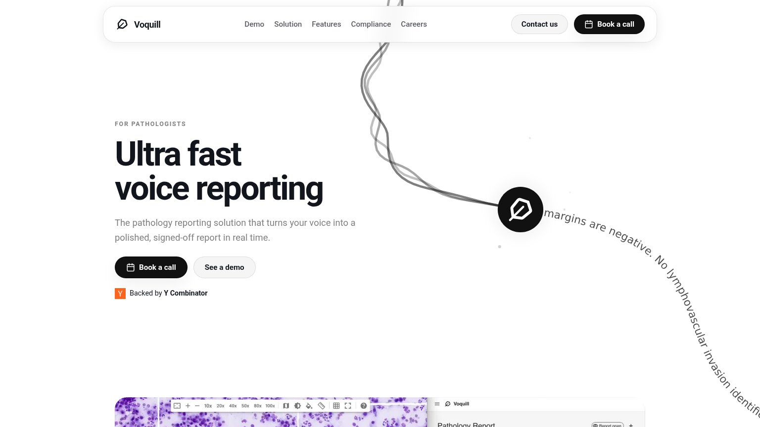
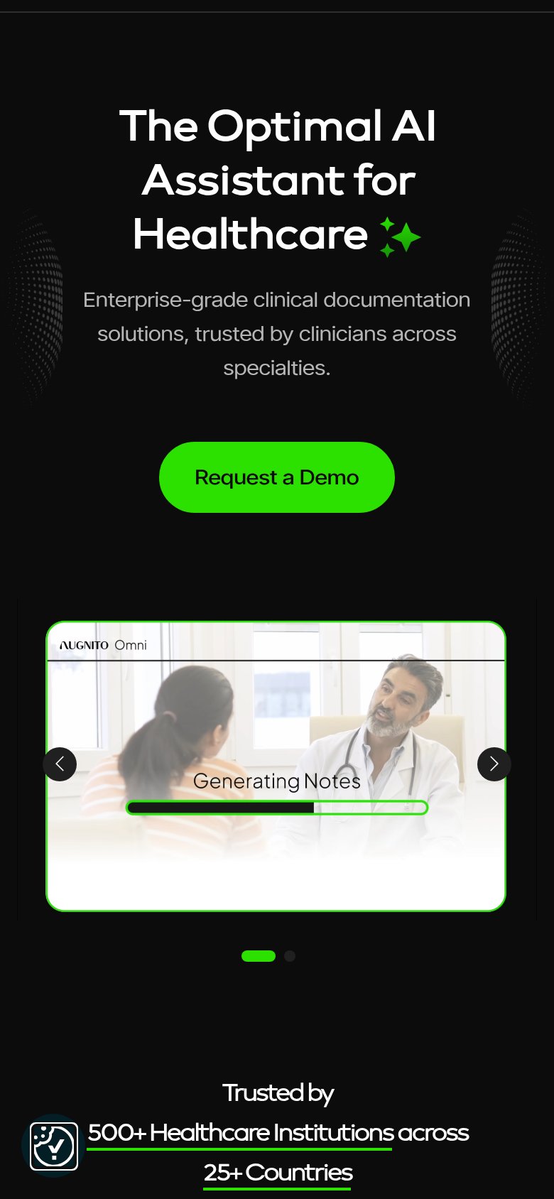
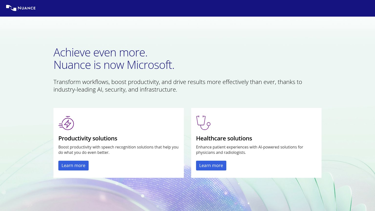
| Trust read | |
|---|---|
| Voicebrook | No visible trust signal identified. |
| "Backed by Y Combinator" badge beneath the hero CTA | |
| Headline "Achieve even more. Nuance is now Microsoft." stating the Microsoft acquisition | |
| "Trusted by 500+ Healthcare Institutions across 25+ Countries" (mobile fold) | |
| No visible trust signal identified. |
Mobile web
48PoorThe phone experience as a first-class citizen.
 123
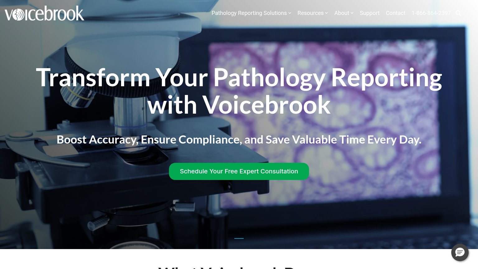
- Overflowing subheadline text — Text bleeds off both viewport edges — reads 'oost Accuracy' and 'nd Save', looks broken.
- Chat bubble on CTA — Chat widget overlaps the CTA label, hiding 'Consultation' and blocking the tap zone.
- Oversized hero headline — Desktop-scale headline wraps into four tall lines and pushes the CTA to the fold's edge.
Value props
62FairTitle, subtitle, hero — do they sell the product's true value?
Voicebrook’s headline
Transform Your Pathology Reporting with Voicebrook
Boost Accuracy, Ensure Compliance, and Save Valuable Time Every Day.
Working
Could improve
CTA
68FairCopy, size, verb, cost-feel — does the primary CTA earn the click?
How Voicebrook compares
Recommended rewrites
Information hierarchy
72FairDoes the design help or inhibit what the page is trying to say?
What works
What to improve