
Your landing page’s weakest score is Trust.
How Viqal ranks
77Growth scoreupdated
category scores
category scoresShowHide
Trust
58FairProof that the product is real, competent, and safe to try.
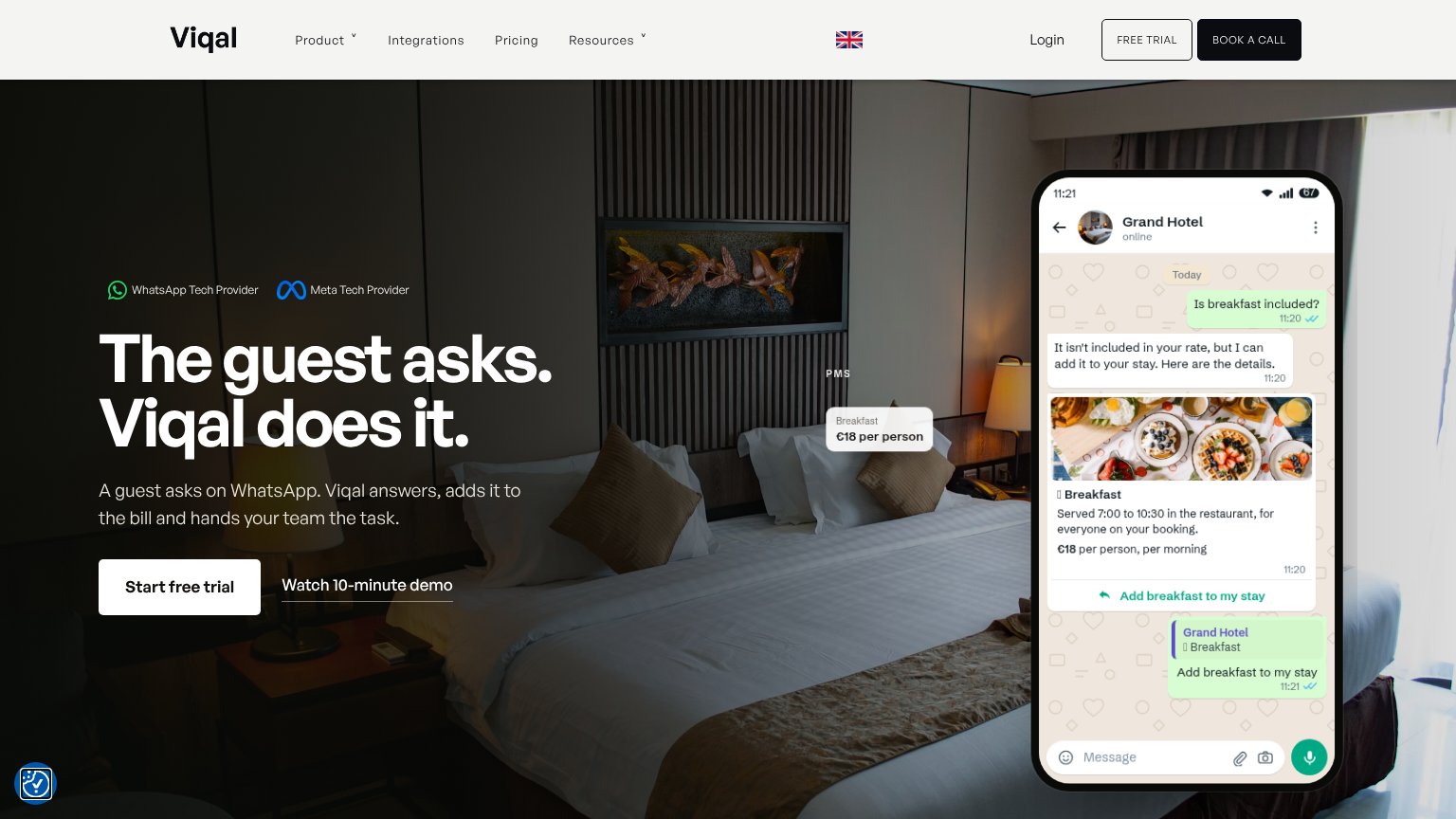
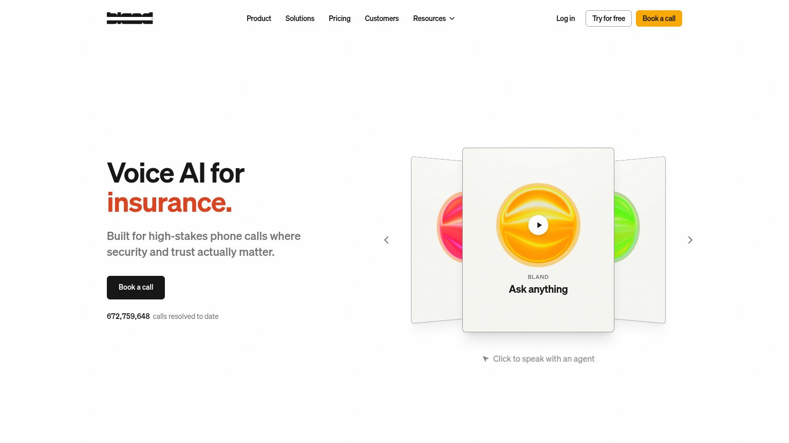
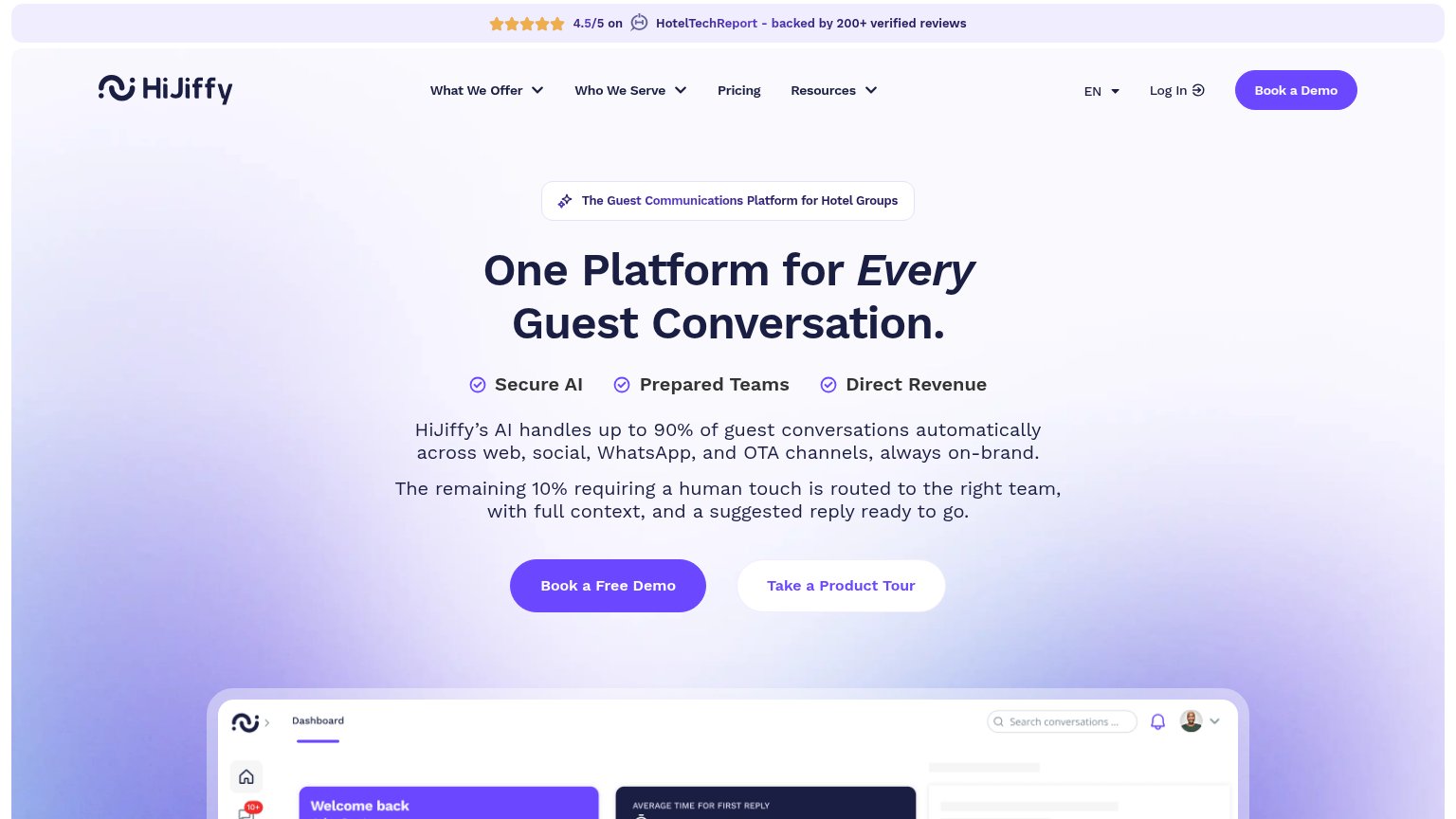
| Trust read | |
|---|---|
| Viqal | Detailed WhatsApp chat demo showing the guest asking "Is breakfast included?" and Viqal replying with "€18 per person, p |
| Backed by Y Combinator · Built for European hotel groups | |
| No visible trust signal identified. | |
| "4.5/5 on HotelTechReport - backed by 200+ verified reviews" banner | |
| "672,759,648 calls resolved to date" counter beneath the Book a call CTA |
Information hierarchy
78FairDoes the design help or inhibit what the page is trying to say?
1234- Duplicate header trial button — "FREE TRIAL" in the nav duplicates the hero "Start free trial", splitting one action into competing entry points.
- BOOK A CALL button — Solid black high-contrast styling outweighs the primary trial path and pulls first-glance attention to a second conversion.
- Nav link row — Product, Integrations, Pricing, Resources and Login give five exits before the visitor reaches the hero CTA.
- Watch demo link — Sits at near-equal weight beside the primary button, inviting a detour instead of clearly subordinating to the trial.
Mobile web
78FairThe phone experience as a first-class citizen.
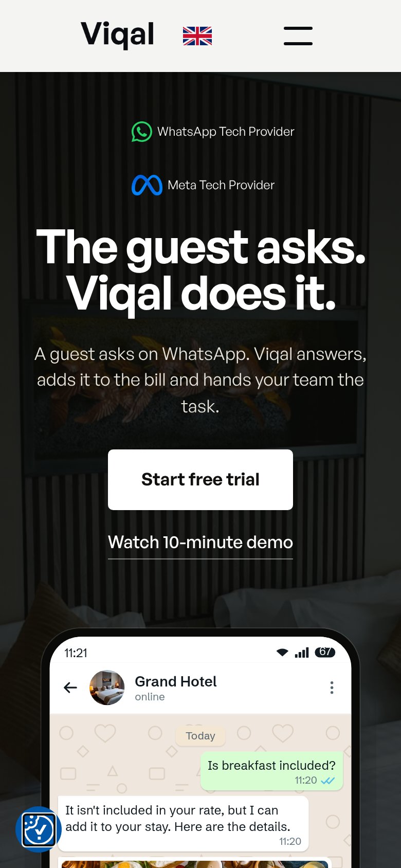
What works
What to improve
CTA
84StrongCopy, size, verb, cost-feel — does the primary CTA earn the click?
How Viqal compares
Recommended rewrites
Value props
85StrongTitle, subtitle, hero — do they sell the product's true value?
Viqal’s headline
The guest asks. Viqal does it.
A guest asks on WhatsApp. Viqal answers, adds it to the bill and hands your team the task.
Working
Could improve