
Your landing page’s weakest score is Trust.
How Ventura ranks
Trust
44PoorProof that the product is real, competent, and safe to try.
| Trust read | |
|---|---|
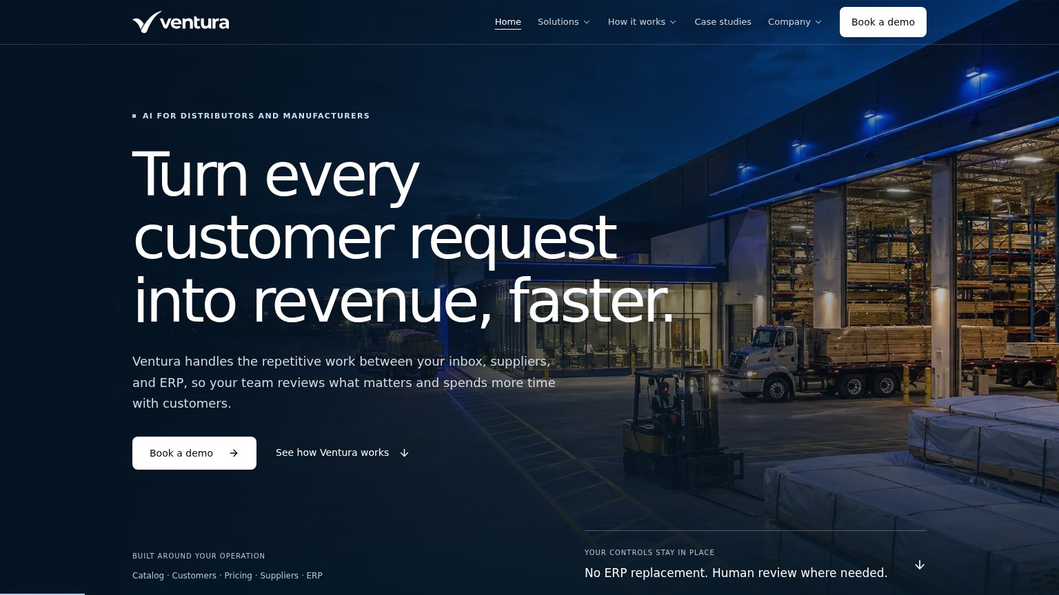
| Ventura | "No ERP replacement. Human review where needed." |
| implicit context Pantheon AI (getpantheon.com) may benefit from pre-existing familiarity among its target audience. | |
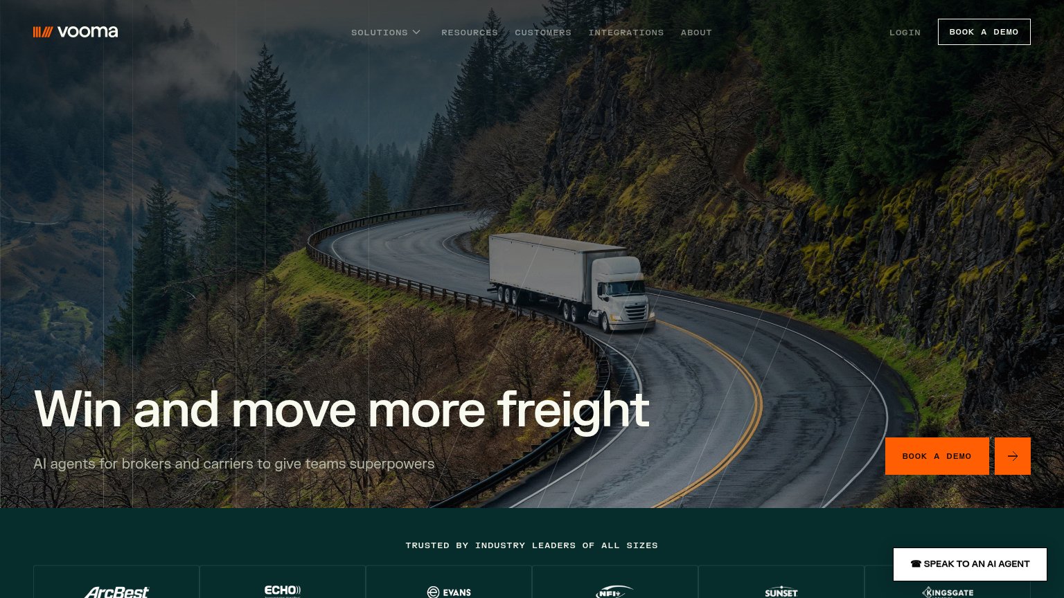
| "TRUSTED BY INDUSTRY LEADERS OF ALL SIZES" logo band with ArcBest, Echo, Evans, NFI, Sunset, and Kingsgate |
Mobile web
64FairThe phone experience as a first-class citizen.
 123
- Six-line headline — "Turn every customer request into revenue, faster." wraps into six oversized lines and eats most of the first viewport.
- Book a demo button — Hero CTA sits well below the first viewport and stops short of full width, leaving a desktop-proportioned button.
- Duplicate header CTA — A second "Book a demo" in the sticky header competes with the hamburger and duplicates the hero action.
CTA
72FairCopy, size, verb, cost-feel — does the primary CTA earn the click?
How Ventura compares
Recommended rewrites
Value props
76FairTitle, subtitle, hero — do they sell the product's true value?
Ventura’s headline
Turn every customer request into revenue, faster.
Ventura handles the repetitive work between your inbox, suppliers, and ERP, so your team reviews what matters and spends more time with customers.
Working
Could improve
Information hierarchy
78FairDoes the design help or inhibit what the page is trying to say?
What works
What to improve