
Your landing page’s weakest score is Trust.
How Vectorize ranks
Trust
62FairProof that the product is real, competent, and safe to try.
| Trust read | |
|---|---|
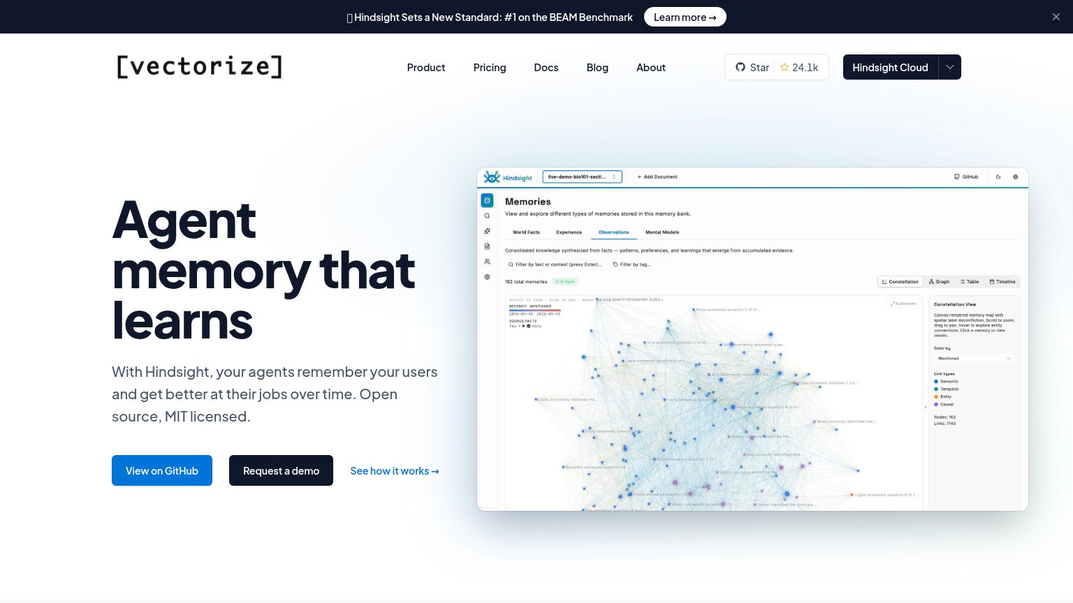
| Vectorize | GitHub star count "24.1k" in the navigation bar |
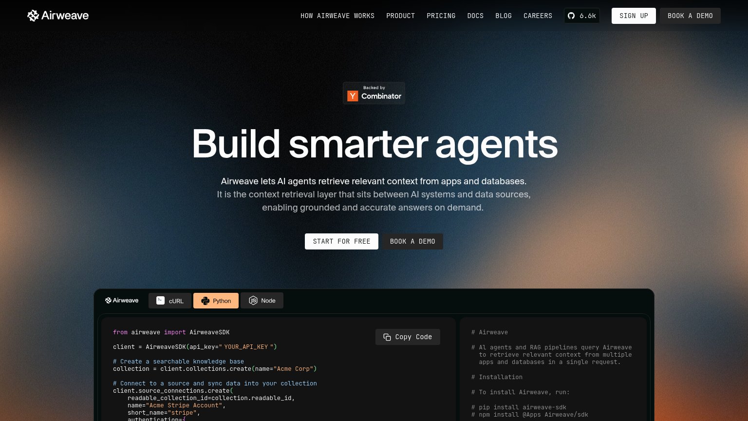
| "Backed by Y Combinator" badge above the hero headline | |
| No visible trust signal identified. | |
| "Trusted by the Fortune 500" heading at the bottom of the fold | |
| "Need a code sample? Ask our AI assistant" box with SDK tabs (TypeScript, Python, .NET) and concrete example prompts | |
| GitHub and Discord icons in the header navigation |
Mobile web
64FairThe phone experience as a first-class citizen.
 123
- Announcement banner — Stacked banner with 'Learn more →' pill eats the top ~200px of the first viewport and routes taps away from the primary CTA.
- Primary CTA pair — 'View on GitHub' and 'Request a demo' sit side by side at half-width instead of stacking full-bleed for the thumb.
- Product screenshot — Desktop dashboard capture shrunk to phone width — its labels and chart text are illegibly small.
Information hierarchy
68FairDoes the design help or inhibit what the page is trying to say?
What works
What to improve
CTA
72FairCopy, size, verb, cost-feel — does the primary CTA earn the click?
How Vectorize compares
Recommended rewrites
Value props
72FairTitle, subtitle, hero — do they sell the product's true value?
Vectorize’s headline
Agent memory that learns
With Hindsight, your agents remember your users and get better at their jobs over time. Open source, MIT licensed.
Working
Could improve