
Your landing page’s weakest score is CTA.
How Vagon ranks
70Growth scoreupdated
category scores
category scoresShowHide
CTA
62FairCopy, size, verb, cost-feel — does the primary CTA earn the click?
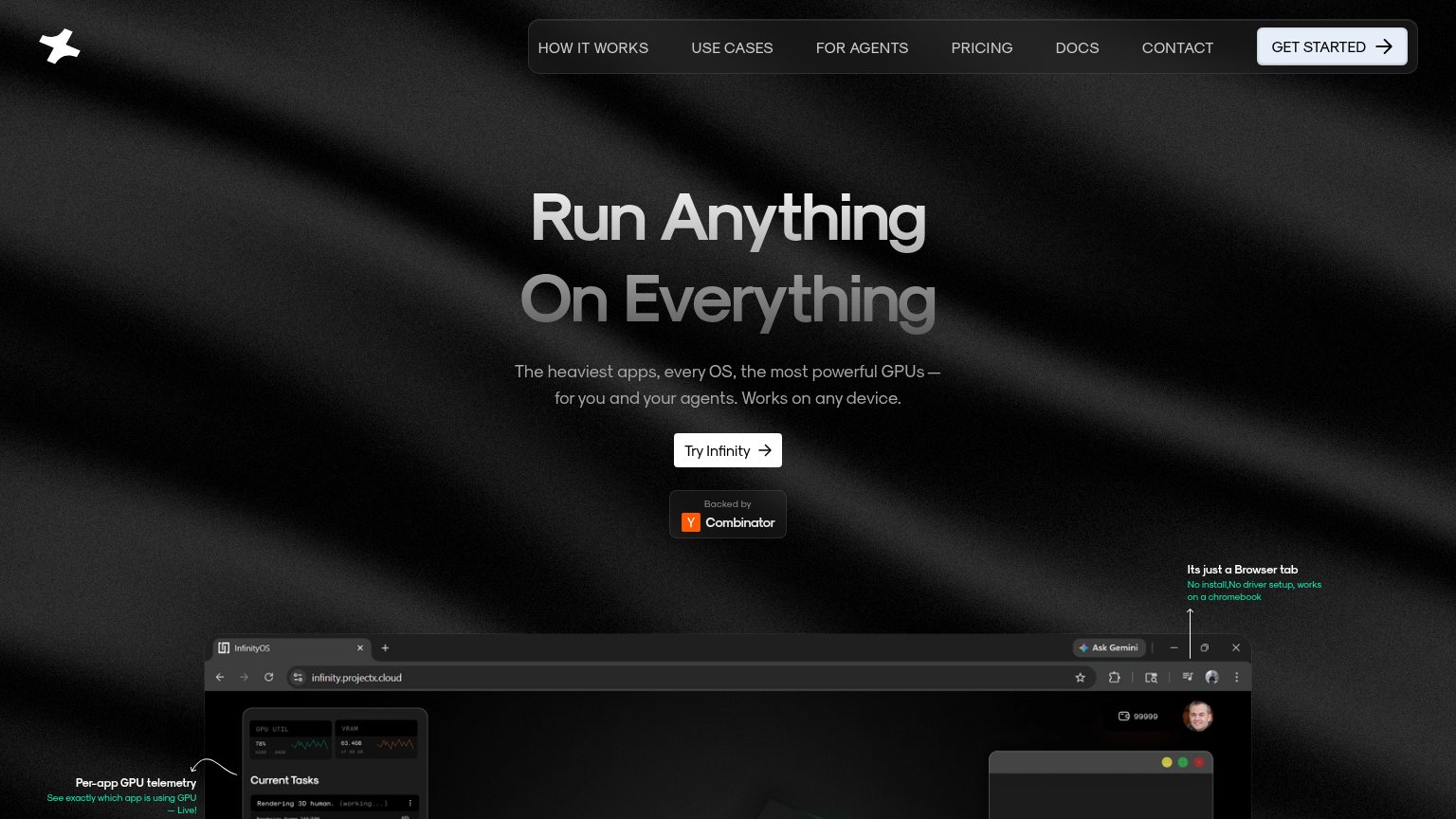

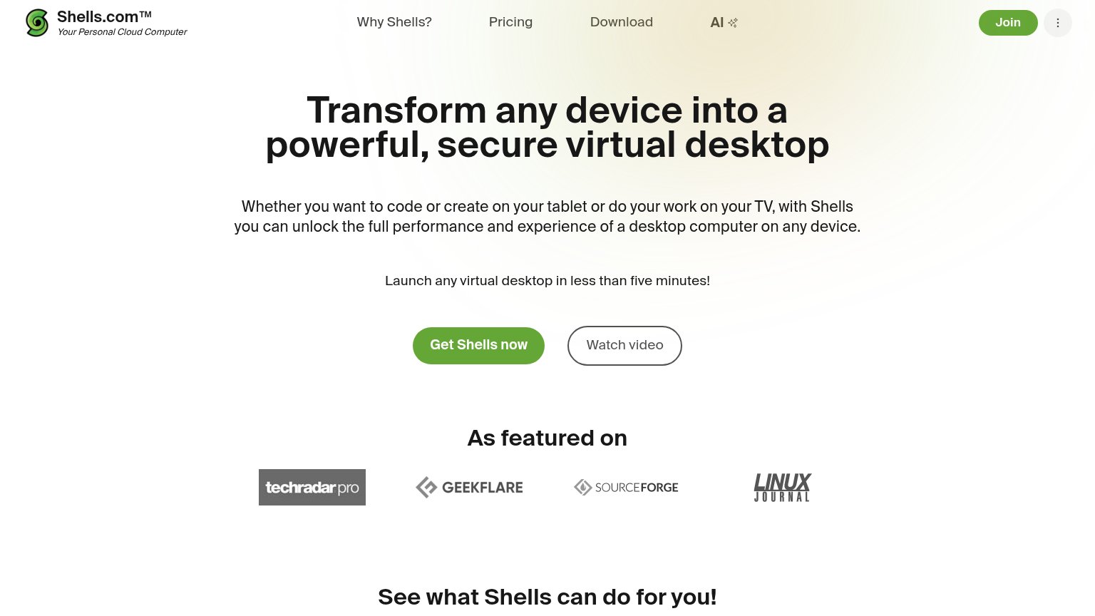
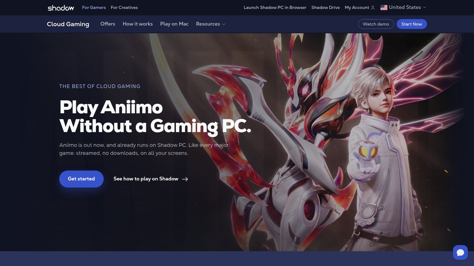
Problems
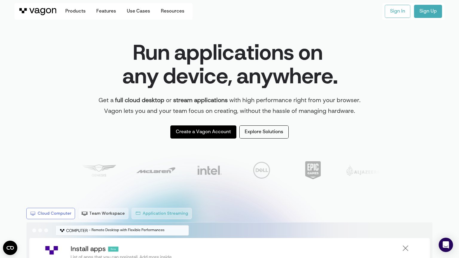
- click feels like signup work
- 4 words — too long
- nav says 'Sign Up' instead
- no payoff in the label
Information hierarchy
72FairDoes the design help or inhibit what the page is trying to say?
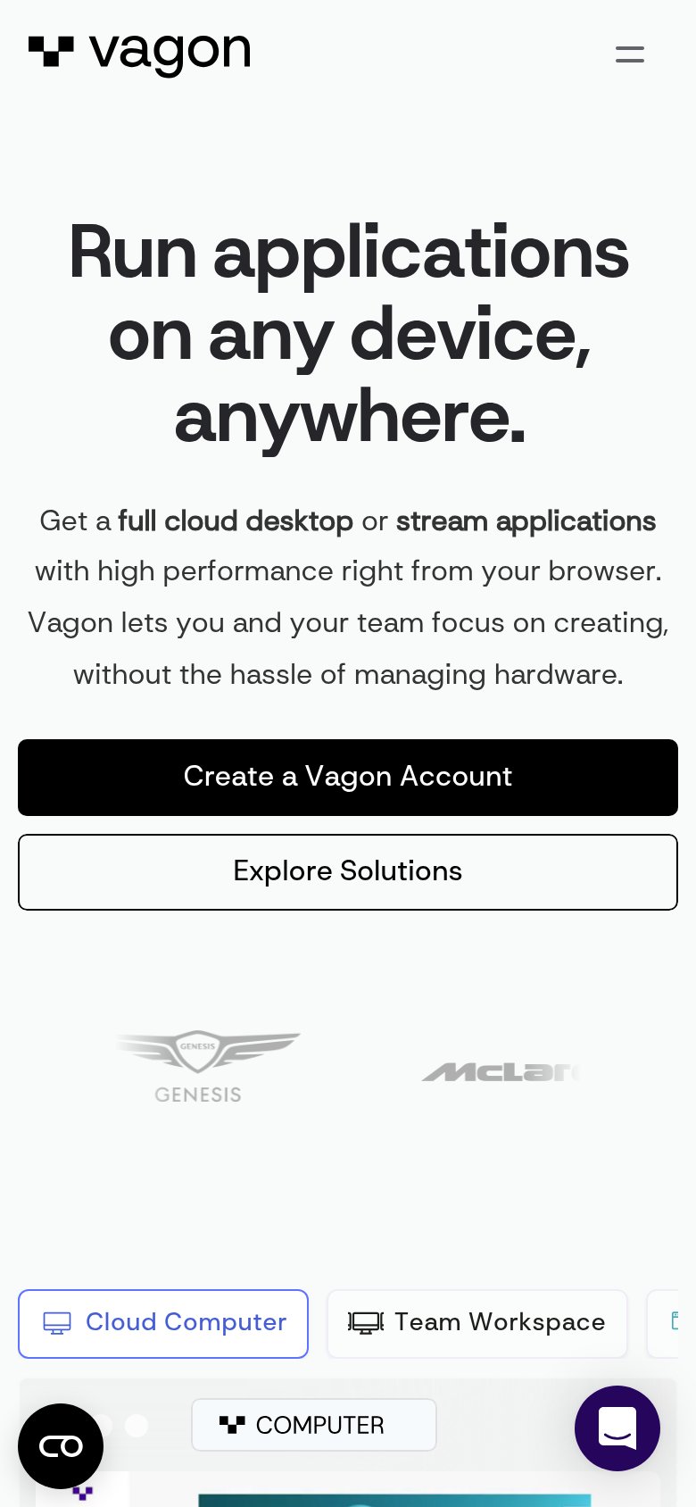
1234- Sign Up button — The only filled blue button on the fold outranks the black "Create a Vagon Account" CTA and splits the primary action in two.
- Explore Solutions button — Nearly identical size and weight to the primary CTA, forcing visitors to choose between two equal actions.
- Product tab switcher — Three tab pills (Cloud Computer / Team Workspace / Application Streaming) introduce a second decision layer right at the fold edge, competing with the CTA row above.
- Faded logo strip — Genesis and Al Jazeera logos are washed out to near-invisibility, weakening the trust signal the row is meant to deliver.
Value props
72FairTitle, subtitle, hero — do they sell the product's true value?
Vagon’s headline
Run applications on any device, anywhere.
Get a full cloud desktop or stream applications with high performance right from your browser. Vagon lets you and your team focus on creating, without the hassle of managing hardware.
Working
Could improve
Trust
72FairProof that the product is real, competent, and safe to try.
How Vagon compares
Trust read
Mobile web
72FairThe phone experience as a first-class citizen.
What works
What to improve