
Your landing page’s weakest score is Trust.
How Flywheel AI ranks
Trust
32PoorProof that the product is real, competent, and safe to try.
| Trust read | |
|---|---|
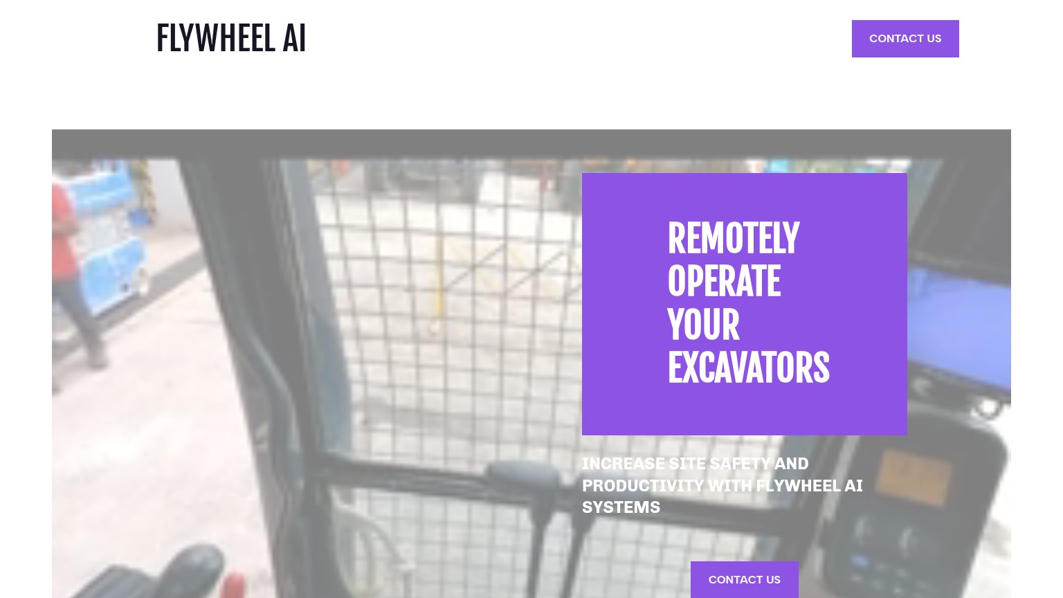
| Flywheel AI | Hero photo of a real excavator cab interior with control levers |
| "No spam. Just a heads up when we launch." reassurance under the email form | |
| No visible trust signal identified. | |
| No visible trust signal identified. | |
| implicit context Doosan Bobcat MaxControl-style remote ops (HD Hyundai XiteSolution) may benefit from pre-existing familiarity among its target audience. |
Mobile web
38PoorThe phone experience as a first-class citizen.
 1234
- Clipped subheadline text — "INCREASE SITE SAFETY AND PRODUCTIVITY" runs off the left edge and sits on a busy photo, making it nearly unreadable.
- Wrapped header CTA — "CONTACT US" breaks into three cramped lines ("CONT / ACT / US") inside a desktop-sized purple block that eats the header.
- Mid-page Contact button — The primary "CONTACT US" CTA sits below the first viewport at desktop proportions instead of near-full-width where the thumb lands.
- Oversized hero headline — "REMOTELY OPERATE Flywheel AI's EXCAVATORS" scales down too little, wrapping into four tall lines that push the CTA out of the fold.
CTA
55FairCopy, size, verb, cost-feel — does the primary CTA earn the click?
How Flywheel AI compares
Recommended rewrites
Information hierarchy
58FairDoes the design help or inhibit what the page is trying to say?
What works
What to improve
Value props
66FairTitle, subtitle, hero — do they sell the product's true value?
Flywheel AI’s headline
REMOTELY OPERATE YOUR EXCAVATORS
INCREASE SITE SAFETY AND PRODUCTIVITY WITH FLYWHEEL AI SYSTEMS
Working
Could improve