
Your landing page’s weakest score is Trust.
How Unifold ranks
70Growth scoreupdated
category scores
category scoresShowHide
Trust
58FairProof that the product is real, competent, and safe to try.
| Trust read | |
|---|---|
| Unifold | "Backed By Y Combinator" badge beneath the hero CTAs |
| No visible trust signal identified. | |
| "a stripe company" mark next to the Bridge logo, reinforced by the banner "Stablecoin-backed cards are now integrated wi | |
| Phone mockup showing the live Meso checkout UI at transfer.meso.network with fee breakdown and "Buy USDC" button | |
| Product dashboard cards showing "Total Balance (USD) $2,315,487.41" with Withdraw button and "Daily Gross Volume (USD)" | |
| Customer logo strip: HotStreak, Coverd, Triumph, Novig, PackDraw |
Information hierarchy
72FairDoes the design help or inhibit what the page is trying to say?
 1234
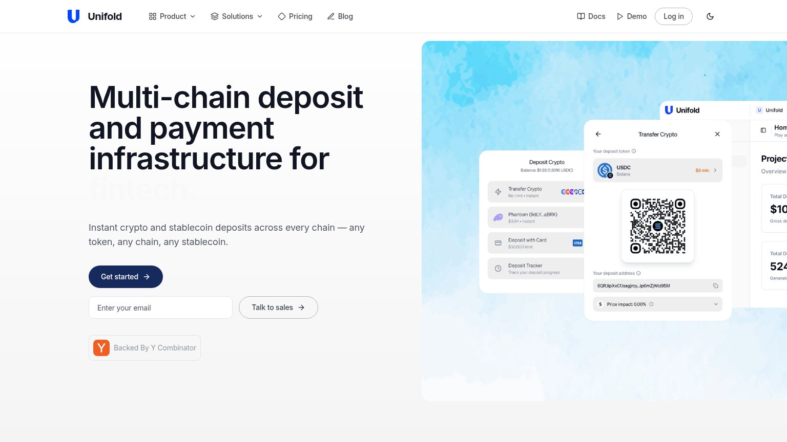
- Product screenshot cropped — The dashboard mockup runs off the right edge and gets clipped, so the fold's main visual proof reads as accidental rather than composed.
- Faded headline word — The rotating word "fintech." is rendered in near-white grey, so the headline's key audience qualifier is barely legible at the exact moment of capture.
- Three stacked CTAs — "Get started", an email field, and "Talk to sales" sit at similar weight in one column, splitting the visitor's first action three ways.
- Docs and Demo links — Two extra top-right exits styled at nav weight compete with the hero CTA before the visitor reaches the fold's action zone.
CTA
72FairCopy, size, verb, cost-feel — does the primary CTA earn the click?
How Unifold compares
Recommended rewrites
Value props
72FairTitle, subtitle, hero — do they sell the product's true value?
Unifold’s headline
Multi-chain deposit and payment infrastructure for fintech.
Instant crypto and stablecoin deposits across every chain — any token, any chain, any stablecoin.
Working
Could improve
Mobile web
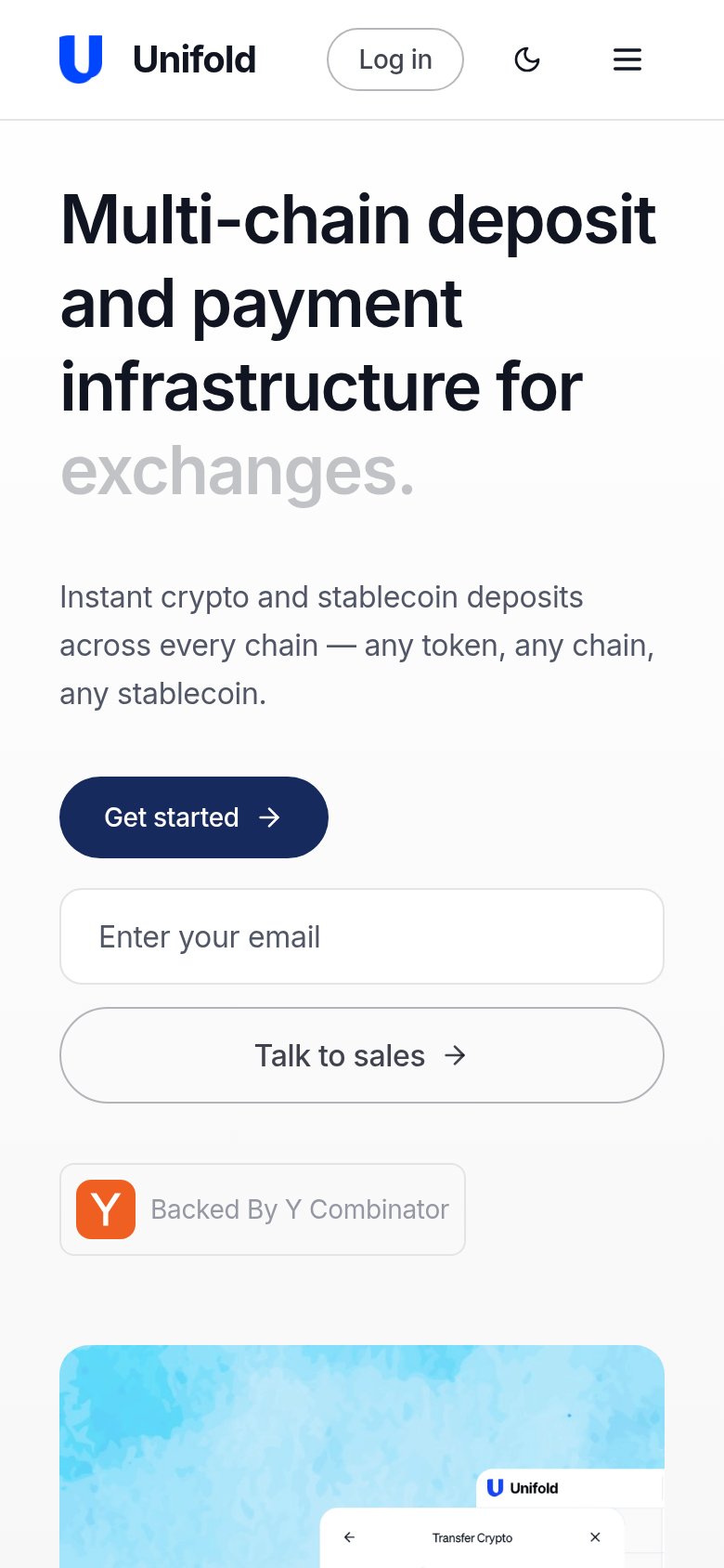
76FairThe phone experience as a first-class citizen.
What works
What to improve