
Your landing page’s weakest score is Trust.
How Typegrow ranks
80Growth scoreupdated
category scores
category scoresShowHide
Trust
74FairProof that the product is real, competent, and safe to try.
| Trust read | |
|---|---|
| Typegrow | Helping +16,000 creators grow their LinkedIn audience faster |
| "Backed by Y Combinator" badge with "843 on GitHub" star count beneath the CTA | |
| "Taplio's AI, trained on 3 million+ posts" subheadline | |
| "4.8/5 on G2" star rating in the proof strip at the bottom of the desktop fold | |
| "Join 100k+ users" with five-star rating and user avatars below the hero CTA | |
| Testimonial: "I'm absolutely blown away by my first post." — Julia Dembowski · Social media consultant |
Information hierarchy
78FairDoes the design help or inhibit what the page is trying to say?
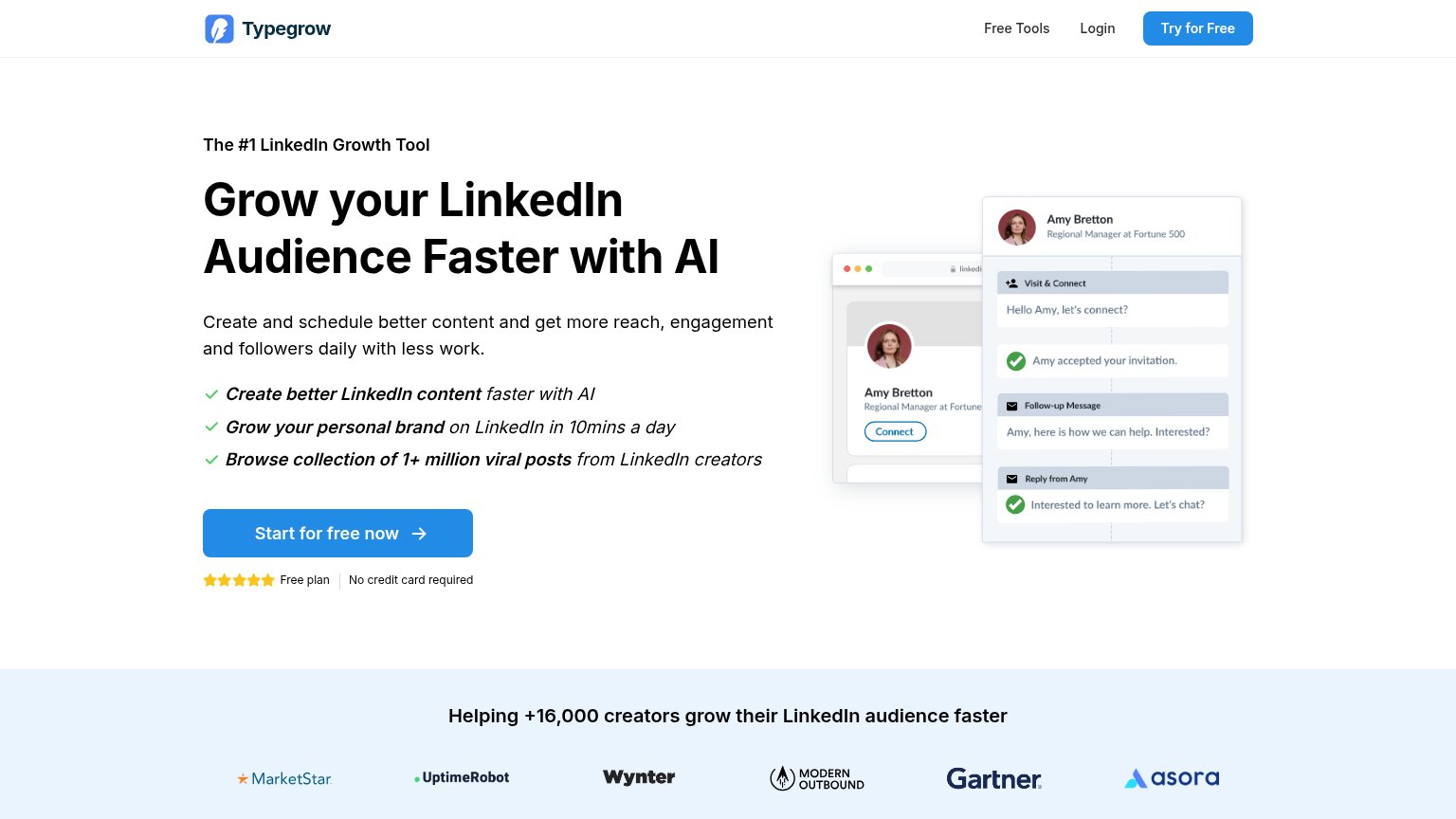 123
- Try for Free button — Nav CTA styled at equal weight to the hero CTA splits the primary action into two competing blue buttons.
- Product screenshot mockup — The Amy Bretton connect/follow-up flow shows outreach automation, muddying the content-creation promise the headline makes.
- Free Tools nav link — Exit path in the nav that pulls first-time visitors toward free utilities before the signup action.
Value props
78FairTitle, subtitle, hero — do they sell the product's true value?
Typegrow’s headline
Grow your LinkedIn Audience Faster with AI
Create and schedule better content and get more reach, engagement and followers daily with less work.
Working
Could improve
CTA
84StrongCopy, size, verb, cost-feel — does the primary CTA earn the click?
How Typegrow compares
Recommended rewrites
Mobile web
86StrongThe phone experience as a first-class citizen.

What works
What to improve